Category: WWDC 23

  • watchOS 10 Preview

    watchOS 10 Preview

    watchOS 10 is being billed by Apple as “the biggest update since the introduction of Apple Watch” and I don’t think that statement is too far off the mark. There are changes to virtually every element of Apple Watch. Over the past month or so I keep glancing at my Apple Watch and smiling, gaining a sense of pleasure having it on my wrist. Rather going though everything new in watchOS 10, I want to do something a little different. I want to point out some specific features that have made me feel so happy to be wearing this device on my wrist.    

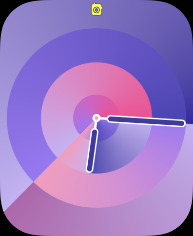
    First, the watch faces. This is the first thing you see every time you glance at your wrist. Even for people who don’t wear an Apple Watch, the face is the most visible element of your watch. WatchOS 10 has (so far) added two new faces. The less impressive of the set is Palette. It’s similar to other faces Apple has introduced like Gradient or Color- it features a dial that changes color as the hands move around the dial. The four corners of the display feature the rich complications that users have come to expect from most other Apple Watch faces. Though for this face in particular, I’m not sure you need to use them. It looks better without complications. In past versions of watchOS, using a face like Palette would mean you are prioritizing an esthetic over information density, but watchOS 10 has a solution for this. More on that in a moment. 

    The other new face is Snoopy. It features Snoopy and Woodstock from the Peanuts cartoon doing something a little different ever time you raise your wrist. When lowered, it shows the two sleeping on top of Snoopy’s doghouse. But when raised, you are treated to any number of unique animations. From Snoopy blowing a gum bubble and it exploding on his face and getting stuck on the hour hand, Snoopy doing his classic dance across the display, or Snoopy sliding down the hands like a fireman pole. It brings a smile to my face every time. And there are multiple color backgrounds you can select from as well. There’s the less interesting newspaper (giving you a background that looks like it was printed on a newspaper), Lucy Blue, Blanket Blue, Peppermint Patty, Woodstock Yellow, Great Pumpkin, and Doghouse Red. It’s a great callback to characters and props from the cartoon. 

    Since watchOS 7 in 2020, Apple has started holding back the introduction of new watch faces until that years Apple Watch models are revealed, so I do expect more new faces to become available once watchOS 10 officially launches to the public. 

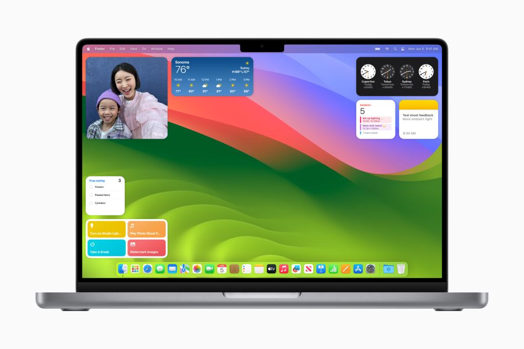
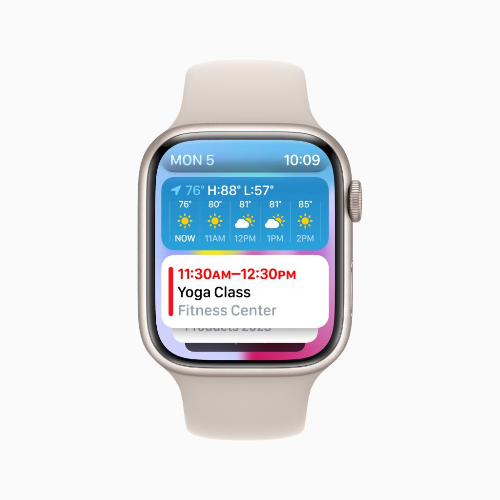
    Circling back to that point I was making earlier about prioritizing esthetic over information density, watchOS 10 has a new feature that frees you up to use whatever watch face you like without having to sacrifice the information you can get at a glance. If you like the super information dense faces like Infograph or Modular, you can keep using them! But if you want to use Snoopy or Contour which feature few to no complications, you can and use the new Widget Stack to get that glanceable information you still want. The Widget Stack is all new to Apple Watch, but is very similar to it’s counterpart on iOS. In fact, many widgets already on iOS look very similar if not identical to their watchOS widget counterparts. And these widgets are on every face now. Simply swipe up or use the Digital Crown to reveal the widget stack and browse your widgets. 

    Currently only Apple apps are available to use, but once watchOS 10 is available to the public, developers will likely begin updating their apps to offer up a widget. I love having the ability to quickly turn the Digital Crown and have my widgets popup and offer up rich information in ways that most complications on most Apple Watch faces simply can’t match.  And when I’m done looking at the information I need, I turn the Digital Crown again and it simply tucks away again with subtle but greatly appreciated Taptic feedback.    

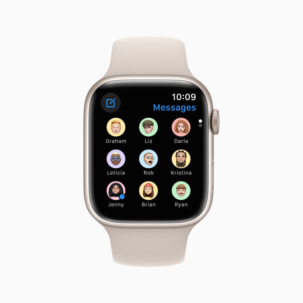
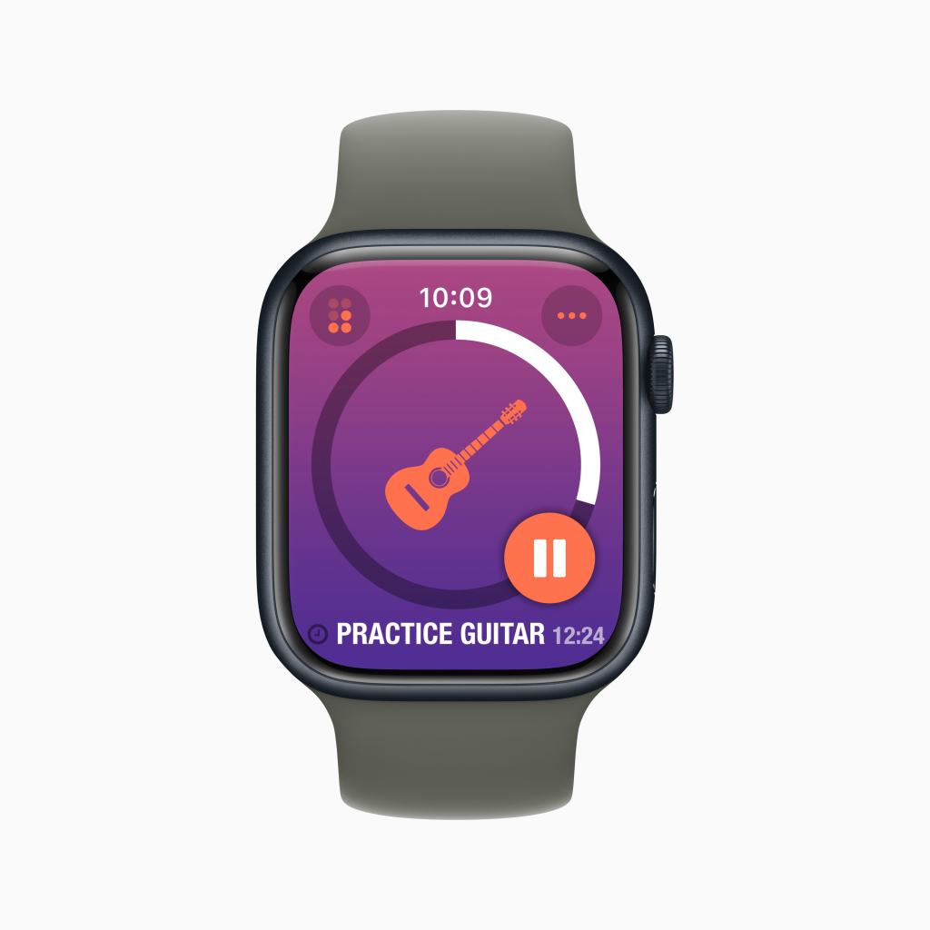
    I do want to draw attention to one of these widgets in particular. It doesn’t have a specific name in watchOS, but its main purpose is to hold three regular sized complications, so I will refer to it as the Complication Tray. The Complication Tray can hold three complications to offer up information to you, like the status of your Activity rings, or quick access to an app like Home. Any widget can be pinned to the top of your stack, so I have this one pinned so I can always quickly no matter where I am on my Watch, access the Workout app, see my Messages, or control my home. 

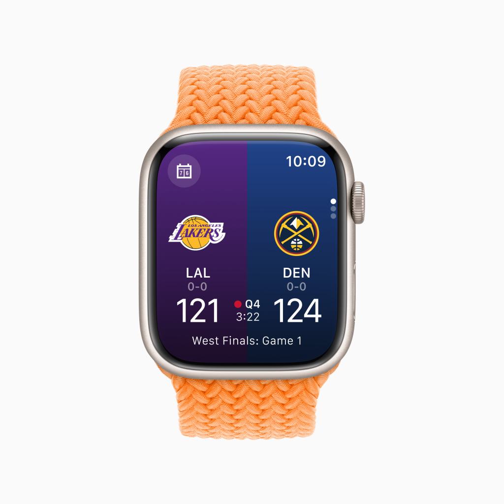
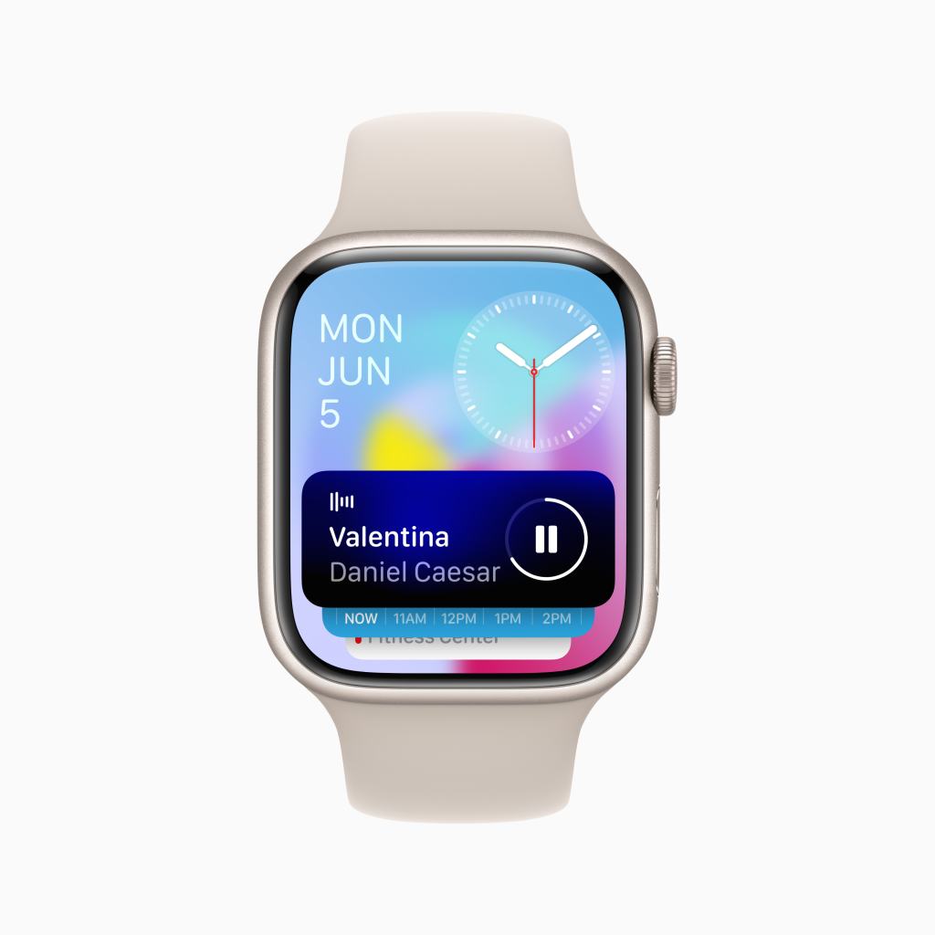
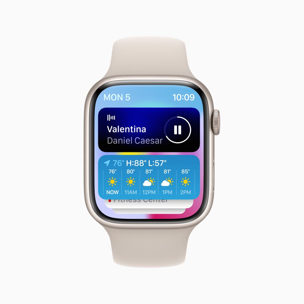
    The Widget Stack is dynamic as well. Throughout the day based on the time or what you are currently doing, it will update with widgets that are timely. For example, when listening to music or a podcast, the Now Playing Widget will appear on top- before even your pinned widgets. Or if a Workout is in progress, you can quickly pause or resume it right from the Widget Stack. 

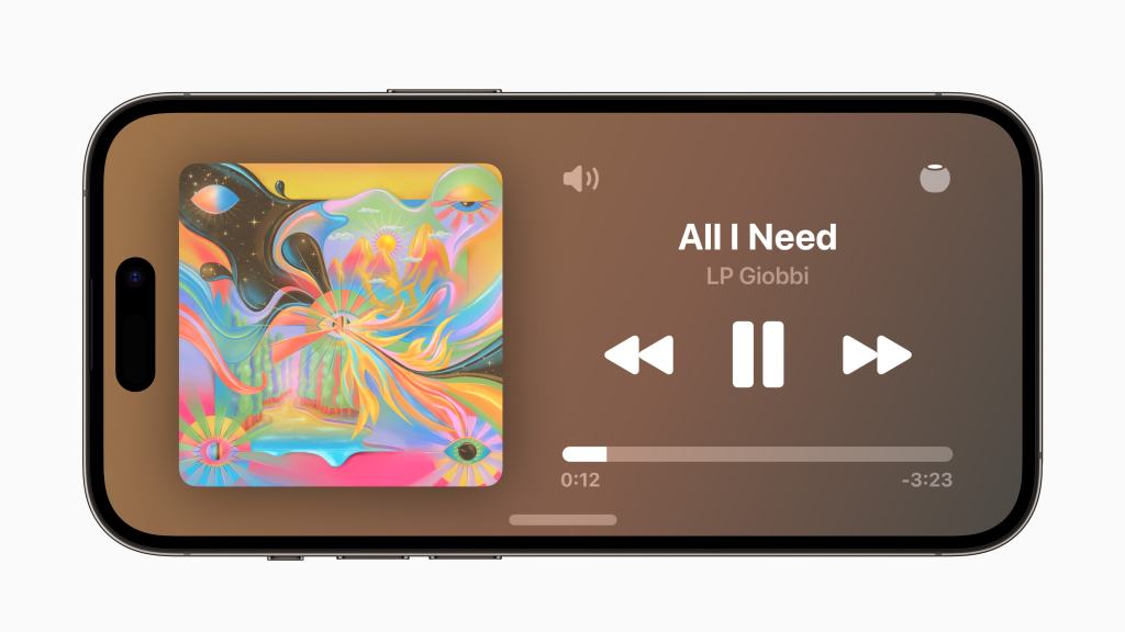
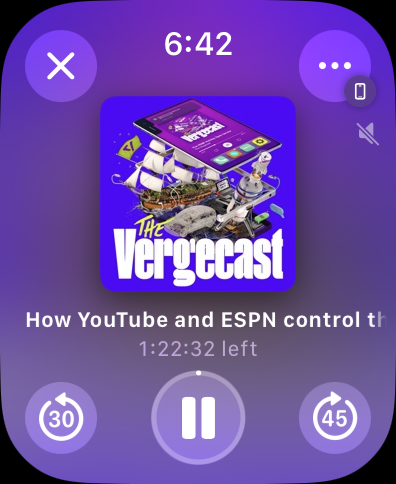
    One the subject of Now Playing, this is a much nicer experience than past versions of watchOS. Previously, you just had a big Play/Pause button in the middle of your screen with some AirPlay controls and one of those infamously non-detailed … buttons. The title of your audio would scroll by on the top and it just looks basic. In watchOS 10, Apple has made this a much more pleasant experience while retaining functionality. Your controls are all in the corners of the display, allowing you to quickly rewind or fast forward, play/pause, close the Now Playing window or change your AirPlay settings with a detailed … button. The album art also fills the middle of your screen and can even be tapped to take it full screen just like on iOS. It’s fun to discover even if its not super practical.    

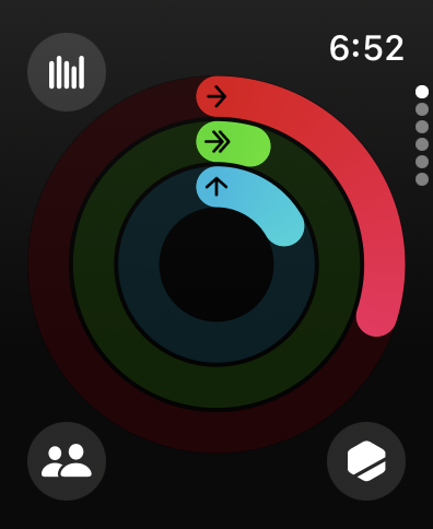
    These bigger buttons and controls in the corners of the display are actually a very common element in watchOS 10 as virtually every single app has been redesigned to look beautiful, offer increased functionality, and communicate more information. Activity for example puts access to your Weekly Summary, Competitions, and Trophy Case right in the corners, removing the need to swipe across the display multiple times to get to what you wanted. Turning the Digital Crown no longer puts you into a long list of information, it instead hilights each of the three rings and offers up deeper information on that specific ring. 

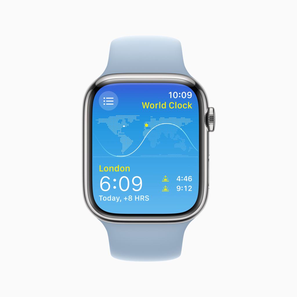
    Weather has full screen weather effects just like the Weather app on every other Apple platform and it looks great. Great enough to be its own face in watchOS 11 I’m sure… It defaults to a current weather overview but using the Digital Crown can show the forecast for the next few hours or even the next 10 days. Tapping the button in the upper right corner lets you quickly select what specific weather information you want- precipitation, humidity, wind, etc… 

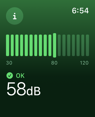
    And Noise no longer has a bar that indicates how loud it is and then makes you scroll down a long list to find how safe your current level is. The full screen is utilized to indicate your current noise level with color communicating that information. More detailed information is hidden behind the “I” button but many people won’t need that level of detail anyway. So moving it out of the way is perfectly fine.    

    This new design philosophy should actually start cropping up in many more watchOS apps once developers can update their apps to support watchOS 10 specifically. Apple has found that many apps fit into one of three styles- Dial, Infographic, and List. 

    The implementation of these styles is left to the developer of each app to select and build their app around- users can’t pick and choose a style on a per app basis. But it is nice to see Apple finally finding their footing on how to best design an app for Apple Watch and take advantage of the bigger displays the Series 4 and Series 7 displays offer. This feels like the first version of watchOS to not be constrained in any way by the original Apple Watch display or design limitations. 

    The other thing I want to mention as neither a positive or negative, but something that is different that I do notice is Control Center. Invoking Control Center is no longer done by swiping up on the Watches display. Instead, you press the Side Button. This brings up Control Center from anywhere, rather than the Dock. While I did make expensive use of the Dock in previous versions of watchOS, I don’t actually find myself missing it. The Widget Stack and refreshed Home Screen make accessing the apps I want simple. And tying Control Center to the same button you use to power the Watch On and Off does make a certain amount of philosophical sense. But it is different and something that will take users a little bit to adjust to. 

    There are more changes like this in watchOS 10 actually. The Side Button brings up Control Center. Swiping up brings up the Widget Stack. You can no longer swipe across the face to quickly change faces- you have to press and hold the screen to do so. The Digital Crown no longer has a direct effect on faces it previously had an effect on. And double pressing the Digital Crown no longer quickly swaps you between two apps. Many of these changes are detailed for users once they update their Apple Watch to watchOS 10. And the Tips app offers up lots of good information for users, but I can’t help but feel like many users may spend the first few weeks with watchOS 10 feeling a sense of frustration. 

    But overall, I am very, very positive on watchOS 10. It is by far the biggest update the Watch has received in years and feels like a platform that Apple could actually now build more advanced features and apps off of than what they had previously. I think while many will feel frustrated at first with it, given time, they’ll come around tot he same joy I feel when wearing and interacting with my Apple Watch. 

  • WWDC 2023 Recap

    WWDC 2023 Recap

    The Biggest Apple Event since 2016

    Apple’s worldwide developer conference (WWDC) keynote has officially ended. For the remainder of the week, developers, journalists, influencers, and others invited to Apple Park in Cupertino, California will be sitting in on sessions to get familiar with changes coming to iOS 17, iPadOS 17, tvOS 17, macOS 14, watchOS 10, and an all new platform, visionOS. Many will also be getting a hands on with the new MacBook Air, Mac Studio, and Mac Pro that were unveiled. And I suspect several attendees will also be getting a hands on (or more appropriately a heads on demo) of the latest hardware product Apple is adding to its portfolio, Apple Vision Pro. These software and hardware announcements have easily made this the biggest Apple Event since at least the September 2015 Event where Apple announced iPhone 6 and iPhone 6 Plus, Apple Pay, and previewed the first generation Apple Watch and watchOS.

    Apple Vision Pro

    Easily the biggest news of the WWDC 2023 keynote came at the very end when Tim Cook used the words made famous by his predecessor Steve Jobs, “We have one more thing.”

    “Apple today unveiled Apple Vision Pro, a revolutionary spatial computer that seamlessly blends digital content with the physical world, while allowing users to stay present and connected to others.”

    Apple Press Release, June 5, 2023, “Introducing Apple Vision Pro: Apple’s first spatial computer”

    Apple Vision Pro is described by the company as a “spacial computer” but it is probably best described as an augmented reality (AR) headset. Many details about the headset are not currently know, but that is to be expected for a product that will not ship until early 2024, similar to the launch timing of the original Apple Watch. We do know that the product starts at a jaw-dropping $3,500 price tag, not including the prescription lenses that you may need to use the device or any other potential upgrades. The headset is made up of several different pieces that Apple claims creates a modular system. The first part is the head band that can be detached and replaced with another in a different size. The second is the audio strap that puts a speaker right next to your ear. The third is the light seal which conforms to your face to block out all stray light. Fourthly is the enclosure that houses the lenses, screens, M2 and R1 chips, and all the cameras and (presumably) LiDAR sensors that make the entire experience possible. And finally, the battery pack that will deliver a maximum of 2 hours of battery life. All these pieces combine to create the singular Apple Vision Pro headset.

    As someone who has not, and will not, go hands on with the device for many more months, I am reserving judgement not he product until I do so. However I do have many questions about this product though. More to come.

    iOS 17, iPadOS 17, tvOS 17, macOS 14, and watchOS 10

    These platforms are par for the course at most WWDC conferences and in line with that, they all made appearances in the keynote. The changes this year seem relatively light compared to several past years, but there is still a good handful of changes and new features coming to everything. iOS, for example, has a new feature called “Standby” that allows it act a lot like a home hub with a screen from other companies like Google and Amazon. There are a lot of personalization and social features coming across the system, like creating stickers from Photos that can be accessed from the Keyboard in any app and the ability to create a custom incoming phone call interface. It is all pretty neat.

    iPadOS 17 once again finds itself playing catch up to iOS 16 from last year, finally getting many of its features from last year like customizable Lock Screens and support for the Live Activities API, but many of this years features also come over this year like the keyboard changes and social features. Unlike previous years where there has been at least one standout iPad exclusive feature, there isn’t one readily presenting itself this year. It does make me wonder why Apple gave the iPad its own OS in the first place if it regularly can’t keep up with iOS and rarely gets its own improvements.

    tvOS did make an appearance, something that it infrequently does. The Home Screen can now fit more apps than it does now, in addition to a new Control Center. There is also a new feature to find the Siri Remote and Continuity Camera comes to tvOS allowing users to take FaceTime calls right on Apple TV with video coming from a connected iPhone camera. It works with many apps to offer a new side-by-side/SharePlay view so you can see both your friends and the content on your Apple TV. It’s actually pretty neat.

    macOS 14 got many of the improvements that are coming in iOS 17 as well as many new fun video conferencing features. There are also many Mac specific adoptions of other OS features like widgets now being able to placed on the desktop, the Lock Screen looks more similar to that of iPadOS and gets the Screen Savers from tvOS. It’s really neat! And yes, Craig was happy to share the name of this release; macOS 14 Sonoma. I called it!

    watchOS probably got the biggest reinvention of all the platforms this year. Virtually all Apple apps got an all new design, the Smart Stack was introduced- merging the iOS widget Smart Stack feature with the Siri Watch Face design and the Dock- that can now be found on every face by using the Digital Crown. The Side Button now invokes Control Center and the Home Screen got facelift as well, retaining its bubbly grid layout but it’s now larger. I am eager to go hands on with this update in July.

    The Apple Silicon Transition is now Complete

    Back at WWDC 2020, Apple officially unveiled their plans to transition the Mac from Intel to Apple Silicon. At the time, they provided developers some guidance on how the transition would work.

    “Apple plans to ship the first Mac with Apple silicon by the end of the year and complete the transition in about two years.”

    Apple Press Release, June 22, 2020, “Apple announces Mac transition to Apple silicon”

    At the time, Apple estimated the transition would take 2 years (ending at the end of 2022), but this did not come to pass. Today however, 2.5 years later, the transition is now complete as the Mac Pro has finally made the jump to Apple Silicon. In addition, the Mac Studio got upgraded with the M2 Max and all new M2 Ultra chips. I will dedicate more time to the significance of the Apple Silicon transition now being complete, as well as how the Mac Pro made the jump, in a later post, but I do not want to diminish the huge accomplishment Apple has made by completing this transition.

    My Standout Favorites

    As I reflect on what will be most impactful to me as a consumer when this software comes out this fall, I think watchOS 10 will be much more pleasant to use though I do worry how Apple changing the basic functions of Apple Watch will sit with users.

    The Standby feature of iOS 17 doesn’t look quite right to me. It seems like nothing is properly in proportion to anything else on the screen and it seems quite complicated to navigate. It generally feels like a feature Apple is shoving though the backdoor of iOS to eventually bring to iPadOS and/or another new product line for the home.

    The new Journal app coming in iOS 17 looks to be pretty close to what I was hoping we’d get. More details can be found in this post.

    And as the only person who enjoys Apple News+, there is a change coming to the service in regards to Audio Stories… they’re no longer part of Apple News+. Starting this fall, Apple News Audio Stories will be available to listen to in the Podcasts app. In some ways, this solves many of my main complaints with eh feature, but also changes the nature of Apple News+ as a service more broadly. I look forward to creating a followup to my previous post. Oh, and you can do crossword puzzles in the News app now too. Neat.

    Apple Vision Pro isn’t a standout to me just yet. There are too many unknowns of the product and everything Apple did show only falls into the “neat” category for me. It is clear that Apple has spent a lot of time thinking about AR and how users should interact with it. There are two things that Apple is not doing that competitors like Meta are, that I think sets Apple up for greater success. First, they are not reinventing reality. Unlike Meta, who believes users will spend all day, everyday in virtual reality (VR) worlds to take meetings or share spaces with co-workers, Apple understands that isn’t possible. They seem to be building the Vision Pro to extend reality and be as compatible with current “legacy” hardware and software as possible. The second is that Vision Pro is seemingly not an accessory to the iPhone. It is a standalone device not requiring any additional hardware to control, unlike competitors who want users to hold special controllers in each hand or plug in to a separate computer to power their experience. But like I said, more details are needed to make any kind of judgment.

    The Next Several Weeks

    The next several weeks on this blog will be more of a deep dive into iOS, iPadOS, macOS, tvOS, the Mac transition, and Apple Vision Pro. As a member of the Public Beta program, I will also be sharing details about these new platforms throughout the summer. I also have many other smaller projects I hope to publish to keep the topics on this blog fresh and new. I hope you return to read more about my thoughts on Apple in the coming weeks!

  • WWDC 2023 Hardware- Hopes and Predications

    WWDC 2023 Hardware- Hopes and Predications

    I want to make it clear right at the top that hardware reveals are not overly very common at WWDC. WWDC is primarily a conference dedicated to giving developers a preview of the changes Apple is making to their platforms in the coming months. The conference, unlike events in September, are much more specifically marketed toward developers and professional users, not the average consumer. Hardware at WWDC is not something that is impossible, it does happen. In the past 10 years, 4 have had hardware announcements. So I don’t generally go into WWDC expecting hardware. Having said that, this is a year where there are multiple hardware rumors going around. So I want to discuss those rumors some while also managing expectations.

    For starters, new Macs are being talked about as a possibility. This would be very exciting as there are a couple Macs that we are still waiting to get upgraded to the M2 chip. The iMac stands out as a product that could realistically get the M2. There have been rumors a larger 15″ MacBook Air with the M2 making its debut. This would be a nice product to have in the lineup, but it’s not very exciting on its own. Think of it this way- exactly a year ago Apple debuted the new 13″ MacBook Air with the M2 chip. Is it really interesting or necessary that they reintroduce the same product in a larger size with the same chip? The answer is no. Another product due for an upgrade, and one that would be very fitting and exciting for this conference specifically, is the Mac Studio. I can very easily see Apple bringing the M2 Max to this product and debuting the M2 Ultra chip at WWDC, marking the Mac Studio as the most powerful Mac in the entire lineup. There have been some rumblings on the Mac Pro making its debut, the last two generations have all been announced at WWDC, but the rumors seem to indicate that Apple hasn’t figured out how they can maintain the products signature modularity while giving it the boost Apple Silicon provides. So a Mac Pro reveal seems unlikely. Better to focus on the Mac Studio- a very impressive and warmly received product- and a larger MacBook Air that can be quickly introduced this summer ahead of the college shopping season.

    The only other product that is supposed to appear, and is probably what you are reading this post for, is Apples new headset that, depending on the rumors you listen to, is either a virtual reality (VR) focused headset or a mixed reality headset that will incorporate elements of both VR and augmented reality (AR). It’ll be a new product category for Apple and the first new product category since AirPods were introduced. I have been a VR skeptic my entire life. So if this headset is mostly VR focused, I will have pretty minimal interest in the product. Especially at the rumored/anticipated $3,000 price point. If it is more AR focused, I’ll definitely be more intrigued, but that price is the biggest thing that consumers won’t be able to overcome. I don’t want to judge a product before it’s announced, but I am not looking forward to this headset in the way I was about AirPods, Apple Watch, or even the launch of Apples suite of paid services.

    I do also want to point out that rumors can be very wrong. If you have been following Apple rumors for the past several years, you might remember the one about the Apple Watch Series 7 getting an all new flat design. That ended up not happening at all. In fact, the opposite was true- the Series 7 introduced curved glass that made the display look like it wrapped over the side of the Watch. I always keep that example in mind whenever rumors like the ones about the headset swirl about.

    Whatever Apple does announced on Monday during WWDC, I will be sure to share my thoughts on it that day.

  • watchOS 10- A Leap Forward

    watchOS 10- A Leap Forward

    If you haven’t already, please read my previous posts about iOS 17, iPadOS 17, macOS 14, and tvOS 17. 

    So I will just come out and say it. I think that wearable technology like the Apple Watch is the way of the future and will someday replace our iPhones. Because of that, my watchOS wishlist tends to get a bit out of hand. Every year I want Apple to go further and take bigger and bolder leaps with the direction of the Apple Watch. So in my list for watchOS 10, I really am going through each app and identifying at least one way of improving it. So let me cut the introductory stuff and just move on to the list. 

    1. Rename Activity to Fitness- This will create consistency with the Fitness app on iOS, iPadOS, and tvOS. 

    2. Ability to share awards directly within app- Currently you can only view your Activity Awards (hopefully soon to be called Fitness Awards) in the Activity app on Apple Watch while on iOS you can both view and share them. It’d be great if you could right from your wrist share an award with a friend directly from the app.

    3. View Activity Trends in app- This is somewhat related to the above point, but currently you can view Activity Trends (hopefully soon to be called Fitness Trends) in the iOS app. It’d be nice if users could see this information in the watchOS app too.

    4. Introduce Group Fitness Challenges- This is a much requested feature. It’d be great if you could compete with up to 32 people in one fitness competition rather than competing with 32 separate people at the same time. This would keep it in line with the group limit on iMessages and FaceTime calls.  

    5. Add “Clear All” option to Alarms app- This is an odd one as the functionality for this feature exists exclusively by asking Siri to clear your alarms. I hope in watchOS 10 Apple can pull this out of Siri and make it a visible button in the Alarms app or put it into the Settings app.

    6. Rename Audiobooks to Books- This is a simple one related to the first point. Renaming the Audiobooks app to Books would be more consistent with its companion Books app on iOS as well as the Books app on other platforms. 

    7. Ability to search and purchase and download audiobooks directly on Watch- This is similar to the point I made in my tvOS 17 post. But Apple should allow users to browse and purchase audiobooks right from the Watch in a similar way to the Podcasts and Music app.

    8. Ability to view previous blood oxygen level measurements within Blood Oxygen app- This would mostly be a quality of life improvement for viewing the health data collected via Apple Watch. 

    9. Add ability to edit calendar events directly on Watch- This is another odd one that I’m surprised Apple internally didn’t catch. Currently you can create events on Apple Watch, but if you tap on the event to edit it, you can’t. Most users would expect it to bring up the same interface from when they made the event.

    10. Ability to view previous ECG results in ECG app- This would also be a quality of life improvement for viewing the health data collected via Apple Watch. 

    11. Ability to use Precision Finding on Watches with U1 chip to locate AirTags and other U1 enabled devices- This is a big one. I want Apple to basically turn the Apple Watch into both an AirTag so it can be found just like an AirTag if you loose it, and into an iPhone so you can use it to find AirTags just like your iPhone. This would greatly improve the reliability of Find My for users and expand the feature set of Watch. 

    12. Ability to see video camera feed directly on Watch in Home app- This is an odd one. It’d be nice to see the last couple seconds of your home security cameras video feed directly in the Home app. 

    13. Add more pill sizes, colors, and icons to Medications app- The Medications app that Apple added last year is great, however adding more pill sizes and colors and icons to the app to help users keep track of even more medications users may take. 

    14. Setup medication schedules in Medications app- While you can track medications taken on the Apple Watch and receive notifications about your medication schedule on Apple Watch, you cannot actually setup a medication schedule itself on your Apple Watch. I hope Apple adds this functionality in watchOS 10.

    15. Improve design of Messages app by adding support for profile pictures and pinned conversations- The Messages app on Apple WatchOS is painfully ugly and outdated compared to its counterparts on Apples other platforms. In watchOS 10, I want Apple to bring support for contact profile pictures to the app, and keep your top 9 pinned contacts on the top of the app interface. 

    16. Ability to use U1 handoff on Watch with Music and Podcasts- If you have a modern iPhone, you might know about the handoff experience the U1 chip inside allows for. I think Apple should bring this ability to the Apple Watch so you can, with just a tap, handoff audio from music or a podcast directly to a HomePod. 

    17. Add support for Audio Stories in News app- The current Apple News app on watchOS kinda sucks. One way to improve it is by allowing users to browse, download and play News+ Audio Stories directly on the Watch just like music and podcasts. 

    18. Dynamic Island inspired animations for Transit and Express cards- If you have an iPhone 14 Pro and use Transit cards or Home Keys in Apple Wallet, you may have noticed the fun animation that plays in Dynamic Island when tapping to a terminal or your lock. Dynamic Island just bubbles out to show the relevant card, it does a little spin, then just disappears. It’s super fun. I want Apple to bring some of that fun animation to the Apple Watch too.

    19. Weather app visual overhaul to show more detail about current forecast- The Weather app in watchOS is very ugly. It also hasn’t changed much since its inception in watchOS 1. This year I want Apple to up the amount and quality of information visible in the watchOS version of the Weather app.

    20. Weather Watch face- This one is pretty simple. I hope Apple can take the existing Weather Lock Screen on iOS and scale it down a bit to look absolutely stunning as an Apple Watch face. 

    21. Ted Lasso Watch face- In a bit of fun, and a kind of spin on the current Toy Story face, it’d be neat if Apple added a Ted Lasso face to the lineup that rotated characters doing something from the show that they are known for. Like Ted smiling and waving at you, Rebecca crossing her arms, Nate nodding, Roy walking off screen, the list goes on. 

    22. Siri complication can be added to any face- Apple has a really neat Siri face for the Apple Watch and it exclusively has the option to add Siri access as a complication. I want to add Siri as a complication to any face you may choose to use. 

    23. Siri Suggestion complication can be added to suggest apps or actions based on usage or unread notifications- Siri Suggestions are something that I hope Apple greatly works to improve this year, especially on Watch as Siri Suggestions could dynamically change the Watch face and help users get to what they want in fewer steps. For example, if I set a Siri Suggestions on a face, it could adapt to showing a shortcut to an app based on if that app has a notification waiting for me to act upon. Or if I frequently use an app at a certain time of day or location, it could adapt to showing a different set of complications based on that criteria.

    24. Live Activities API added for use on Watch faces, dock, and complication slots- Live Activities was arguably the biggest feature to come out of iOS 16 last year but it sadly missed the Apple Watch. So Watch users still get bombarded with notifications or have to check an iPhone to see the status of an ongoing Live Activity. This year, I hope Apple brings Live activities to the Watch so users can, at the very least, check the status of an activity while it runs. This can be visible in a large complication slot on the face or stored in the Dock.

    25. Custom notification sounds and Taptic feedback- This has been a big request from the accessibility community for years, but is also something that would greatly benefit all users. It’d be great if apps could allow their own notification sound or if Apple expanded the number of available default sounds apps could take advantage of. And rather than getting the same Taptic feedback for every notification, imagine having something a little different for your favorite contacts or for specific apps. That way you could tell what is going on without even needing to look at the Watch.

    26. Complication Gallery shows preview of complication before adding to face- Currently whenever you go into the Complication Gallery to add or remove a complication from your face, it only lists them by app and the information it shows without giving you any context for what the complication will actually look like after being placed in that complication slot. Apple should update this to be a more visual experience.

    27. Continued remastering of older Watch faces- With the discontinuation of Apple Watch Series 3 and earlier last year, Apple needs to work on remastering some of the original Apple Watch faces they still offer like Activity Digital for example. The face technically does support the Apple Watch Series 4 rich complications, but they haven’t been scaled correctly. Text and gauges in the corners and at the bottom look small and some of these spaces don’t fully support rich compilations despite having the space to do so.

    28. Improved smart replies in Messages- This is something that supposedly is already implemented in watchOS, but I highly doubt it is as I’ve never seen it work before. Supposedly Apple Watch will scan your message history to generate some default replies to messages on your device, in addition to the basic predetermined ones. However, I have never seen it offer up anything other than the basic predetermined ones. So this year, I hope Apple can fix this feature or improve it so that it is much more noticeable.

    29. Nap Detection- This is a big requested improvement to the Sleep App. In addition to sleep detection, I hope Apple adds nap detection so your Watch can detect the amount of sleep you get while taking a quick mid-day snooze.

    30. Specific lists from Reminders can be added as complications- Currently you can only add the Reminders app itself as a complication to your face, however it’d be great if Apple let users go a bit further and put a dedicated shortcut to a specific list in Reminders right on the face.

  • tvOS 17- At Your Service

    tvOS 17- At Your Service

    If you haven’t already, please read my previous posts regarding iOS 17, iPadOS 17, and macOS 14

    Every year at WWDC, you can guarantee at least 4 things. That Apple will announce changes being made to iOS, iPadOS, macOS, and watchOS. Less certain, and with decreasing frequency, is any talk at all of tvOS. In its place, Apple has been increasing it’s focus on the home and how their technology and platform is going to make it easier to setup and use your smart home accessories and keep it secure. While this is an encouraging thing for Apple to be keeping track of and investing in, they also need to keep some focus on the Apple TV itself and making it better. This is why I don’t want to ignore tvOS the way Apple does. The Apple TV is unique in that it doses’t need features to get users to do more things with it, it needs features to make accessing your content and services easier than ever. 

    1. Improved Multiuser Support- Starting with tvOS 13, Apple added multiuser support to the Apple TV with the goal of keeping family members content and services more separate. However, there are very few apps I find that support this feature. Instead, apps keep users content separate by having their own account based system in place but that doesn’t extend to the OS level. So users content still regularly gets mixed up. In an App Store rule change beginning in tvOS 17, Apple should require developers who connect to TV app or developers who have a user select screen in their app to plug-in to Multiuser API. 

    2. Kid Profiles- In a related point to the above, users in a Family Sharing group who have users marked as kids should have special profiles that can be managed by an adult user who can turn on extra options and filters to keep the content kids can watch or access age appropriate. 

    3. Screen Time support- Also related to the point above, it’d be great if Apple Brough over Screen Time to the Apple TV. App Limits and time spent on Apple TV are included in Screen Time metrics on other devices but exclude Apple TV. This means if a user maxes out their time on an app like YouTube on their iPad, they can go to the Apple TV and keep watching there with no penalty to way to track it. 

    4. Passcode Options for User Profiles- Related to the couple points above, you don’t want kids swapping to adult profiles to get around restrictions or if you live in a dorm and share your Apple TV with friends rather than family, you don’t want a friend to mess up your account. So it’d be great if users could add a simple passcode to their profile so you can’t swap to them without knowing the passcode. It’d be great if every time the Apple TV woke up from sleep it would ask who is using the Apple TV and prompt them to use their profile. 

    5. Faster UI animations- the Apple TV suffers from a problem that the Apple Watch had for several years which is the speed of animations. It feels like it takes 1-2 seconds from the time you click a button on the Siri Remote for the screen to reflect the action you wanted to take. If animation speed was cut in half, it’d go a long way to making the device feel a lot nicer and getting users to their content quicker. 

    7. Apple News app- Let me be clear, I’m not saying you should be able to read news stories on your Apple TV. That would be hell. What I am saying is bring the Apple News app to the Apple TV so people can listen to their News+ Audio Stories and watch video from News app partners.

    8. Weather app- This would also be great app to bring to the Apple TV. To see weather radar in full screen along with weather trends for the entire day. In tvOS 15 and earlier, there was a really neat Weather interface you could get to by talking with Siri, so I really just want Apple to pull that out and make it a full, separate app.

    9. Apple Books app- Let me be clear here too, I’m not saying you should be able to read full books on your Apple TV. That would also be hell. What I am saying is you should be able to listen to and browse for and purchase Audiobooks on the Apple TV just like you can movies or podcasts. This would give people even more options for enjoying their audiobooks and increase potential revenue for purchases of audiobooks. 

  • macOS 14- A Sight To Behold

    macOS 14- A Sight To Behold

    If you haven’t already, please read my previous posts on iOS 17 and iPadOS 17

    macOS and by extension the Mac itself, is by far the most mature platform Apple maintains today. With the first home Apple computer being released in 1976 and the first operating system for the Lisa being released in 1983, elements of our modern macOS manage to go back that far. The personal computer market has seen several decades of transitions, changes, and technological innovations that simply haven’t been possible yet on many other Apple devices. In coming up with a list of features that should come to macOS, it has a similar problem to that of iPadOS. Where iPadOS tries and struggles to bridge the gap between the Mac and iPhone, macOS tries to maintain its technical and professional users happy by keeping choices open and allowing for customization not seen in any other Apple product, while also keeping more causal users happy by making the Mac as simple to use as the iPad. When making a wishlist for macOS features you want to see, you need to keep in mind which audience you are a part of. In my case, I’m pretty firmly in the casual audience. So these are things I’d like see that make my Mac work a lot more like an iPad or iPhone than a traditional “computer”.

    1. Better Widget support- Many first party apps like App Store, Batteries, Books, Contacts, Files/Finder, Game Center, Mail, Maps, Music, Shortcuts, Siri Suggestions, TV, and Wallet are missing widgets that you can find on iOS and iPadOS devices. All these apps should add their widgets as options to macOS. It’d be even cooler if Apple went a step further and allowed widgets to be placed on users desktops. It’d make some of the large and extra-large widgets that exist on iPadOS already and make them available to more users.

    2. Wallet app- One of the core features and services in the Apple ecosystem is Apple Pay. I think most users are trained that in order to setup and manage Apple Pay you go to the Wallet app. The Mac of course, has no Wallet app. Users are forced to go to System Settings to add and remove cards. In MacOS 14, Apple should introduce a Wallet app to allow users to mange and setup Apple Pay cards as well as apply for an Apple Card, Apple Pay Later, and make deposits and withdrawals to and from their Apple Cash Card. Basically feature parity with iPhone for Wallet and Apple Pay offerings. Users could even (theoretically) track orders they’ve made on the web with Apple Pay.

    3. Native AirPods setup- We all know how to pair AirPods with our iPhone right? Open the case, popup appears, tap “Connect”, and boom. That’s it. But on a Mac? It gets a lot more complicated. You’ll need to open System Settings and go to Bluetooth and press and hold the button on the back of the AirPods case, and yuck. It’s a horrible user experience, especially comparing it to the way it works on every other Apple device. Apple needs to bring the same pop-up interface for pairing and registering AirPods from iOS to macOS, giving everyone the same first class user experience all users.

    4. Native AirTag setup- In a similar vein to the above point, setup of AirTags is super easy on an iPhone. Conversely, it is impossible on a Mac. Apple could expand the customer base and user base of the Find My network by bringing the ability to setup AirTags to the Mac.

    5. Apple News+ Audio Stories- If you read my post on iPadOS, this point is going to be very similar. In short, Apple should allow Mac subscribers to Apple News+ to listen to the same Audio Stories iPhone subscribers to the same service can listen to.

    6. iMessage app support- Starting in iOS 10, Apple opened a new App Store for the Messages app that expanded the functionality of iMessages on iPhone and iPad. Now that we have Apple Silicon in the Mac and the Messages app running on it is the same one from the iPad, I’d say its time for Apple to allow iMessage apps on the Mac.

    7. Fitness app- The Fitness app, formerly the Activity app, was an iPhone and Apple Watch exclusive app. Starting with the launch of Apple Fitness+, Apple brought the app to more new platforms like Apple TV and iPad. Apple should expand the Fitness app to the Mac to allow people who travel with just a Mac to utilize Fitness+ workouts on a larger screen.

    8. Health app- This is a simple one, it’d be nice if you could browse your health charts on your Macs big screen and export charts or workout history to a PDF or directly to Numbers. 

    9. Apple Arcade app- If you read my previous post on iOS 17, this will also sound very familiar. In short, Apple should have a dedicated Arcade app to let users browse and download Arcade games without having to go through the App Store.

    10. Updated Volume and Brightness HUD- Remember how big and obnoxious the old volume indicator was in iOS before Apple changed it to a small slider that popped out when you adjusted the volume? What if I told you it’s still in macOS and yes, it continues to be just as annoying. A much more elegant solution would be to drop down the volume slider from Control Center when adjusting the volume. 

    11. Redesigned Launchpad- Launchpad is currently the place you go to view all the applications you’ve installed on your Mac. You get there by clicking the Launchpad app icon or four finger pinching on the Macs trackpad. It hasn’t changed really at all since it’s introduction in 2010. I think it’d be nice if Apple redesigned it to look and function a bit more like the App Library on iOS and iPadOS. 

    There is one more thing I didn’t mention about macOS 14. Astute students of macOS will know that macOS isn’t just numbered like iOS is, it’s named. Every year since 2013 and the launch of Mac OS X Mavericks, there has been some kind of naming controversy every WWDC as to what macOS will be called. 2013 was the year Apple’s crack marketing team decided to transitioned from their dwindling supply of big cat names to locations in California. In the years since, we’ve gotten the likes of Yosemite, Sierra, Big Sur, and Monterey. We’ve sadly missed the likes of Weed and Rancho Cucamonga. But what will Apple call macOS 14 this year? My personal bet is on macOS 14 Sonoma. I may be missing my old GMC Sonoma, but I think it rolls nicely off the tongue compared to other options like Mammoth and it sounds much more pleasant and inspired than something like Skyline or Pacific. But I’m sure Craig Federighi, Hair Force One himself, will not hesitate to let us know the full insider story when WWDC rolls around. 

  • iPadOS 17- Worlds Collide

    iPadOS 17- Worlds Collide

    If you haven’t already, please read my iOS 17 wishlist here. It will provide some important background on how these wishlists were made. 

    iPadOS is a weird operating system for Apple. It’s perfectly fitting as the iPad is weirdest product Apple produces. The iPad started life as basically a big iPhone- they shared the same design and OS. As the years went on, especially after the death of Steve Jobs, they did begin to give the iPad some exclusive features that iPhone didn’t get despite running the same OS. Once 2019 rolled around, Apple decided to take the iPad into an all new direction by giving the iPad it’s own OS- iPadOS. iPadOS 13 was built on top of the foundations of iOS 13, but added many features that made sense on an iPad that couldn’t be as easily utilized on the smaller screen of the iPhone, like multiple windows, Slide Over, gestures for copy/paste/cut/undo/redo,  Picture in Picture, an emphasis on dragging and dropping everything, and a redesigned exclusive Home Screen. It was a fantastic release. But as early as iPadOS 14, Apple started going back on a lot of the improvements they made to the iPad and began bringing a lot of iPadOS features to the iPhone. Eliminating the point of giving the iPad its own OS in the first place. Since iPadOS 14, Apple has gone back on gestures, dragging and dropping, Picture in Picture and the tighter Home Screen grid. In exchange for these features going away  or being paired down, users generally got nothing in return. This year, I want to see Apple return to the direction and design principles of iPadOS 13 and make the iPad a great in-between product of the iPhone and Mac. I want to be clear at the outset. I am not in favor of Apple allowing dual-booting of macOS on iPad, nor Apple simply porting over their Mac apps to iPad and requiring users to have the Magic Keyboard accessory to make it all work. Apple should treat the iPad as a touch first product that has a lot in common with their two other products and carefully design features that appeal and appease users of both products. 

    1. Multiuser Support- This is something that macOS has had forever and is something that the iPad desperately needs. Data shows that iPads rarely leave the home and are frequently used by multiple people in that household. It’d be great to have something akin to the macOS profiles that so that apps and an Apple ID can be tied to just one user. On devices with Touch ID, a simple touch on the Home Button can fast user swap. Or on devices with Face ID, you can authenticate when unlocking for the first time from the Lock Screen or anytime by using Control Center. Similar to tvOS, a little dropdown can come from the top right corner indicating who has been signed in. Each user can have their own Lock Screen, Home Screen, Focus Modes, and app and account access. 

    2. Support for Apple News+ Audio Stories- If you’re a reader of this blog, you’ll know one of the first posts I made was about how Apple News is a frustrating feature to use. In iPadOS 17, Apple should finally allow users to listen to Audio Stories on iPad. On iPad, Apple could even go a step further by using the same ML technology from Apple Music Sing, users can easily follow along with the text of an article being narrated. 

    3. Rename “News+” tab in News to “Magazines”- This is another minor thing concerning the News app, but I think Apple should rename the News+ tab to Magazines in order to eliminate confusion on what the News+ category gives you access to. Tapping it while not subscribed can show you the benefits of subscribing, but once subscribed, it’d be nice if it just let you see all the magazines you’ve followed. 

    4. Optimize Battery Charging- Every other Apple product has the optimize battery charging feature. iPhone, Mac, Watch, even AirPods. Apple should add this to iPad as well to help users preserve their battery integrity and give users information on when they will need to replace the battery. 

    5. All new Home Screen- This is an exciting feature. I hope that Apple returns to the widget and app icon sizing. And Athen instead of having pages like on iPhone, give the iPad a rectangle that is the height of the iPad, so when it’s tuned horizontal, you can see a wider view of your Home Screen. This eliminates the problem of the iPad having a tiny app grid and gives the iPad additional flexibility over devices like the Mac by giving it a larger canvas to work with to freely place apps and widgets and folders on this continue scrolling ribbon that would look the same no matter what orientation the iPad is held.

    6. Updated Status Bar- Taking inspiration from macOS and the Dynamic Island on iPhone 14 Pro, I think Apple should make the Status Bar slightly taller to allow more detailed icons like Now Playing or Timers to be displayed without having to go to Notification or Control Center.

    7. Notifications drop in from top left of screen- I’ve commented before how great notifications are on iOS by dropping down from the top of the screen, then to see them again, you just pull down from the top of the screen and there they live. This is the same behavior on iPad, but an iPad has more screen than iPhone and none of the ears or extra Status Bar space iPhones have, so to make it more clear where you need pull down from in order to see your notifications, I think it’d be great if Notifications dropped in from the top left of the screen. The previously mentioned taller Status Bar and suite of icons it displays would more clearly show to pull down from to access Control Center.

    8. Notifications can be dragged into windows- This is a feature that was previously in iPadOS but somewhere along the line got removed for some odd reason. It used to be super convenient to get an iMessage notification and just drag in out into a Slide Over window and have the full conversation right there. Now you can only tap it to open the app or pull down to reply and have a short glance at the last few messages sent. I have no idea why Apple ever removed this feature, but it made using the iPad harder.

  • iOS 17- A Focus on Refinement

    iOS 17- A Focus on Refinement

    Starting a couple years ago, I began maintaining a detailed note throughout the year keeping track of what changes I’d like to see made to Apple’s operating systems and apps in the hope that come WWDC, I’d be right about some of the changes they’d make. These were bullied lists; some read something like, “Updated Status Bar and Dynamic Island activities”. This obviously makes sense to me, but almost certainly does not to you. So in converting my iOS wishlist to a blog post, I’ll provide a brief justification for the change or try to explain the root of the complaint. Because, I am only human, and humans do love to complain about things they haven’t yet developed a solution for, but in offering the complaint, can spark an idea or discussion with another. I also want to generally speak the state of each platform; how mature is it and how much use do I give that platform each day. These kinds of things effect my views of each platform. Providing context for each is also important. Finally, I’ve tried to group these in somewhat of an order. Generally these lists will being with some higher level system changes and then drill into individual apps So without further ado, let’s begin. 

    iOS is by far Apple’s biggest platform. It’ll also be going on it’s 17th iteration this year. This will also be the 5th year of iOS’s third major design era- the Customization Era. Beginning with iOS 13, Apple introduced Dark Mode system wide, iOS 14 Brough new Widgets and the App Library, iOS 15 brought Focuses and the Notification Summary, and iOS 16 brought major changes to the Lock Screen. These releases have focused on adding complexity to the system and I doubt Apple will go back on that. Complexity is fine, especially on a mature platform like iOS, but there is an ever growing lack of clarity on how all these features work on their own and together. Being able to tie a custom lock screen with custom lock screen widgets and specific Home Screen layouts to certain Focus modes based on times of day or location is very powerful, but it’s also very difficult to do. My biggest hope for iOS 17, is that Apple works to bring all these features together and focus on ensuring features work the way users expect them to. My second biggest wish is that Apple focuses on design again. Making beautiful products. Products aren’t just hardware for Apple- they also sell you an operating system and services. All of them have to work great and look great, especially together.

    1. Refreshed Design Inspired By macOS Big Sur. I want to be clear. I am not advocating for changing all the iOS app icons to match those of the Mac. As Alan Dye mentioned while revealing macOS Big Sur, the icons of Big Sur were inspired by the previous generation macOS icons. This history doesn’t exist on iOS. Also, while macOS and iOS icons look similar, the flatter design of iOS makes it more clearly recognizable what app is for what platform. Especially when you consider on a Mac you can run apps from three different platforms- Mac, iPhone, and iPad. Having a clear indicator of what app belongs on what platform is a consumer benefit that Apple would be foolish to change. What I am advocating for is adding some of the design elements of macOS Big Sur and bringing rime other the iPhone where it makes sense. For example, the macOS Control Center features tons of color and horizontal sliders and switches. Simple to access drop down menus reveal additional options. On iOS, it’d be great to have horizontal sliders for screen brightness and volume control. It’d also be nice to have to long press on each Control Center tile to bring up additional control. Surfacing these controls in separate tiles or in a pop up menu would be great. This can extend to Settings too. Nothing is more simple to understand than a simple on/off toggle switch. The macOS Settings app also has really nice iconography for basically every option you can click on. This is something I’d love to see in the iOS app as well. It would definitely help users navigate around the app and make that navigation more enjoyable. 
    1. Customize Quick Actions on Lock Screen- Currently on every iPhone that is Face ID equipped, the Lock Screen of your device has to two Quick Actions in the lower left and right corners of the screen- the Flashlight and Camera.  These options cannot be changed nor can they removed. This is especially weird considering in last years iOS 16 update, every other element of the Lock Screen was updated to become customizable. The font and color of the clock, the widgets, and the overall style and theme of the Lock Screen itself. But not the Quick Action options. This is the easiest thing for Apple to change. At the most basic level, let any Control Center tile be added to the Lock Screen. In addition, allow users to completely remove the Quick Action option if they so choose. Taking this a step further, Apple should update the default set of Quick Actions. If you’ve used earlier version of iOS, you may remember you could easily swipe and get to your Phone. That’d be a great option to re-introduce. In earlier versions of iOS, you could also have an app that was open on another device appear right not he Lock Screen for easy access. (For example, if I were working on Pages on my Mac an picked up my iPhone, Pages would the lower right Quick Action).
    1. Expanded Lock Screen Gallery Options-In iOS 16, as part of its redesign of the Lock Screen, Apple introduced the Lock Screen Gallery to view all the different Look Screen themes and options available to users. It currently is very good about making it look like there are a lot of options to pick from than there really is. There is the Emoji Lock Screen that lets you pick a handful of emoji and they can be mixed and laid out in a few different ways. There are an immeasurable number of ways to edit and customize a photo that appears on your Lock Screen. This actually makes up the majority of marketing material Apple puts forth about the new Lock Screen. And there are some curated options like the Astronomy, Weather, or Unity options. But that’s about it. I think it’d be great if Apple reintroduced all the images they’ve used from iPhoneOS 1 though iOS 15 and remastered them to look amazing on modern iPhone displays and took advantage of depth whenever possible. I’d also love to see more fun Lock Screens like Weather. For example, if you track your water intake via Apple Health, the Lock Screen can gradually fill up with water throughout the day. As you tilt your iPhone around, it could even slosh around a bit. That’s the kind of fun interactions I’m lookin for. 
    1. Live Photo Support for Lock Screen- This is a simple followup to the above point, but in iOS 16, Apple removed Live Photo support from the Lock Screen. Only static images can be used. Since then, many have complained and rightly so. There is no reason to not have Live Photo support. The Apple Watch Photos face supports Live Photos and the whole Lock Screen redesign was inspired by the Watch. Just make it so whenever a user raises or taps their Lock Screen the photo animates. Same applies to iPhone 6s and later Live Wallpapers; bring those back too. 
    1. Get rid of all traces of 3D Touch and Haptic Touch- I am a vocal proponent of 3D Touch and not a day goes by that I wish Apple didn’t kill it. But they did. That is the reality of the world we live in. Since Apple couldn’t stand to not replace 3D Touch with something else, they invited the solution of Haptic Touch. Haptic Touch is code for a long press. Long presses are some of the worst UI design in app development history and especially in the way Apple has implemented it. In Files or Music for example, a long press brings up a full pages worth of options for users to select. It’s way too much. Apple needs to look at all the places a long press beings up a list of options and consider if those can options can or should be viewed from a separate menu after initially tapping on the item. Files is an easy one. Tapping a file can open it or bring up the preview window and from there, users could select an option to bring up all actionable options for that file specifically. When Apple killed 3D Touch, they replaced its functionality with long presses. This was a miscalculation. The fix is to introduce visible menu options to bring up the options that 3D Touch or long presses did.
    1. Default App support for more app categories- In iOS 14, Apple allowed a small number of app categories to become defaults for the system, including email apps and internet browsers. At the time, I think Apple considered this an experiment to see if it could work and I would generally say it has. The time has now come to expand those app categories to include default app support for things like calendars, maps, reminders, notes, photos, music, and podcasts. If a user wants to set Google Maps as a default, they should be free to do so. Apple’s apps will still be the default and come pre-installed on all Apple devices, but if a user dose’t want to use them, they won’t be forced too. This will force Apple to complete with other developers to consistently create the best apps in its category. 

    7. App Store rules updated to allow browsers to use their own rendering engine, separate of WebKit- In a related thought to the above point, allowing different browsers to use their own render engines will increase competition on iPhone. Allows greater competition among browsers in the App Store

    8. App Store rules updated to require developers to give users more control over notifications- This is another thing that Apple should have done when they introduced a priority level system in iOS 15. Many apps like Uber or BestBuy will send users notifications that are ads for products or services, but also send notifications for important things like alerting you to the fact an order is ready for pickup or has shipped. Developers are the ones who determine if an apps notifications are non-important (and could be blocked in certain Focus modes) or important (and would be marked as Time Sensitive, allowing them to bypass certain Focus modes). The problem is not hard to see. If you are a smart developer who wants people to be in your app at all times and ever present on a users Lock Screen, you send regular notifications and mark them all as Time Sensitive. And that is exactly what these apps do. Apple needs to implement an App Store rule that requires developers to give users control over they types of notifications they receive and if those notifications are Time Sensitive or not. I don’t think it’s up to Apple to require this be controlled in apps or in the Settings app, but it needs to be somewhere. This way, people will have greater control over how much time they spend in an app and filter out distractions from their life. Developers will obviously need time to update their apps, so giving them a year I don’t think is unreasonable. And if at that point an app ins’t in compliance, they will not be able to send users any notifications at all. 

    9. App Store rules updated to allow game streaming apps- Currently the App Store does not allow services like Xbox GamePass to be on the App Store. Some have viewed this as a way to protect Apple Arcade, but I don’t think that’s it. Apple Arcade can always have it’s own dedicated tab in the App Store and unlike GamePass, Arcade doesn’t require an internet connection to play. That’s a competitive feature right there. But the fact users can’t decide what game service to utilize is crazy to me. It’s no different than Netflix streaming movies to your device.

    10. Dedicated Apple Arcade app- In a related note to the above point, Apple Arcade absolutely can be one of the main tabs in the App Store. Apple owns the App Store, and the games they pay to be developed or licensed to their platform can be given top tier placement in their store to ensure revenue. But a dedicated Apple Arcade app that allows you to view and download games, promote new releases and updates, and offer up promotions would be important as well. Not just for existing subscribers but for potential subscribers as well. The Apple TV has its own Arcade app and Macs in Apple Stores have special dedicated Arcade folders. Why not extend this to iOS and take it to the next level?

    11. Dedicated Game Center app- I’m not sure how many people are really aware of what Game Center is or how it works. Part of that is due to the fact that in iOS 10 it was removed as an app where you could go and see what it offered and was instead replaced with being built into the backend of all Game Center games where it’s features were now palced. It’s very odd and kinda annoying when you want to play a game on iOS and these Game Center popups keep getting in the way of your game. Reintroducing Game Center as an app would raise awareness of what the service is and what it offers with users and help cleanup all the games that support  it by returning those Game Center features to its own app. Game Center would be the best place to see all your achievements for all of your games, setup controller settings, send and receive game invites, and manage friends. 

    12. Updated Status Bar and Dynamic Island activities- This is a hard one to explain and it currently only effects iPhone 14 Pro users, but if the rumors are true that all iPhone 15 models will adopt the Dynamic Island, it is certainly something Apple will want to cleanup. Sometimes there are duplication and inconsistencies in how apps using your location utilize Status Bar and Dynamic Island. One example is when I open Pikmin Bloom, the Status Bar updates with a location arrow in a blue circle, then when I start to plant flowers, the Dynamic Island will expand out to show the app is using my location. Which it always was in the first place. It’s bizarre and this is the kind of thing that I hope Apple reviews and cleans up the Status Bar and adjusts some of the things that appear in the Dynamic Island. 

    13. Camera Roll and App Albums in Photos app- This is a simple one. I hope Apple changes the Library tab in Photos to just show photos taken with your iPhone camera or those shared in iMessages. Then all the screenshots you take or photos you save from an app like Twitter or Reddit can be saved to their own App Album. This way it’ll be easier to separate out the pictures that you have taken with your iPhone camera and those saved or taken in other apps

    14. Multiple timer support in Clock app- Finally, this is the big one, please Apple, allow users to set multiple timers in the Clock app on iPhone. This can be done already on Apple Watch and HomePod, but nowhere else. It’s time.