Blog

  • The Worrying Trend From Apple: Protect the iPhone.

    Apple Watch Independence

    A year ago, Bloomberg’s Mark Gurman released a story about how a few years ago Apple was working to bring Apple Watch compatibility and the Health app to Android devices before ending the project so that the company could protect iPhone sales.

    I suspect Apple began working on this feature in 2018 and while we didn’t get- and still haven’t gotten- Android support, I suspect these development efforts did start to materialize with the introduction of the dedicated watchOS App Store app in watchOS 6 (2019), the introduction of Family Setup in watchOS 7 (2020) and was probably meant to be part of watchOS 8 (2021) before getting scrapped.

    watchOS 8 placed a pretty big focus on communication with the introduction of features like a redesigned Photos app to make it easier to view and share photos with others. The ability to share music with others in the Music app. A redesigned Home app to make it easier to control your smart home from just the Apple Watch. A new Contacts app to add new phone numbers to your contacts list. And Find My to locate your devices and friends.

    All of these are features you’d want to add if the goal was to make Apple Watch owners able to work independently if they couldn’t rely on having an iPhone.

    Did you take a photo on your Android and save it to iCloud? Now you can easily share or view on Apple Watch. Want to stream Apple Music without a phone at all, but share a really cool song you want a friend to know about? Share it from Watch. Did you meet someone new and want to swap numbers? Just open up the Contacts app and add away. Misplace your AirPods? Now you can find them with Find My on the Watch.

    But this isn’t what ended up happening. Instead we got the features, which is nice, but can more easily and reliably use iPhone to do them instead. And since you need an iPhone, there’s no reason to use your Watch.

    This is part of a troubling trend Apple has displayed over the past several years- both from an innovation and business perspective. The trend is Apple doing everything they can to protect and increase sales of iPhone, even if it comes at the expense of other Apple products.

    If we stick with Apple Watch for a moment, this approach means that the install base of Apple Watch can only ever be as big as the install base of the iPhone. So if iPhone sales ever stall or decline, all other Apple hardware and services growth potential, as a result, stall or decline as well.

    This creates a system where you need one specific Apple device (iPhone) in order to gain entry to the wider ecosystem, rather than creating a system where it doesn’t matter what Apple device you start with and using that to gain entry to the wider ecosystem.

    Echos of the Past: The “Post PC Era”

    In the early 2000s, we were in what Apple described as the “PC Era”, a world in which the personal computer (usually a desktop, but could be a laptop) was the center of users digital lives. Every new device or service Apple introduced relied on the use of a PC. iPod had to be synced, backed up, and purchases made on iTunes (which required a PC) had to be transferred via a wired connection. And when the iPhone rolled out, it worked the same way. It had to be managed from a PC. Even the iPad at launch had to be managed in this way. But starting in 2011 with the introduction of iCloud, Apple brought PC independence to their devices. You could buy an iPod, iPhone, or iPad and login with your Apple ID (now Apple Account) and get all your information right from the cloud. Commonplace today, but in 2011, a pretty bold idea. This independence from the PC helped to spur sales of iPhone and iPad and led to what Apple called the “post PC era”. Or as we can probably more accurately call it, the “mobile era”. The mobile device in your pocket had the same if not more importance as the PC did in the previous decades.

    What we are seeing now is an echo of the past. We are moving into what can be described as a “wearable era”. People want devices they can wear. Watches, rings, glasses, headsets, wireless earbuds, and these are just the most common devices right now. Some are more developed than others, but growth is expected in all these areas over the coming years. Apple is hold fast to the mobile era and requiring their mobile devices to be a gateway to the wearable technology, but many companies are bypassing Apple entirely and just building these devices to work independently of what phone you have. Over time, unless Apple changes, I worry they’re going to get shoved out of the “wearable era” because they’ll never allow their wearables to get good enough to replace the iPhone.

    I can extend the same argument to home devices like HomePod, which require an iPhone or iPad to setup and connect to the internet. As growth of smart home accessories increase, Apple risks missing out on big parts of the market by not supporting other platforms or taking a leap over the competition by not requiring a mobile platform to setup at all. AirTag requires an iPhone or iPad to setup and locate, it can’t be done on any other device or platform. I can even make this argument about Apple Vision Pro, despite Apple claiming Apple Vision Pro is a “fully independent computer”. It really isn’t since you need an iPhone or iPad with Face ID to scan your head and get a head band size. Some Apple device is required and specific models at that.

    The Loss of the Self-Canibalization Mantra

    Steve Jobs once said, “If you don’t cannibalize yourself, someone else will”. This idea is all over the early 2000’s products Apple put out. Howard H. Yu summarized this well in his 2016 essay, “Apple’s dwindling sales show importance of self-cannibalization”. He wrote, “In 2005, when the demand for the iPod Mini remained huge, the Nano was launched, effectively destroying the revenue stream of an existing product. And while iPod sales were still going through the roof, Jobs launched the iPhone which combined iPod, cell phone, and Internet access into a single device. Three years after the iPhone’s launch, iPad made its debut and raised the prospect of cutting into Mac desktop computer sales.”

    This mantra is no longer at Apple. Nothing is allowed to devour the sales of the iPhone. It’s the reason why Apple Watch, no matter how capable the hardware becomes or advanced the software gets, it’ll always have to play second fiddle to iPhone. It’s why users can’t even pair an Apple Watch to an iPad; protect the iPhone. It’s why Apple News Plus Audio Stories are only on iPhone. It’s why Apple backtracked on Apple Fitness Plus requiring an Apple Watch, so iPhone users could pay the subscription fee. It’s why things like AirPods pairing is seamless on iPhone but not on Mac. Or why AirTag setup isn’t allowed on a Mac. Originally, Apple Arcade titles had to be playable on all Apple devices, but after a year or so, they backtracked and allowed games to be iPhone only.

    Everything has to ship on iPhone to protect its revenue. Nothing can cannibalize the iPhone. When it was introduced in 2007, the iPhone changed the way Apple thought about their products. 18 years later, and it seems like the thinking is still the same.

    Addendum

    Since initially wiring this post, Apple has displayed another instance of this behavior. On February 4th, Apple introduced the Invites app. An iPhone only app that allows you to create and share an event invite to people via iCloud. This app does work on iPad, but in the classic ‘iPhone mode’. This trend is reminiscent of other recent Apple developed apps. The Sports app is iPhone only. Journal is iPhone only.

    Apple Music Classical initially launched iPhone only in March 2023 and was brought to iPad 8 months later and just 3 months ago was expanded to CarPlay and work with Siri. It continues to be unavailable on Watch, Apple TV, Vision, Mac, Android, and the web. All platforms that Apple Music is already available on.

    Some apps, even though they may be available on multiple platforms, don’t function the same. Audio Stories, a feature available to Apple News Plus subscribers, are only available on iPhone. Not iPad, Mac, Watch, or Vision. Fitness on iPhone has a suite of features including viewing your Activity ring history, trainer tips from the Apple Fitness Plus trainer team, and ring sharing activity. None of this available on any other platform.

    It goes to show not only a shift in the way Apple is trying to protect the iPhone, but a shift in the way Apple approaches app development. That anything other than iOS isn’t worth creating apps for. What kind of message does that send to the developers that Apple is trying to court to create visionOS apps when Apple themselves don’t see value in developing for it?

  • Apple Intelligence Review (iOS 18.2)

    18.2- Image Based Tools

    With the recent release of iOS 18.2, Apple continues to rollout new Apple Intelligence features. Compared to the weak and lackluster initial rollout with iOS 18.1 in late October, this second phase is more noticeable and a bit more impressive. However, I continue to struggle to find way to work Apple Intelligence into my life in ways that help me express myself and be more productive.

    Genmoji

    Let’s start with Genmoji. This is one of the more fun features offered by Apple Intelligence, and could have been a breakthrough for adoption of Apple Intelligence, however it doesn’t do much. As such, it doesn’t really move the needle.

    If you watched this catchy ad by Apple and tried to generate any of these Genmoji’s, you probably didn’t get any of the same results.

    For example, I tried to regenerate the tomato spy emoji and I got something VERY different. Not only did I get nothing related to a tomato, I got promoted to use my sisters photo as a reference. Which is absolutely bizarre to say the least.

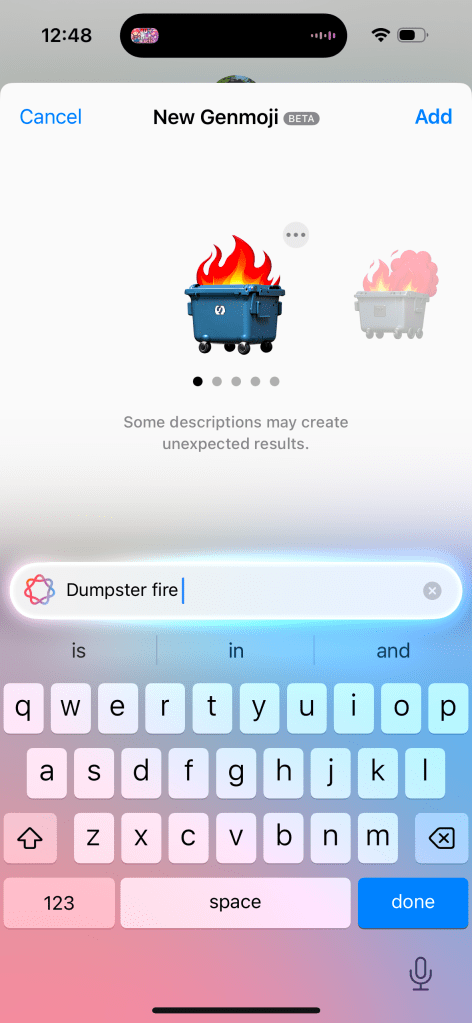
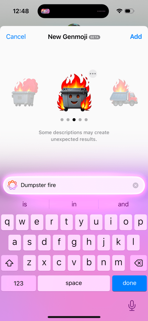
    The 12 sided die only generates a standard 6 sided die. Can of worms can get some decent results, but it requires a relatively extensive prompt. More extensive than is suggested by the ad or promotional material or even the size of the search box. You can get some decent results, like the one I generated for a dumpster fire (full disclosure, this has quickly become one of my favorite emojis to send) but some options have oddities- like adding a smiling face to the dumpster.

    The interface for Genmoji is functional and easier to find than the Writing Tools in my opinion. But I don’t think Apple has nailed this. You open your chat or text field and hit the Emoji button. Then you need to hit the button that has the Emoji face with a plus icon and the Apple Intelligence glow around it, and you can enter your prompt. This tiny button is next to a massive search bar to search for an already existing emoji.

    I’m not sure why the search bar and the Genmoji button are two different things. I feel like it’d be more intuitive to go search for an emoji and then if it finds a match, it’ll present that to you. But if it can’t find a match, then it’ll generate an emoji to use. Maybe this can be improved upon in iOS 19.

    The final thing to note about Genmoji is that it’s only on iOS and iPadOS. macOS is excluded at this time for some reason. It’s an odd omission considering all the previous Apple Intelligence features landed on all platforms at the same time. Not sure why this one didn’t. Also sending Genmoji via Messages to anything but another iMessage user is not a great experience. It’ll just send a large PNG picture to Android users and are entirely unavailable in other apps.

    Image Playground

    This is one of the most un-Apple like implementations of a feature I’ve ever used. And people beyond me have pointed this out. The icon does not convey it is the quality of an Apple created app. And when using the app, it doesn’t feel like a first party Apple app either. Some people on Reddit and Bluesky have even mistaken it as a scam app or one of those microtranscation filled kids games from the App Store.

    This app is interesting. When you go to generate an image it’ll ask you to enter a text prompt (just like Genmoji, though note, you can’t create Genmoji in Image Playground), select a person to use as a reference, and you can select some pre-curated options to customize your image further without needing to enter a specific prompt. These options range from things like”disco” or “winter” to costumes like “astronaut” and chef”, accessories like “sunglasses”, and places like “city” or stage”.

    Selecting just one option or a person or a single prompt will allow the model to begin generating your image. You can select an animation style (think Pixar) or an illustration style (think like a holiday card). To Apple’s credit, they do not allow you to generate a photorealistic image. So this really is more of an entertainment thing that is good for laughs more than anything.

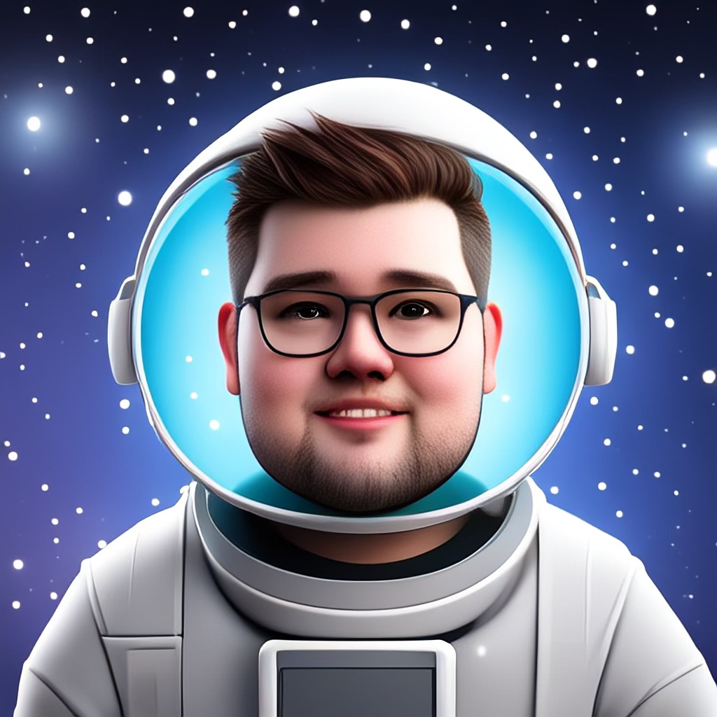
    The results aren’t great. I’ve included some examples above. The first one is using the disco, fireworks, starry night, and text prompt “add the text 2024”, and it looks alright. I generated this with the intent of using it for a year-in-review- kind of post. The second is based on a photo of myself and the “astronaut” and “starry night” prompts. It’s fine, but my hair is very, very wrong stylistically (this has been widely reported as an issue with Apple Intelligences model) and its on the outside of the same helmet. In addition, the skin around my neck is clearly visible and not covered by the space suit. The third is a couple text prompts describing a modern home with hardwood floors and at a glance it’s nice. But when you take a closer look you can see all kinds of errors with the legs on the table, the pillows on the couch, and the table on the left looks weird.

    The real takeaway from Image Playground is it has no useful purpose. What would you want to use this app for? I haven’t found a purpose and neither has anyone else online either.

    Image Wand

    This is basically an extension of Image Playground. The difference is instead of exclusively using text and suggested themes to generate an image, you can draw something in an app (like Notes) using Markup and then circle it to give Image Playground a head start on what you are looking for. You can then augment the sketch with text prompts, or if Apple Intelligence cannot determine what your drawing was, it may ask for more information about your sketch before generating more options.

    Putting aside the creative encroachment for a moment, I have two issues with this feature. The first is that I frequently need to give more than just my sketch to the model before it can start generating something. An elementary drawing of a house asks me to describe to what I’ve drawn. That’s pretty disappointing and not very productive.

    The second is that it just as often takes my sketch and goes a mile with it. My elementary house sketch that I really wanted to use Image Wand on to make look a little nicer, just generates an entire house design concept with the AI generated image oddities we’ve all seen before online or in the Photos Cleanup Tool. The result I get often bears little resemblance to what I started with. I often complain about Apple Intelligence not doing enough, but this is a case of it going too far without a way to reel it back in.

    ChatGPT Integration with Siri

    I don’t have much to say about this one since I have this turned off as I don’t want to share any information with Open AI and, as this post has probably indicated, I’m just not an AI fan in general. But the idea here is that if you engage with Siri in a way that Siri can’t respond to, that data will be sent to ChatGPT and that information will be supplied back to you via Siri. It’s a crutch to making Siri look more powerful than it actually is.

    While on this subject, Apple has been super disingenuous with the Siri improvements in iOS 18, their marketing of the iPhone 16, and Apple Intelligence. All the marketing advertise…

    1. The new Siri interface, which is worse than the orb
    2. New Siri functionality, which does not exist
    3. And uses the Siri + ChatGPT to make Siri look better than it actually is

    This is a trend that is very un-Apple like and I hope does not return with iOS 19 and the iPhone 17 lineup.

    Writing Tools Improvements

    While Writing Tools was first introduced with iOS 18.1, Apple has gone back and improved this set of tools a little bit. The missing ‘Describe Your Change’ feature, where you could describe a type of change to make to your text is now available. This can be achieved by using Apple Intelligence, however it can kick your request and the associated text to ChatGPT if the request you make is outside of Apple Intelligences capabilities. The benefit here is users can get a better result, or at least a result more in line with their expectations, but the downside is confusion to the user as to what Apple Intelligence really is. If Apple Intelligence is marketed as a rival and superior option to ChatGPT, Google Gemini, or Meta AI, but Apple Intelligence regularly kicks you out to use one of those options, then what’s the point of Apple Intelligence?

    I do want to note that at the time Writing Tools was introduced, I pointed out just how difficult it was to even find or use and this hasn’t changed substantially, but is a little bit better for people who use Pages. Pages now has a dedicated Writing Tools button in the toolbar- making it easier to access but not any easier to use. For example, if I describe a change but don’t like the result, it’s not easy to go back and change my prompt. One of the options for advanced proofreading I previously complained didn’t work in real time and it still does not. I’d love to know just how widely used these tools are because I’d be quite surprised if it is widespread.

    Visual Intelligence

    This is an interesting feature in that it is one of the few Apple Intelligence features exclusive to the iPhone 16 and iPhone 16 Pro. It’s not on iPhone 15 Pro. The way this is invoked is by click and holding the Camera Control button . I do not know why, but limiting this feature to just iPhones with Camera Control is kinda dumb.

    I also don’t think this feature is very impressive. After you open Visual Intelligence you are presented with an Apple Intelligence animation-ified Camera interface where you can click an ‘Ask’ or ‘Search’ button to ask ChatGPT about what you’ve taken a picture of or do a Google Image search for what you’ve taken a picture of. Neither of these, obviously, utilize Apple Intelligence. It’s the ChatGPT problem all over again from the Writing Tools.

    You can get information about things you’ve taken a picture (like what breed a dog is) but I don’t think this uses any new Apple Intelligence functionality, but rather piggybacks off the Visual Look Up feature Apple introduced to the Photos app in iOS 17. Visual Look Up works by scanning your photo and identifying what is in the photo and provides you Siri Knowledge and related web results on what has been identified.

    Apple Intelligence Mail Categories

    This is maybe the best use of Apple Intelligence so far. The Mail app has gained four inbox categories- Primary, Transactions, Updates, and Promotions. Then based upon the emails you receive, Apple Intelligence will automatically sort your mail into one of those four categories. The Priority category from iOS 18.1 remains as a sub-category within the Primary category. Visually this is really nice and can help to have those promotional messages that you don’t need to know about but don’t want to miss out on either in your mind without feeling like you need to take action on immediately.

    The bad news is twofold. First, Apple Intelligence doesn’t sort these messages by message content, it still bases its sorting on who the sender is. If I place an order from Dominos for a pizza, I’d expect the order confirmation with the delivery time to be shown in Primary as a priority message since it’s message contents have a time associated with it. But the promotional “get your free pizza” email, that I’d expect to another one of the categories like Promotions. At the same time, maybe Updates is more appropriate? It’s not a Transaction, but could lead to a transaction.

    It feels like Apple put themselves into a corner by pre-selecting these categories rather than having Apple Intelligence dynamically create categories based upon what is in your inbox. And basing the categorization by sender creates problems for different kinds of emails you can get from the same sender.

    The other problem is that this Mail app is exclusive to iOS. You can’t view your email with these categories on iPad or Mac. This is especially disappointing on Mac where most emails are created and viewed. And it’s just a baffling omission from iPad since iPadOS and iOS are virtually identical. Guess we’ll have to wait for another future software update.

    I will end on one last positive. While I have issues with the way Apple Intelligence sorts my mail, I do overall like the feature. But if you don’t, it is super easy to switch back to the traditional single-inbox experience. Just tap the More button in the upper corner and you can instantly switch between the two styles.

    Overall Thoughts-

    Based on my extended time with the first wave of Apple Intelligence features and the overall impressions of the second wave of features, there are a couple trends that are becoming very clear.

    First, the investment Apple has made into Apple Intelligence has seemingly not been worth it and I struggle to see how these image generative tools benefit users or help Apple build future products. Look at Image Playgrounds- an app that has no functional purpose to exist and is commonly mistaken as a scam app. Image Wand is a feature that is sure to met the ire of Apple’s creative customers. And if so many of the Apple Intelligence features have to be sent to ChatGPT, what is the benefit of Apple building their own AI models? Other companies have show that AI products like the Rabbit R1 and Humane AI Pin are just kinda pointless. So there’s nothing hardware or platform wise Apple can build with AI.

    Secondly, it is becoming clear that users do not understand what Apple Intelligence is or how it works. I saw a Reddit post a month or so ago of someone who “hacked” Apple Intelligence onto their iPhone 13 and demoed the new Siri animation and re-write features that used ChatGPT, not Apple Intelligence. What people thought they were getting with Apple Intelligence was a chatbot integrated into Siri and what we got was very much not that. Leaving users confused about what AI even does or is for. While Siri improvements are supposed to be coming next year, the damage has likely been done to Apple Intelligence’s reputation. And all the Siri improvements are dependent upon adoption of the App Intents API Apple has made available. Back in 2016 with iOS 10, Apple greatly expanded the uses of the Siri API so more developers could plug their apps into Siri. That never happened though and many of the features Apple showed at WWDC that year never shipped or have been discontinued.

    Third and finally, very few Apple Intelligence features are well implemented. This is incredibly concerning from a company like Apple who got to this point by shipping complete and polished experiences that are intuitive and easy to use. Nothing about any Apple Intelligence feature has been complete (as evidenced by its piecemeal rollout), polished (as evidenced by how often they have to rely on competitors AI models to do work for them), intuitive (as evidenced by how hard it is to find a lot of these features in the first place), or easy to use (since you have to already know how to prompt AI to get a certain result). Apple has been under fire for years with questions about their ability to deliver experiences like they did in the Steve Jobs era and I am more confident than ever that Apple has indeed lost their way and are just chasing trends.

  • Apple Intelligence Review (iOS 18.1)

    18.1- Text Based Tools

    It has been over a month since iOS 18 released to the public and since the iPhone 16 launched. iPhone 16 was billed as ‘the first devices built from the ground up with Apple Intelligence’ so this should make your device feel much more complete. At WWDC, Apple Intelligence was sold as ‘a service to help you get things done effortlessly’. And we now finally have it! Or at least, some of them. Apple is slowly rolling out Apple Intelligence in waves and this is just the first of several. This going to be a slow rollout. The vast majority of Apple Intelligence features first detailed at WWDC and at the iPhone 16 reveal won’t be available until next year. So iOS 18.1 primarily just brings what can be described as the text based tools to iPhone, iPad, and Mac. So let’s go through these first few features and discuss how helpful they are.

    Writing Tools-

    These are the main draw of this update. These tools are meant to help you proofread your text, rewrite the text, adjust the tone of your text, and help you summarize your text, everywhere you can input text in iOS, iPadOS, or macOS. It’s not limited to Apple apps.

    Writing Tools encourage you to summarize and re-write text that has already been written. Very little of the Writing Tools are actually generative like ChatGPT is. With a few exceptions, you cannot use Apple Intelligence to generate text. It will only re-write or summarize what has already been written.  

    If you want to make an email you wrote shorter or sound more friendly, you have to manually select ALL the text from the email you want Apple Intelligence to rewrite or proofread and select the Apple Intelligence icon and select what you want it to do. There is no generative or proactive way to do this so you can on-the-fly adjust your language or fix errors. So there’s no real time savings going on here.

    Selecting text can be awkward depending on what device you use. If you’re using a Mac, this is pretty easy. People have been selecting text on the Mac from many different apps for decades. But on a device like iPhone, this can be much more challenging. Getting the Apple Intelligence icon to even come up. Sometimes the Apple Intelligence icon will popup, but not always. Many Apple Intelligence tools are just hard to find — excluding the Notes app which has a dedicated button for some reason. Some other apps like Mail have one too, but again, it’s hidden behind an option and among many other icons. It doesn’t really stand out.

    Once you’ve done your action, it replaces the text you selected to re-write without a way to easily compare to the original and see what has changed or describe a change you want Apple Intelligence to make to refine the rewrite (despite promotional images showing this as an option).

    The Writing Tools options as shown in A17 Pro iPad mini marketing images in October 2024.

    You have to either keep the changes and re-select the text, click the ‘try again’ button, or undo the Apple Intelligence changes and make some text adjustments you want, then re-select the text and do the whole thing over again. It’s not very intuitive nor easy to use, and ends up being more of a time sink than just re-writing the text yourself. 

    Since the start of the 18.1 beta, I have had to go out of my way to try using these tools. My biggest problem is that none of these tools are proactively presented, nor are they very useful or helpful. For being the headlining feature of this update and the first of the Apple Intelligence suite of features, I think these are among the worst set of tools available.

    Summarize Notifications-

    This is probably my favorite feature from iOS 18.1. If you have 2 to 3 notifications from a single app, it’ll stack them together and summarize the contents of those notifications into a short summary. Tapping the notification stack expands out the full notification. If you have a notification that can contain a lot of text, like a Teams message, that message individually will be summarized. This is a really nice feature and I have enjoyed getting the main point of everything without needing to look at everything. This carries over to watchOS as well for notifications that originate from iOS and are mirrored to Watch. Native watchOS notifications won’t be summarized.

    The downside is if you get more than 3 notifications from the same app, Apple Intelligence will just give up and do what it’s done in iOS 17 and earlier and just display the top message and say ‘+3 more from Mail’. I don’t know why the limit is 3, but it seems to be for some reason. These summaries are usually pretty accurate, but not always. Overall, I like this feature a lot and find it to be the most useful and helpful of the suite.

    Email Summaries-

    Similar to Notification Summaries, these are alright too. Tap the summarize button in Mail and it’ll summarize the content of the email. This are usually fine, there are some issues with phrasing or conflicting information but you can usually get the idea. 

    Like Writing Tools though, the worst part is how hidden this feature is. You have to tap on an email, swipe down, tap the summarize button, wait 5 seconds, then get the summary displayed to you. It’s usually not faster than just reading or skimming the email yourself.

    Reduce Interruptions Focus-

    This feature works in 2 ways. There’s a dedicated Focus mode and a Reduce Notifications option that can be turned on for other Focus modes. The goal being that it uses Apple Intelligence to help determine if a notification is truly important or not.

    The Focus Mode itself works in that it certainly does reduces the number of notifications I get; it is nice to switch on an hour or so before I go to bed and it works well to help me wind down and distance myself from my phone. As an option for other Focus modes, it kinda sucks. I’m not totally sure it works to be honest. In my Personal focus, I don’t allow messages from certain work contacts, but it also silences all my other contacts that come through normally and I would want normally. So I end up missing messages from my mom or sister for example and that can be really annoying. 

    New Siri UI-

    This is a weird one. Siri is mostly unchanged from before, but with a screen wrap animation.

    This new Siri animation is fine. I find it to be slower and less responsive than the orb, but it kinda looks nice? I don’t know, it’s fine. No strong feelings. I do have strong feelings on this for CarPlay though. When using Siri with CarPlay, I do actually think it’s a downgrade. It’s a lot harder to tell without looking at the screen if Siri is listening to you or not. On Mac, there is no screen animation that plays, it just displays a text box for you to type to Siri directly and the bar glows. The ability to ask multiple questions back to back and Siri remaining aware of the context is nice and better than previous versions. 

    Type to Siri-

    This is nice. It’s always been an accessibility option, but having it built into the OS as a default is great. Double tapping the home bar can be a little awkward, but the initial glow animation after tapping once is great to show that you can interact with it in a new way to invoke something related to Siri and Apple Intelligence. It oddly doesn’t share the same Siri screen wrap animation, instead it shrinks the app you’re using and puts a glow animation over the keyboard and Siri text box.

    Unfortunately, some of the auto correct suggestions are just dumb. I typed “Set a time” and Siri responded (via text) “For how long?” I began to type “15” and one of the suggestions was ounces. If I just had Siri set a time and it just asked for how long, why would it suggest anything other than measures of time? For a feature that is billed as “helping you get things done effortlessly” and “drawing on context” and “a new era for Siri” we sure aren’t off to a great start. 

    Cleanup Tool-

    This works as long as your edits are small and in the background. The bigger the thing you want to remove and the closer to the subject it is, the worse it will do. It’s not hard to get a really bad result. I got more bad results than good ones. And the good results aren’t “amazing”. Below I’ve attached some pictures from my library using the cleanup tool to remove some elements I think people would commonly want to remove from photos. Originals are on the left, cleaned up are on the right.

    Photo Memories-

    This one is actually pretty good too. You can describe the type of memory you want to create and Photos will pull photos and videos from your library that meet that criteria and assemble a short video for you. The animation is top notch and it usually puts together a pretty decent result. No major complaints here. While it is nice, I don’t think it’s significantly better than the ones iOS automatically puts together for me and that don’t require Apple Intelligence to create.

    Phone Call Recording & Transcription-

    This may or may not be an Apple Intelligence feature, but it was advertised as one at one point, so let’s call it an Apple Intelligence feature for the sake of argument. It’s bad. Like, REALLY bad. I am fundamentally opposed to Apple even allowing phone call recording for all the privacy and legal concerns it presents. Apple has tried to address this – Siri will announce after you start the call that the phone call is being recorded, and that plays for all parties on the call- but there’s no way to opt out beyond hanging up. And if you get transferred from one party to another, I don’t know if the announcement plays again. So you could be in a situation where someone doesn’t know they are being recorded.

    Secondly, in the testing I did the transcript was fine, but it often didn’t break it up by who was speaking. So discerning who said what was hard to do. Some whole sentences are missing. But the summary is awful. The conversation I had was about phone call recording being creepy and ending work for the day. The summary generated was… “Requests a bump on a log to collapse”. Um…

    Hide Distracting Elements-

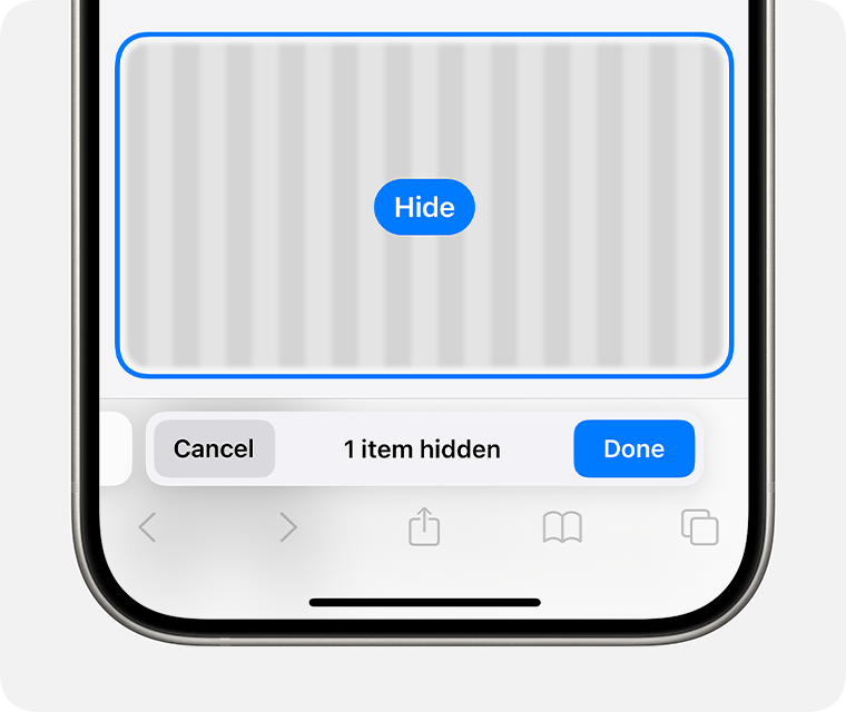
    This isn’t really an Apple Intelligence feature, but where else am I going to talk about it? The animation is cool and it does work. I can hide all those annoying popup ads that prevent me from getting at the content on a website. You may be wondering why not just use reader mode? Reader mode isn’t supported on all website and sometimes destroys context around something that was written. So this feature has merit. But again, iOS isn’t doing this automatically for you. You have to hit the buttons and select the option and manually choose what to remove.

    So you end up reading the whole page anyway while you decide what to remove, and by this point, what was the point? I’ve hidden all the popups for what? It doesn’t save this for if you reload the page or come back to it later. You have to go through the whole process again. It’s a waste of time. 

    Overall Thoughts-

    I’m not impressed. All of these features do “work”. It’s not like anything is blatantly broken- with the exception of the Cleanup Tool maybe. But things certainly don’t feel finished, or tested, or well implemented. Apple isn’t doing anything new here and they aren’t doing it in a new or different way. It does all run on-device as far as I can tell, but there’s no indication when something is happening on-device or in private cloud compute (PCC). Many of these features are, in my opinion, hidden, a gimmick, and/or take more time to setup and use than just not using them at all. Maybe I’m just an old dinosaur at the crisp age of 25, but I really don’t understand a lot of these features. I don’t understand how they’re going to help people or how they provide a foundation for future Apple devices and services. I hope the next round of Apple Intelligence features are better, but I’m not optimistic.

  • Apple Watch Series 10 Impressions

    Hey. It’s been a while. I’m happy to be back to share my initial impressions of this years new Apple Watch- Apple Watch Series 10.

    Let’s start by going over the thing Apple wants people to talk about, the bigger display sizes. If you remember, 10 years ago to the day, Apple announced the first generation Apple Watch with its 38mm and 42mm case sizes. Now Series 10 features massive 42mm and 46mm sizes with displays that absolutely dwarf the Series 3 and earlier models.

    Bigger displays are always great to have and on a device as small as Apple Watch, every pixel counts. But this a trick Apple has pulled before and with only moderate success. The bigger displays of Series 4 worked to drive upgrades, but we had a culmination of other features too. Like the ECG app, the powerful S4 SiP, the Taptic Crown, and the bigger screen. Apple last increased the screen size with the Series 7, but this model fails to drive upgrades as it was really just that- bigger screens. Some people (like myself) were interested in bigger screens and upgraded for that, but most didn’t. I think this is where the next part of Apple’s marketing comes into play…

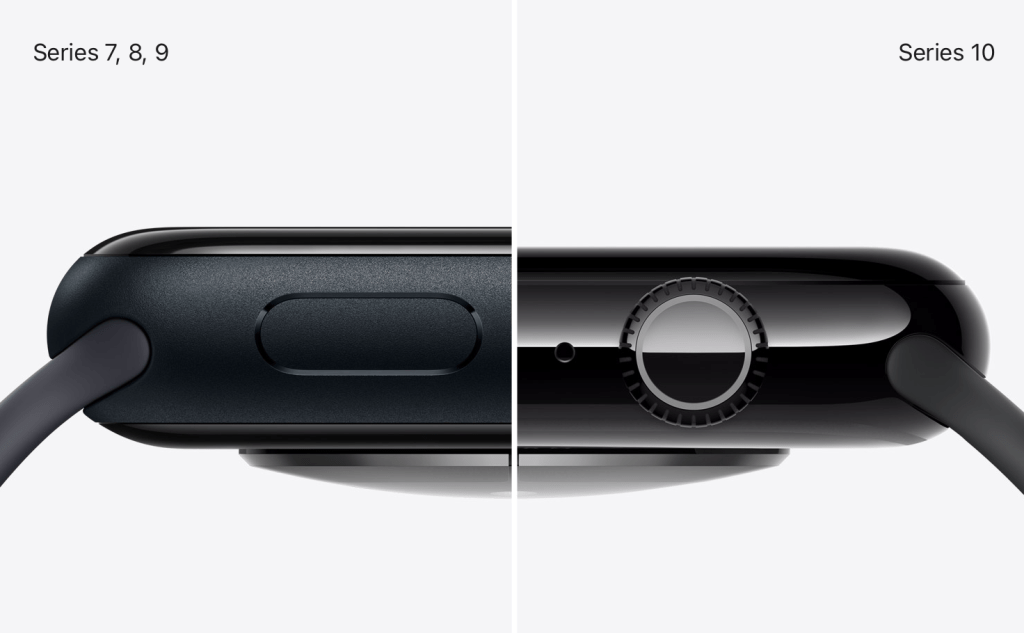
    Apple Watch Series 10 is advertised as being 10% thinner than previous models. This should make the Series 10 more comfortable to wear and less obtrusive on your wrist.

    In this side-by-side, it certainly is thinner, but I don’t know if it’s substantial enough to be noticeable. At the scale of Apple Watch, 10% is 10% and I’ll take it, but I’m not sure it’s going to be obvious. Much like how the M4 iPad Pro is “the thinnest product has made” and that seems to not be driving sales of those devices. But the last time Apple made the Watch thinner was with Series 4. So if Apple is aiming to drive upgrades of Apple Watch, they seem to be emulating the strategy of the Series 4 by creating a new Apple Watch that is both bigger and thinner than before. We’ll have to see if this shakes out for Apple.

    As for me, I am happy to see Apple Watch become thinner and larger, but I feel like we’re hitting the maximum for how big of a device Watch can become. I have a pretty large wrist and wear a 45mm Series 9 currently and I’m hesitant to go much bigger. And extra 2mm might be all I can tolerate on my wrist before having to size down or stop upgrading entirely. I am excited to see Apple returning to a focus on product thinness though, this is a welcome return of the Ive philosophy of design.

    Next, let’s discuss the other hardware improvements. We have a redesigned speaker that is 30% smaller but supposedly retains the same acoustic performance of previous models and is now able to play any audio directly from the Watch- not just phone calls. Yes, my lifelong dream of playing music from my Watch without the need for AirPods is finally coming true! Not sure why this limited to Series 10, but I’m happy this functionality is available nonetheless.

    We also have out first instance of an Apple Watch Ultra feature migrating down the product lineup- the depth and water temperature sensors. This is not the first Apple Watch Ultra feature I expected to make its way into a lower end model, but I guess I’ll take it. Just like with Apple Watch Ultra, when doing a water workout, you can check your Apple Watch to see the water temperature and how deep you are. Keep in mind however, Apple Watch Series 10 does not have improved water resistance, so you can’d go diving with it like you can Ultra.

    Of all the features from the Ultra that could’ve migrated down, this wasn’t near the top of my list, but does suggest Apple is open to brining more features to the base model. Hopefully in the next year or two we can get a bigger battery, or dual frequency GPS, or maybe someday Apple’s growing suite of satellite connectivity features will appear in Watch.

    There is also a new focus on case finishes and materials that Apple hasn’t paid attention to since the Series 5. Aluminum comes in three colors. The classic and neutral silver color that Apple Watch users have come to love. A new rose gold color that hasn’t been seen since the Series 4 and looks quite nice, even if there is no color matched iPhone to pair it with. And, what I expect to be by far the most popular color, a polished and anodized jet black color that looks like it would pair perfectly with the jet black iPhone 7. It looks stunning in Apple’s marketing and if I pick up a Series 10, it’ll be this model.

    Stainless steel is out this year and in is titanium. Very exciting since this also hasn’t been used since the Series 5. The natural titanium looks nice, it will certainly pair well the natural titanium iPhone 15 and 16 Pro. There is a slate option as well which is deftly the darkest option here but doesn’t look black. It almost looks like a graphite color. And gold returns as well, and it looks very nice. Defiantly a gold that would look much more in place with the iPhone XS than our current iPhone colors, but gold is gold, some people love the color. I’d be much more upbeat with the titanium options if they were not polished (they almost look like stainless steel) and if the accompanying bands were also made of titanium and not stainless steel. It contributes to feel of Apple Watch as one product that is designed by one group of people and Apple Watch bands as another set of products designed by another group of people without the two ever communicating. I hope next year Apple develops the Apple Watch Series 11 as a complete package- one where the materials and design and colors all match and compliment each other by default.

    The only other hardware thing to note is that while we have the S10 SiP in this years Apple Watch, I don’t see anything to indicate that it is actually different than the S9 from last year. I expect that the differences are really limited to supporting the water depth/temperature sensors and the new display with no performance improvements to speak of. Disappointing, but unfortunately not unexpected.

    Finally, we actually have a new health feature this year! And one that is going to be more impactful than the temperature sensors. Using the improved accelerometer from both the S9 and S10, combined with the data Apple Watch tracks while you sleep, Apple claims they can detect sleep apnea. This could be pretty big if it works. It is interesting that Apple is using sleep tracking and accelerometer data to do this rather than the SPo2 sensor from the Series 6 onward, but considering it’s patent dispute with Masimo, it’s maybe not too surprising. Once that dispute is resolved, maybe sleep apnea detection will improve.

    This feature combined with the introduction of the Vitals app and Training Load in watchOS 11 (and combined with the other health related features Apple touted in the event itself) makes me think Apple is back to having some comprehensive health plan for the Apple Watch.

    So overall, that is Apple Watch Series 10. I’m overall pretty happy with what we have here. Bigger and thinner, a focus on the Watch fundamentals like design and materials is a welcome return to form. The features are light, but bigger than what we get most years. And the prices remain unchanged which I find to be very positive. I’m hoping I can get some hands on time with Series 10 later this month, and stay tuned for my watchOS 11 review.

  • I Tried Apple Vision Pro. Here’s What I Think.

    If you’re a nerd like me, you’ve been tracking all the Apple Vision Pro reviews as they’ve been becoming available over the past week or so. When I headed down to Iowa’s only Apple Store on February 3rd, I had a good idea of what to expect from my time with Apple Vision Pro. But when I tried it myself, I was pretty torn. The technology and design was incredible and felt like something a lot of people will have in a couple of years. But as for me, I had issues with my prescription and sight and that means that until there are hardware changes to either the Vision Pro or the ZEISS lenses, I can’t really use Apple Vision Pro. And that left me pretty disappointed.

    Two Apple Vision Pro headsets on display in an Apple Store.
    Apple Vision Pro on display in the Apple Store

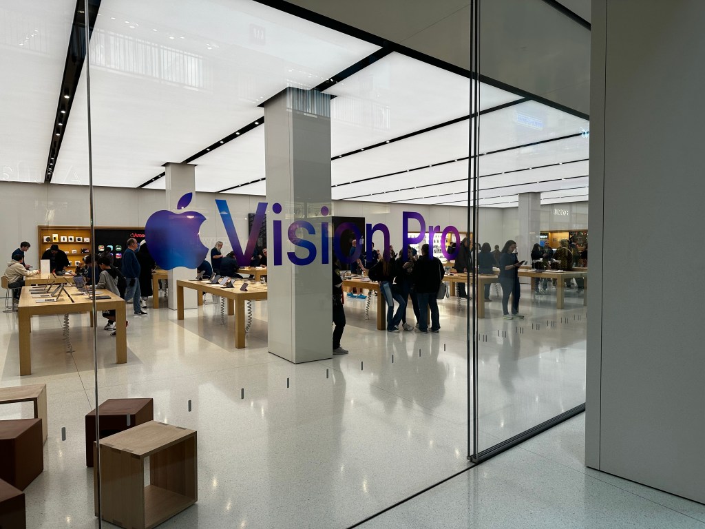
    I arrived with my partner to the Apple Store about 5 minutes before it opened. Inside I could see Apple employees handled in the back of store between the forum and the table where they would soon be giving demos of Apple Vision Pro to visitors. There were just a handful of us outside the store, most of us wanting to demo the new product, of course.

    The new Apple Vision Pro tables inside the Apple Store.

    Inside the store I could see a new table had appeared since I last visited that had 4 Apple Vision Pro headsets set on top of it. 2 headsets per white tray showing the Vision Pro from different sides with the power cable gently draping down to the large silver battery laying on the table next to it. In just a few moments, I was going to be putting one on and seeing if this product was all it was hyped up to be.

    Once the store opened, we were greeted by an employee who took some information from us and had us wait by the Vision Pro product table until they were set for us.

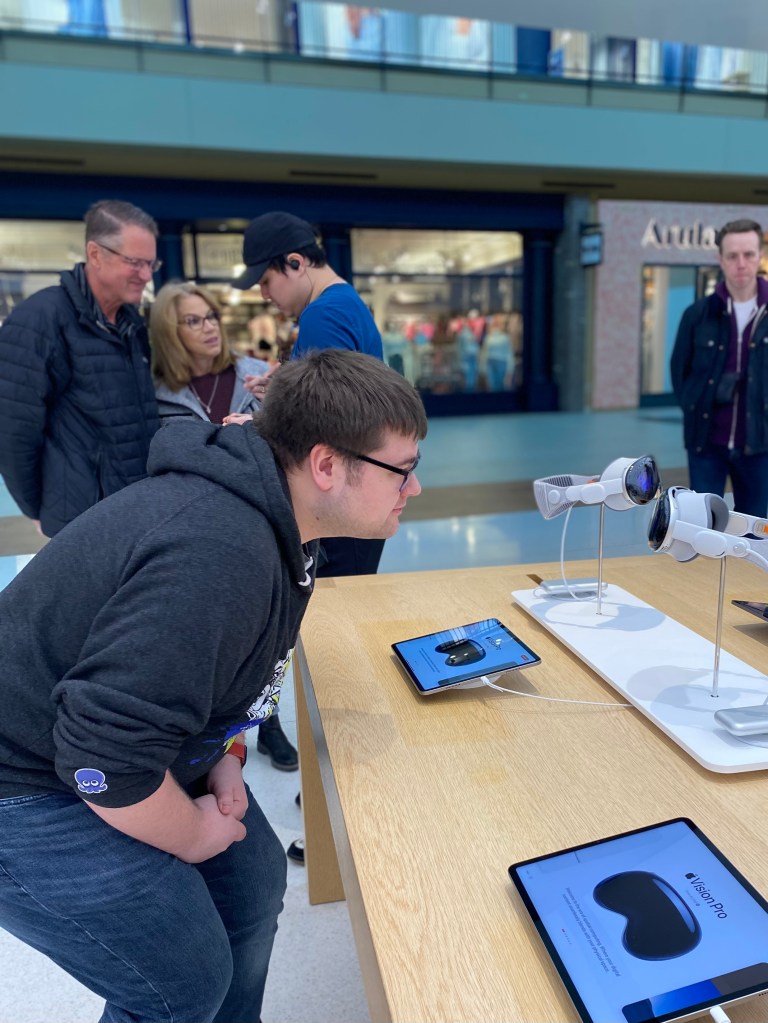
    I closely inspect the Apple Vision Pros design for the first time.

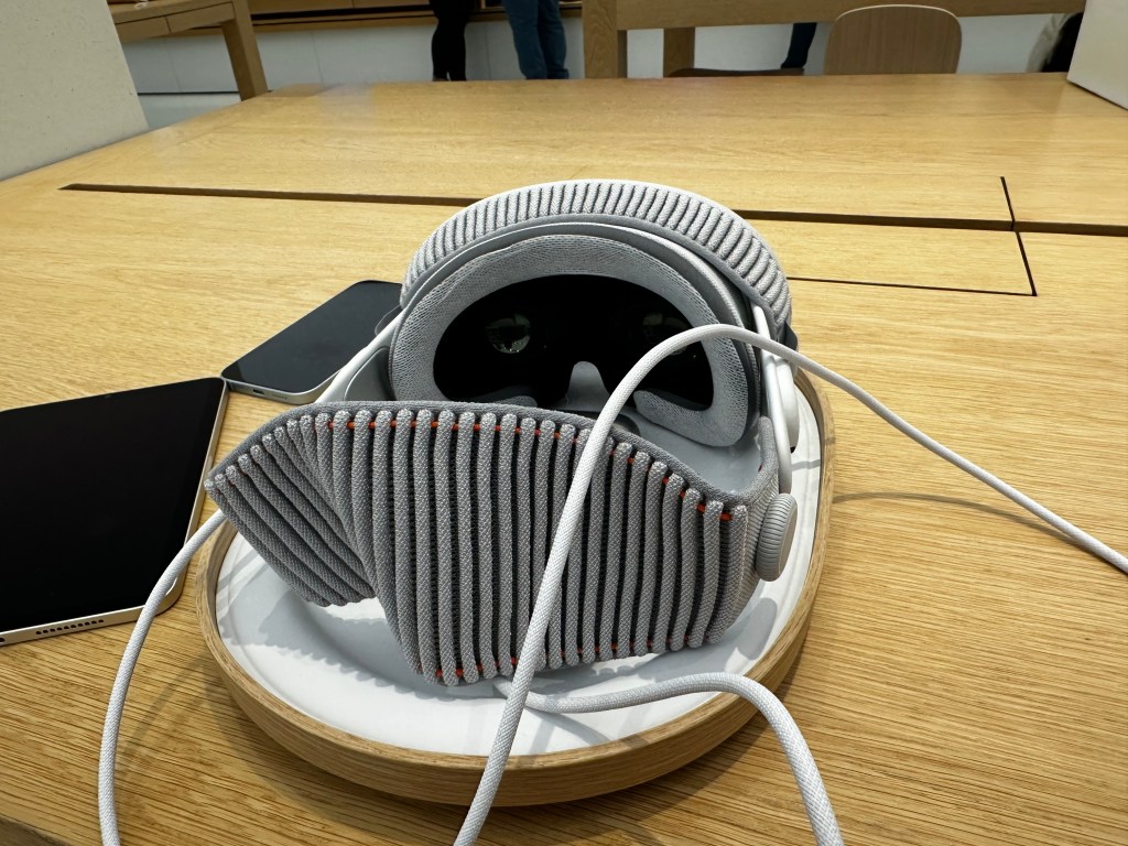
    After a quick survey on my phone, I began to closely inspect the Apple Vision Pro in front of me. I don’t know if I can say it’s a beautiful device, but it is pleasant to look at. You can really see the amalgamation of different Apple products from the past decade in this devices design. The frame of Apple Vision Pro is relatively thin and unapologetically looks like the silver aluminum iPhone of the 6 and 6s era. The Audio Straps are pure white like AirPods. The power cable that connects the device and its battery is braided akin to the current generation MagSafe charges Apple uses for the MacBook Pro. The fabric of the Light Seal and Solo Strap around the back looks like it came off either a next generation AirPods Pro Max canopy or Apple Watch band. And speaking of the Apple Watch, the only two ways to physically interact with the device are by the Digital Crown and Top Button (which looks identical to the Watches Side Button). I did notice a few odd inconsistencies in the stitching of the Light Seal, but I’m not sure if this was intentional and it just looked off to me, or if the stitching is more even on production units than the demo units on display.

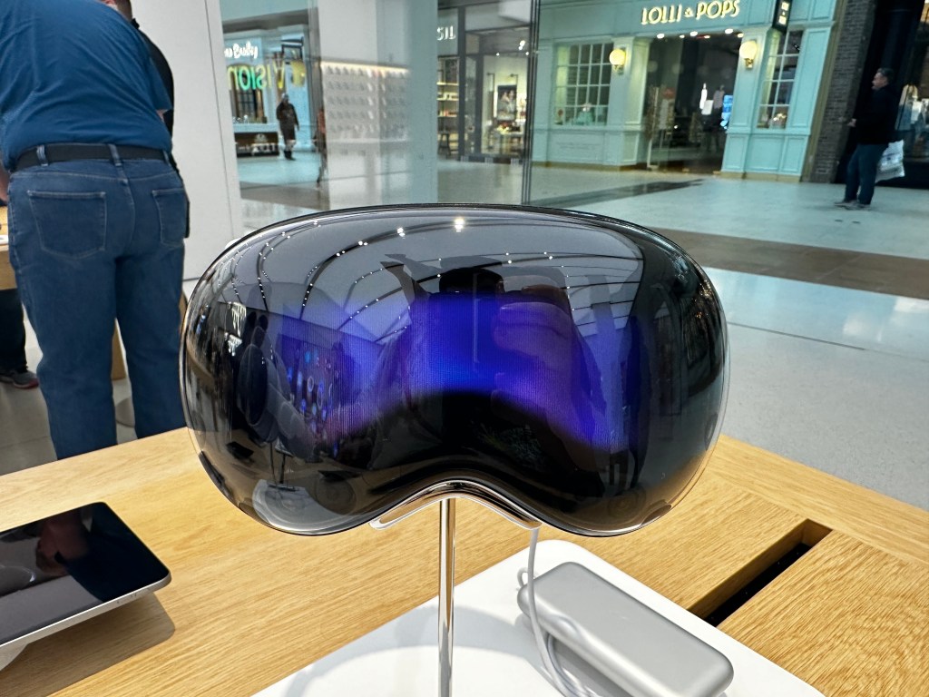
    The outward facing EyeSight display on Apple Vision Pro.

    By far the part of the design that stood out the most to me was the outward facing EyeSight display. When revealed at WWDC last year, Apple said that it was “foundational” to Apple Vision Pro to make the device not feel isolating. Based on reviews from the past week, I’m not totally sure it succeeds at that goal. But the EyeSight display does do a few other things which I certainly find interesting, if not compelling. For example, when setting up a Persona, large colorized arrows direct you to turn your head to the left, right, up, and down. And when installing a visionOS update, you can see a progress bar and an Apple logo when it begins to reboot.

    My main concern when inspecting it in person is that the display is just bad. There’s no other way to say it. It’s bad. It’s very small, deeply recessed into the headset (or at least far behind the cover glass), and it’s horribly pixelated. I think I could count the individual pixels on the EyeSight display if I had enough time to do so.

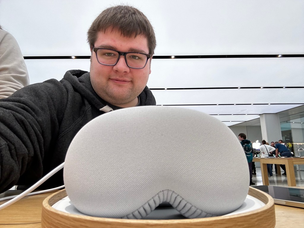
    Apple Vision Pro devices to be used for demos come on these nice little wooden trays with a white liner that conform the corner radii of the device itself.

    After a few moments of waiting, I was brought over to a table toward the back corner of the Apple Store where I took a seat in these new wooden office chairs that allow you gently lean back and easily turn in place. The Apple Store employee who was to guide me though the Apple Vision Pro demo took a seat on a typical stool next to me. He handed me an iPhone 15 to quickly do a scan of my head to find the right size of headband for me. If you’ve done the checkout process in the Apple Store app on your own iPhone, it’s the same one. It is simple, but I did have trouble getting the phone to recognize it when I turned my head toward the right. The same thing happened on my own iPhone a few days previously.

    Once my size was confirmed, I was taken over to the infamous Apple Vision Pro cabinet which, I suspect, holds dozens upon dozens of ZEISS Optical Lenses for demo use with Apple Vision Pro. I wear prescription glasses, and because of this they needed to use what I think is a lensometer to quickly measure my prescription and match it to the closest corresponding left and right ZEISS lens.

    The infamous Apple Vision Pro demo cabinet in all its mismatched glory. Photo credit Mark Gruman.

    This is where my demo went a little bit of the rails.

    After putting my glasses onto the lensometer, and it taking just a minuet to scan each lens, it returned a result that my prescription was not available for demo and to proceed with the demo sans optical inserts. Or at least, that’s what the employee said. I wasn’t wearing my glasses. I couldn’t read the message on the machine. So we sat back down at the table and we went ahead with the demo.

    A few moments later, another employee wearing gloves came out of the back, holding my demo unit on this snazzy wooden tray and gently set it down on the table in front of me. It almost felt like I was being served a meal in the Apple Store! After a few quick instructions, the employee guiding me though the process had me pick up Apple Vision Pro by the aluminum frame and put it on. It was a little difficult as the frame is somewhat narrow and the rest of the components that I naturally wanted to grab ahold of I knew were magnetically attached to the device. So if I grabbed them, they’d come right off. But after a moment, I got it and put it on my head.

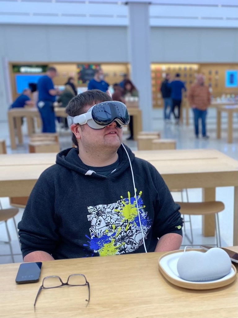
    Me wearing Apple Vision Pro for the first time.

    Right away I noticed the newfound weight on my face. In half an hour, it was hard to gauge how much of a problem this would be long term. After a few hours, after a few weeks, it could be totally fine. I have no way of knowing. The other thing I noticed was that the Light Seal wasn’t blocking all of the light around me. If I looked down, I could see a thin bit of light leakage from the store around me. It wasn’t bad and didn’t bother me, so I went with it. I tried to adjusted the Fit Dial on the side on the headset to make it a little tighter, to more snuggly fit my face, but the dial was maxed out. I probably could have asked for a smaller size, but I did want to keep the demo going and not be super demanding. I wasn’t intending to purchase one after the demo after all.

    Right after that, the second thing I noticed was that I was in the Apple Store. I could see my partner at the other table across from me, the employee next to me was right where I left him prior to putting Vision Pro on, and I saw the screens flickering around the Apple Store. It was kinda immersion breaking to be honest. But I also noticed that everything around me was a bit blurry. Just like it would be if I woke up and walked to the bathroom without having put on my glasses. This was a frequent occurrence throughout my demo and just had to live with it. I was able to get the idea of what I was looking at; I’m not TOTALLY blind without my glasses after all. (Just very close)

    The third thing that happened was I was prompted by Vision Pro to calibrate eye tracking. I used my eyes to look at a series of dots that appeared around me and would tap my fingers together when they were hilighted to select them. The eye tracking was very good throughout the whole demo. There were a few instances where I was looking at something, like the corner of a window, and the resize option didn’t appear and I was a little confused on how to make it appear. When something like that occurred, I was never certain what to do. I usually looked somewhere else and then redirected my eyes toward what I wanted to do originally. Sometimes I would try just randomly taping my fingers together to see if visionOS could guess at what I was trying to do. This only happened twice, but did leave me slightly frustrated in those moments.

    The next thing it had me do was setup my hands for hand tracking. I put my hands in front of me and after a few seconds it said they were ‘connected’. I was able to tap my fingers together to select things I was looking at with my eyes, I could tap and move my hands outward and inward to move windows and resize them. It was very, very cool and surprisingly natural.

    In same way the design of Apple Vision Pro felt like an amalgamation of previous Apple devices from the past decade, the UI of visionOS feels much the same. When looking at an app icon, it slightly expands and displays the app name like on tvOS. The UI of resizing windows is lifted almost directly from Stage Manager on iPadOS. iPadOS apps themselves can be run natively on visionOS. App icons themselves are circular similar to watchOS. The window bar that appears under all windows looks like it was pulled right out of iOS.

    Once I found my footing in visionOS I was directed to the Photos app to view some photos. I was directed toward an album that had the sample photos to look at. The first was a pretty standard photo that was taken on an iPhone. Once it was selected, the room around me dimmed to emphasize the content. It was a very cool effect and one that I found enjoyable. The next was a Panorama photo that had been taken on an iPhone as well and when expanded it surrounded my space. It was also very, very cool. I actually quite liked this feature as I almost felt teleported to the lake where it had been taken.

    Spacial Video in Apple Vision Pro. Photo credit Apple.

    Trying to minimize the Panorama and view the next photo in the album proved to be a little tricky. I couldn’t locate a minimize button and swiping with my hand to the next photo caused some kind of error to occur where there was no photo in my space for a second and then the Spacial Photo loaded. The Spacial Photo itself was cool. It almost felt like viewing a memory from one of the memory orbs in Pixar’s ‘Inside Out’. The Spacial Video I saw next was similarly cool, but I don’t know if I’d want o take one. TO take one, I’d have to either hold an iPhone 15 Pro up close to a subject and turn on the specific mode, or get up close to a subject while wearing Vision Pro. It’d be a very… strange… scene to others in the room.

    I got a quick tutorial on how to use the Environments feature with the Digital Crown. Turning the Digital Crown allows you to dial in a 3D background that essentially replaces the space around you. So with a quick twist of the Digital Crown, I was once again teleported from the Apple Store to what I believe was Mt. Hood. It was very cool to be able to finely dial in and out my level of immersion. I could definitely see situations in which I’d use Environments, but I generally found myself preferring to stay in my actual space, in the Apple Store.

    A quick press of the Digital Crown brought up the Home Screen and allowed me to open the TV app. I selected an option on the sidebar and it brought up a selection of 3D video content. By far my favorite part was getting to watch a clip of the Super Mario Bros. Movie in 3D. In some cosmic way, I like to think that this validates Nintendos experiments with 3D on the 3DS. I also felt like I was playing Super Mario 3D Land all over again. It was so cool I had to watch the clip twice. Once in the normal window size and once again in a massive window I put slightly above me to feel like I was in a theater. It was kinda incredible.

    Also in the TV app was a quick video that showcased the ‘Apple Immersive Video’ format. The format is shot with a special camera that shoots video in 180 degree views. This was easily, by far, my favorite part of the demo. The video was so incredibly detailed. And the depth it captured was incredible. Everywhere I looked I saw some new detail in the video. The standout moment was when a baseball and soccer game came on. It felt like I was standing right there on the sideline of the game watching in person. I hate sports, but I’d watch sports on Apple Vision Pro.

    The standout moment was when a baseball and soccer game came on. It felt like I was standing right there on the sideline of the game watching in person. I hate sports, but I’d watch sports on Apple Vision Pro.

    Connor Duffus

    Once I saw the video, my demo began to wrap up. I was instructed to open the Compatible Apps folder on the Vision Pro Home Screen and open an iPad app. And I got to experience having 3 different windows from three different apps be all around me. And a mix of those apps were visionOS and iPadOS apps. I didn’t get to interact with the iPad app, but I’m also not certain how I would have. I tried to look at the app and control it that way but none of the visionOS UI elements got overlaid or seemed to react. So I am a bit worried how good (or bad) iPad apps will be on Vision Pro.

    Apple Vision Pro in its protective cover on the demonstrative wooden tray.

    And that was where my demo ended! It was a really cool experience overall. I think Apple Vision Pro is a great product and one that in a couple of years most will be using. The biggest holdup right now is price. It’s $3500. The ZEISS Optical Inserts will add between $100-$150 to that. The Travel Case will add another $200. Not to mention that entertainment is the biggest draw and best experience you can have on Vision Pro and that content will cost money. Apple TV+ is $7/month. Disney+ is now I think $10/month. While movies purchased directly via the TV app don’t cost extra right now, I could see that being a thing companies charge extra for in the future.

    The second holdup is comfort. By the end of the 30 minuet demo, I could definitely tell I was wearing a heavy device on my face. My partner mentioned she had felt some uncomfortable pressure build up under her eyes where Vision Pro was resting. Making Vision Pro out of lighter material, like plastic or maybe titanium would yield a better result.

    The final holdup, and the one that made me not go back to the store and buy Vision Pro right then and there, was my prescription.

    My vision prescription as it appears in Apple Health.

    I have a very strong astigmatism which greatly impacts my vision and requires a pretty strong prescription to correct. When entering this prescription into Apple Health, it thought my right cylinder was an error. Let that sink in. I already knew from the demo they didn’t have my prescription in store, but I checked on ZEISS’s website and they confirmed that they cannot produce optical inserts for my prescription for use with Apple Vision Pro. And since you need a valid prescription to get ANY inserts, I am SOL. Apple also doesn’t currently allow for any third party inserts either, so that isn’t an option.

    My astigmatism is also so severe that soft contacts are not available. I’d have to wear hard lenses and Apple Vision Pro doesn’t support hard contact lenses. It dosen’t really matter how you slice it- if I were to get Apple Vision Pro, I could use it, but I would not be able to see anything. It’d be worse than using any other Apple device I own.

    So I do hope that Apple and ZEISS are working to support a greater range of prescription lenses and/or making adjustments to future versions of Apple Vision to allow for people with such sever vision issues to more effectively use the device in the future.

  • Apple In 2023

    I’ve been looking at all the products and announcements Apple has made in 2023 and have been thinking for a while about what the overall trend was. What did Apple focus on? What did they not focus on? What is the direction Apple is being steered in? After sitting with these questions, I think I found an answer.

    2023 was bookended with announcements to the Mac product line. January brought us the M2 Pro and M2 Max chips. These chips powered new MacBook Pros and a new Mac mini. Oddly enough the year ended with M3, M3 Pro, and M3 Max in the same MacBook Pros. Even in the middle year we got an updated Mac Studio and Mac Pro with M2 Ultra chip. macOS Sonoma is one of the nicest upgrades the Mac has gotten in a while too. Don’t get me wrong, it’s not revolutionary, but the features and improvements it does bring are very nice and utilize the neural engine inside Apples custom silicon well. The state of the Mac product line overall is very, very good. There’s one or two products or product configurations that I raise an eyebrow at, but nothing stands out as outright bad in the current lineup. I’d entertain the argument that 2023 was the biggest year for the Mac since 2020.

    On the other end of the spectrum, the iPad got absolutely nothing in 2023. This is the first year in a very long time (maybe ever) that no new iPad was released. In fairness, the iPad did get a few bones thrown at it. The most noteworthy iPad news from 2023 is that Logic Pro and Final Cut Pro came to iPad (which Final Cut users did not particularly enjoy), and Apple created a new Apple Pencil that supports USB-C to replace neither of the previous Apple Pencil models and rather sit alongside them. So in an already convoluted iPad hardware lineup and a convoluted accessory lineup, Apple just further fuels the fire with this new product. The only way this new Apple Pencil would make sense is if Apple cleaned up the iPad lineup. But they didn’t. And don’t get me started on the state of iPadOS. We are 4 years removed from Apple giving the iPad it’s own dedicated OS that is supposed to combine the best of iOS and macOS and it continues to feel like a grab bag of iOS features from the previous year. iPad sales continue to drop as well due to the high prices of most iPad models, the lack of compelling software, and expensive accessories. By far, this was the worst year ever for iPad.

    I’d say the iPhone had a good year overall. Much, much better than last year. iPhone 15 and 15 Plus feel like much more complete products than the iPhone 14 and 14 Plus last year did. And the same goes for the iPhone 15 Pro and 15 Pro Max as well. The new titanium frame makes these devices much lighter and addresses the fingerprinting complaint people have had for years on the stainless steel models. The A17 Pro chip is also a big improvement over last years A16 chip, especially in the graphics department. Indeed, it feels like Apple is both starting to find a stride with their chip design and a wall with what TSMC is able to manufacture for them. The A17 Pro (and M3 as it uses the same IP) are built on a 3nm design that has yet to be refined. There were multiple complaints at launch of iPhone 15 Pros overheating and there has been some growing concern over what the M3 could mean when it inevitably hits products without a fan like iPad Pro and the MacBook Air.

    Apple Watch had a modest year. The Series 9 came out with some nice, if immature, improvements. These all migrated over to the Ultra 2 as well. No changes to the SE this year, but I’m sure we’ll see a new SE in 2024. Despite the modest year in terms of hardware, software was a totally different story. watchOS 10 brought a complete overhaul to the Apple Watches software and it truly does feel new and exciting.

    Apples services had a somewhat quite year as well. Apple TV+ continues to grow in popularity despite launching less content in 2023 than 2022. Apple added new storage tiers to iCloud+ as well for the first time in a long while. Apple Fitness+ also got new features like being able to set a workout routine. Apple Podcasts can now let you access third party subscription content by linking it to those apps. Perhaps biggest of all was the launch of Apple Pay Later (Apples take on BNPL) and Apple Card Savings Accounts (a HYSA for Apple Card holders). It wasn’t all good new though. Virtually all of Apples services got some kind of price hike and we did bid farewell to one; the Apple Music Voice Plan.

    But by far the biggest announcement of 2023 was Apple Vision Pro. Apples next big product since Apple Watch. And the first since the iPad to not be an iPhone accessory. I did a full breakdown of the announcement here if you want to check it out. While the product won’t launch until 2024, it does to me signal a recommitment to wearable technology. Apple has some of the best wearable technology in the world like Watch and AirPods, and Vision Pro looks to be an ambitious addition to that category.

    Overall, when I look at 2023 and consider what direction Apple is going in, I think there are two trends. The first is that Apple isn’t just a technology company, they are a processor company. This isn’t new, Apple has been pushing the limitations of the ARM instruction set and their own custom chip designs for years, but 2023 feels like the year where they are advancing as fast if not faster than foundries can keep up. The second is that Apple is rapidly moving us toward the post-PC era. An era of computing that is defined by powerful processors that are both mobile and isn’t limited by a screen. One that is wearable and yet still personal. Devices like Apple Watch and Apple Vision Pro are likely to play a big role in this next era. Apples investments in Vision Pro now and over the past decade with Watch give them a leg up over the competition.

    2023 was overall a great year for Apple and I can’t wait to see what 2024 brings!

  • Apple Watch Series 9 Review: 3 Months Later

    So I’ve been wearing my Series 9 for a little over 3 months now and many of my thoughts on the Watch have changed from initial review in September. At the time, I titled my review as “Coming Later This Year”, due to so many flagship features of the Series 9 not being available at launch. Since then, Apple has made good on those promised software updates and the Series 9 is now doing everything it was advertised as being able to do in September. 

    So let’s start with the big one; Double Tap. This came in October with watchOS 10.1. Apple advertises this as a “magical way to interact with Apple Watch” and I think that oversells the feature a bit. For some specific functions, I do find it genuinely useful. If a song starts playing that I don’t like, rather than raising my wrist and using my other hand to tap the skip button, I can just raise my write, Double Tap, next song plays. It’s much nicer. Similar for ads in podcasts. Ad starts, I just Double Tap until the ad is over. Sitting at my desk at work and I want to quickly check the news or see if I have any missed message? Quick little Double Tap to bring up and scroll the Smart Stack. This one isn’t quite as “magical” as the other examples as if I want to open Messages or News, I then have to use my other hand to tap the screen. 

    Overall I fond Double Tap to be a handy if not always helpful feature. It doesn’t work everywhere, and third party apps currently have no way to use the Double Tap feature, but I do think Double Tap has a future if Apple continues to support it and update over time. My other hope is that Apple makes the feature more customizable. From the Watch face, the only thing Double Tap does is bring up the Smart Stack. I would personally find it much more helpful if Double Tap brought up Notification Center. It’d also be nice if I could set Double Tap to dismiss notifications, rather than do whatever the first action prompted on the notification is. The best way to tell if a feature is good or not, is to take it away and see if you miss you. When in Low Power Mode, Double Tap is turned off. And when I did have my in Low Power Mode, I did try to use Double Tap and missed it. With time, I could probably adjust to not having it, but I do like it enough that I’d rather Apple keep building on it. 

    The other big feature that more recently got added with watchOS 10.2 is Siri integration with the Health app. This allows users to use Siri to request information from the Health app and be delivered to you. It works the other way too, for some health related items, you can use Siri to log that information into the Health app. In a press release, Apple outlined some (maybe all) of these requests. They generally focus on information that could be viewed from the Activity, Workout, Sleep, and Medications app. You can use Siri to log some information that isn’t associated with a specific app though, like your weight, which is nice. 

    I tried to use Siri to log some water intake recently and the request plain didn’t work. I tried “Siri, log 33.8 fluid ounces of water” and Siri thought I was trying to take a medication. I also tried “Siri, I drank 33 fluid ounces of water today” and Siri basically told me that she couldn’t log water to the Health app on Apple Watch and to try doing it on my iPhone instead. Why can I use Siri to log my weight on Watch and not my water intake? I have no idea. Adding insult to injury, there’s not even a Siri Suggestion that pops up on my iPhone to ask if I want to do this action. So if Apple took this feature away, I’d honestly be none the wiser to it. It’s a good idea, but needs to work consistently across all Health categories to be actually useful. 

    I do find it amusing how in the press release for this feature Apple hilighted asking Siri for information the Watch would have no knowledge of without an additional accessory or piece of hardware being used. Like asking for your blood glucose level or blood pressure. I hope this is Apple laying the foundation for these kinds of health sensors to be added to Apple Watch in the coming years. 

    A few other pieces to go over. The improved brightness of the display. I haven’t actively noticed it at any point in the last few months. Screen brightness on Apple Watch is still controlled automatically via software. The display is also able to get dimmer than before and, unsurprisingly, I haven’t actively seen this difference either. 

    My thoughts on the S9 system in package (SiP) has been largely unchanged since September. The S9 is a pretty notable improvement over previous generations of SiPs Apple has used. Apps are still speedy to load and watchOS has never dropped a frame or slowed down once. Some machine learning (ML) tasks like handwashing detection that use the improved Neural Engine in S9 are better than they were previously. I think the S9 lays a great technical foundation for Apple to build on in future version of watchOS. 

    One of the new components of the S9 is the 2nd generation ultrawideband chip (U2). My thoughts on this have also not changed much since September. This chip enables precision finding of your iPhone 15 or 15 Pro. It also lets it show the Now Playing widget in the Smart Stack when you are near a HomePod mini or 2nd generation HomePod. This feature was added in watchOS 10.2, but I can’t tell if the feature is working correctly or not. I’ve never seen the exact widget Apple shows in the marketing material, but when my Apple TV (which is connected to a 2nd generation HomePod) is playing, it does show up in the Smart Stack. I just don’t know if this is using the U2 chip or if some other Home/AirPlay magic is at work. 

    I will continue to criticize Apple for limiting things like precision finding to models with U2 and not bringing this feature to the Apple Watches with U1 where it would absolutely work. I know this because iPhones and AirTags only have the U1 chip and it works great. 

    But that really is the Apple Watch Series 9. Some good, if not fully baked improvements. It’s the best Apple Watch you can (hopefully) buy. If you have an Apple Watch Series 6 or older, I think you’ll appreciate the upgrades. And for those with a Series 4 or SE who may be considering an upgrade, you definitely won’t be disappointed. 

    I do stand by my greater criticisms of the Apple Watch as a platform however. This is probably worth a full post to explore more in depth, but the first era of Apple Watch (Series 0-3) was defined by Apple adding core technologies to Watch. The second era (Series 4-6) was defined by Apple adding health sensors and quality of life improvements. We are now in the third era (Series 7-9) and it’s so far been defined by Apple making the Watch slightly better every year in some way, but without moving toward an end goal. Is it making Apple Watch an independent wearable computer? No. Is it making Apple Watch a health device? No. It’s hard to tell what Apple really wants the Apple Watch to be at the moment. 

    But for whatever the Apple Watch currently is, the Series 9 is the best yet.

  • Apple Watch Series 9 Review- “Coming Later This Year”

    Remember for a couple years when Dieter was still at The Verge and he reviewed Apple’s entry level iPad? He summed it up in the first two sentences for several years by saying, “Yep. It’s an iPad.” I feel the same vibe and energy from the Apple Watch. 

    Yep. It’s an Apple Watch. 

    That’s not a bad thing. Apple Watch Series 9 offers the ECG sensor that was introduced with the Series 4. It has the Always On Display that was introduced with the Series 5. It has the Blood Oxygen sensor that was introduced with the Series 6. It has the large and beautiful edge-to-edge display and overall design that was introduced with the Series 7. And it of course includes the Temperature sensor from the Series 8 last year. It culminates in a device that can track a TON of information about you and provide you with a lot of information about yourself that likely didn’t know about. It’s advanced to say the least. My problem is that that it’s advanced for the sake of being advanced. There is no software feature that takes all this information and presents users with anything of value. 

    The original Apple Watch though the Series 3 added core technological improvements that had a clear purpose for users. GPS to make running workouts more accurate. Improved water resistance to let people wear it while swimming. Cellular so you don’t need an iPhone while you run to make your workouts more enjoyable. Or make a call in an emergency. The Series 4 though 8 added all kind of new health features, but they haven’t culminated in anything. It’s a little disappointing. 

    Focusing on what the Series 9 on its own does have, the S9 system in package (SiP) is Apple’s 6th generation silicon for the Watch. It replaces the 5th generation silicon that they’ve been using since the Series 6 was introduced in 2020. And I do think it is notably better. Apps load almost instantly and everything on the Watch runs without slowdown. Booting up the Apple Watch is also notably faster for the rare occasions that is necessary. Siri responses are also able to be done on device with the S9’s new Neural Engine making Siri responses much snappier.

    The Series 9 display is also slightly improved. It can get up to 2,000 nits, 1,000 more than previous models, and as low as 1 nit. The new brightness will be appreciated while outdoors on a bright day, but I’m not sure where the new low end of that spectrum will be useful. There’s not many situations in which I think to myself, “If only my Watch was dimmer”. Apple mentioned in the keynote this could be useful in a movie theater, but you should use Theater Mode to completely turn the display off. 

    The Series 9 also has the second generation ultra wideband chip built in. The predecessor was dubbed the U1 chip, so I will dub this the U2 chip. It enables Precision Finding for other U2 enabled devices like other Apple Watch Series 9 or Apple Watch Ultra 2 models, or iPhone 15 and 15 Pro models. It should be a great feature, but it’s limited by the fact it’s limited to U2 only devices. My complaint here is not that Apple is improving their ultra wideband technology, but it is odd to me that Apple needed a U2 chip to do a feature that has been available in various U1 enabled iPhones and accessories for a few years now.

    At this time, that’s all there is to the Series 9. It’s another evolution of the Apple Watch lineup. Which again, is not a bad thing. But what is a bad thing is the number of features Apple is advertising that are missing. For most of these, Apple says they are “coming later this year”. Including Siri integration with the Health app. There are new interactions that will be possible between the Apple Watch and a HomePod for media controls or suggestions, but that is also coming later this year. This oddly is an example of Apple enabling a feature between U1 enabled HomePod devices but will only work on Apple Watch models with the U2 chip. I do not understand why. 

    And the biggest omission is the new gesture Apple is touting the S9 chip enables called Double Tap. It’s coming soon- in October- but for the marque feature of this years Apple Watch to be missing on day one is astounding and very un-Apple like. Since it’s not available right now, I can’t test it to tell you how it works. 

    And that’s it. It’s an Apple Watch. The most advanced and technologically improved Apple Watch Apple has ever made. If you have an Apple Watch Series 5 or earlier, this is a great Watch for you to upgrade to. If you have an Apple Watch Series 6 or later, you likely don’t need to upgrade. Keep your current Apple Watch, upgrade to watchOS 10, and enjoy it. If you have an Apple Watch SE (first or second generation), this is also a great Apple Watch to upgrade to if you want the features it offers.

  • Apple 2023 September Event- Wandering

    I know I’m late to this party, but I figured I’d talk about the most recent September Apple Event. This was a pretty small event with only really two product categories getting any kind of an update- Apple Watch and iPhone. 

    Let’s start with Apple Watch. This year we got the Apple Watch Series 9 and Apple Watch Ultra 2. Neither of these devices are revolutionary over their predecessors from last year, least of all on the outside of these devices. The improvements Apple is focusing on are on the inside. 

    This year Apple is introducing the S9 system in package (SiP) with dramatically improved performance to make the act of using and interacting with the Apple Watch better. While technically the Apple Watch gets a new SiP every year, it very rarely does much more than add support for that years flagship health sensor. For example, the S4 and S5 SiPs are identical other than the S5 having components in the package that support the compass and always on display drivers. But this year we’re moving from Apples 5th generation silicon that debuted in 2020’s Series 6 to a much speedier 6th generation silicon. This should translate to things like faster boot-up times, loading in applications like the App Store or Memoji, and loading music or podcasts from the system should also be faster. The next generation neural engine in the S9 SiP also allows for a semi-new gesture coming in October called Double Tap. This will allow the Watch to detect when you tap your thumb and index/middle fingers together to perform a quick action based on what is on the screen. For example, if you get a phone call and can’t use your other hand to press the answer button or use Siri to answer, you can double tap your fingers and answer the call. This is almost identical to an accessibility feature called Assistive Touch that was introduced a few years ago in watchOS 8. The main difference is this is a double tap with your fingers, rather than clenching your hand. Double Tap does a single action, whereas the current Assistive Touch options are designed to not only do a certain action quickly, but also allow users with a disability to take greater control of their Watch. The final main difference between these two is that Assistive Touch is somewhat unreliable in my experience. When I used it upon its release, I almost never got the feature to work. In theory, the S9 is supposed to make this much more reliable, but that remains to be seen. Early impressions from the Apple hands on at Cupertino were positive, so there may be hope. No doubt Apple heavily drew inspiration for Double Tap from the Assitive Touch, but I do think they are relatively distinct. 

    This is something I want to focus on more in a separate post, but there is also a second generation ultra wideband chip inside both new Apple Watch models. Apple does not refer to this second generation ultra wideband chip as the U2 chip, however I will. This chip offers some features that have previously only ben on iPhone like per scion finding for iPhone 15 and 15 Pro (and future models with the U2 chip). Apple is also developing a suite of features for the U2 chip and HomePod that enable things like media suggestions when you get close to one and Handoff between the two. I’m not totally sure why the U2 chips is required for this, nor why some features are backwards compatible with U1 enabled devices and not others, but it seems Apple is finally building a platform of features that can work across the Apple ecosystem powered by this U series of chips. 

    All these features are coming to both Apple Watch Series 9 and Apple Watch Ultra 2. Like I previously said, there is nothing revolutionary here, it’s just the next evolution of Apple silicon taking root in one Apples products. I did purchase the Apple Watch Series 9, so please look forward to a review of that. 

    There a few disappointments with the Series 9- there is no dual frequency GPS that was introduced in the Ultra last year and I had hoped would work its way into the regular model this year and eventually the SE. The temperature sensor from last year also has no new functionality or improvements, that holds true for the ECG, Blood Oxygen, and Heart Rate sensors as well. To a certain extent, it feels like Apple has added these features to the Watch to claim they have the most advanced wearable fitness device on the market, without also pushing to make them better or combine them to do something innovative via software. 

    The iPhone 15 and iPhone 15 Plus. Remember the iPhone 14 Pro from last year? Take that, make it aluminum, remove a camera, add some color, put a USB-C port on it and you’ve created an iPhone 15. There is a little bit more to the story, but not much. The aluminum frame is now slightly curved at the edges, so it still is a very flat design, but it should conform to your hands a little bit nicer. The main camera sensor is the same as the iPhone 14 Pro, so photos should be a bit better. There is some software trickery Apple is doing to make taking portrait photos better, but as far as I am aware, this is iPhone 15 exclusive despite the iPhone 15 having no unique hardware or software to make this exclusive. The glass is no longer dyed to be a certain color, it is instead part of the glass fabrication (for lack of a better word) so the colors are even thought the whole product. I still find these iPhone colors to be too pastel and washed out to truly look good and wish we could get a return of the bright and saturated colors of the iPhone 5C and iPhone XR. And the USB-C port is just a USB-C port. Nice!

    This does mean- however- that the iPhone has finally ditched Lightning as its connection input. You can now use your MacBook charger, iPad charger, Siri Remote charger, or any standard Android charger on your iPhone. That is really cool! It’s a big transition for Apple and by extension its users, but it should be easier than the Dock Connector to Lightning was. Both of those were Apple proprietary, but USB-C is not. It’s a port that has been in use for years by other types of devices and used by a multitude of companies. The ecosystem around USB-C already exists, Apple doesn’t need to built it not collect any MFi licensing revenue. If you do need to ditch your Lightning cables, please consider responsibly recycling the cable by visiting an Apple Store or see if your local waste disposal company offers e-waste collection. 

    The iPhone 15 Pro and Pro Max are somewhat more interesting, though not substantially. Take the iPhone 14 Pro from last year and make it titanium, make some camera improvements, put a USB-C port on it and you’ve created an iPhone 15 Pro. The material change to titanium over stainless steel is greatly appreciated. Titanium is much lighter than steel, this addresses one of the main complaints Apple has been experiencing since the iPhone X was introduced and they made the switch to steel. The iPhone 15 Pro camera offers some improvements to make it better, but the iPhone 15 Pro Max gets an exclusive piece of glass over the telephoto lens that allows it to be a 5x zoom. This is exclusive to the Pro Max however. I despise it when Apple gives two identical products two different sets of features. And there are already rumors that next years iPhone 16 Pro will get this lens. It makes me wonder why Apple didn’t just wait til next year to introduce it when it could hot both sizes at the same time. 

    The final thing to note about this ears Apple Event was the focus on carbon neutrality. Apple made a big deal about this and… I just didn’t care. Carbon neutrality is important, but carbon negative is even more important. Apple doesn’t need a cringy video with Olivia Octavia as Mother Nature to quickly hit you with statistics about how Apple is doing in this regard. These videos have become common over the past few years and I am generally negative on them. Apple frequently doesn’t take advantage of the video format to do anything that couldn’t be done in a keynote slide. 

    Overall, this was a very mid Apple Event. But this is about on par with Apple’s other September Events where they introduce the same two products every year- Apple Watch and iPhone. This is the second or third time in as many years where I find myself asking, “Could this not have been a press release and been done better?” 

  • watchOS 10 Preview

    watchOS 10 is being billed by Apple as “the biggest update since the introduction of Apple Watch” and I don’t think that statement is too far off the mark. There are changes to virtually every element of Apple Watch. Over the past month or so I keep glancing at my Apple Watch and smiling, gaining a sense of pleasure having it on my wrist. Rather going though everything new in watchOS 10, I want to do something a little different. I want to point out some specific features that have made me feel so happy to be wearing this device on my wrist.    

    First, the watch faces. This is the first thing you see every time you glance at your wrist. Even for people who don’t wear an Apple Watch, the face is the most visible element of your watch. WatchOS 10 has (so far) added two new faces. The less impressive of the set is Palette. It’s similar to other faces Apple has introduced like Gradient or Color- it features a dial that changes color as the hands move around the dial. The four corners of the display feature the rich complications that users have come to expect from most other Apple Watch faces. Though for this face in particular, I’m not sure you need to use them. It looks better without complications. In past versions of watchOS, using a face like Palette would mean you are prioritizing an esthetic over information density, but watchOS 10 has a solution for this. More on that in a moment. 

    The other new face is Snoopy. It features Snoopy and Woodstock from the Peanuts cartoon doing something a little different ever time you raise your wrist. When lowered, it shows the two sleeping on top of Snoopy’s doghouse. But when raised, you are treated to any number of unique animations. From Snoopy blowing a gum bubble and it exploding on his face and getting stuck on the hour hand, Snoopy doing his classic dance across the display, or Snoopy sliding down the hands like a fireman pole. It brings a smile to my face every time. And there are multiple color backgrounds you can select from as well. There’s the less interesting newspaper (giving you a background that looks like it was printed on a newspaper), Lucy Blue, Blanket Blue, Peppermint Patty, Woodstock Yellow, Great Pumpkin, and Doghouse Red. It’s a great callback to characters and props from the cartoon. 

    Since watchOS 7 in 2020, Apple has started holding back the introduction of new watch faces until that years Apple Watch models are revealed, so I do expect more new faces to become available once watchOS 10 officially launches to the public. 

    Circling back to that point I was making earlier about prioritizing esthetic over information density, watchOS 10 has a new feature that frees you up to use whatever watch face you like without having to sacrifice the information you can get at a glance. If you like the super information dense faces like Infograph or Modular, you can keep using them! But if you want to use Snoopy or Contour which feature few to no complications, you can and use the new Widget Stack to get that glanceable information you still want. The Widget Stack is all new to Apple Watch, but is very similar to it’s counterpart on iOS. In fact, many widgets already on iOS look very similar if not identical to their watchOS widget counterparts. And these widgets are on every face now. Simply swipe up or use the Digital Crown to reveal the widget stack and browse your widgets. 

    Currently only Apple apps are available to use, but once watchOS 10 is available to the public, developers will likely begin updating their apps to offer up a widget. I love having the ability to quickly turn the Digital Crown and have my widgets popup and offer up rich information in ways that most complications on most Apple Watch faces simply can’t match.  And when I’m done looking at the information I need, I turn the Digital Crown again and it simply tucks away again with subtle but greatly appreciated Taptic feedback.    

    I do want to draw attention to one of these widgets in particular. It doesn’t have a specific name in watchOS, but its main purpose is to hold three regular sized complications, so I will refer to it as the Complication Tray. The Complication Tray can hold three complications to offer up information to you, like the status of your Activity rings, or quick access to an app like Home. Any widget can be pinned to the top of your stack, so I have this one pinned so I can always quickly no matter where I am on my Watch, access the Workout app, see my Messages, or control my home. 

    The Widget Stack is dynamic as well. Throughout the day based on the time or what you are currently doing, it will update with widgets that are timely. For example, when listening to music or a podcast, the Now Playing Widget will appear on top- before even your pinned widgets. Or if a Workout is in progress, you can quickly pause or resume it right from the Widget Stack. 

    One the subject of Now Playing, this is a much nicer experience than past versions of watchOS. Previously, you just had a big Play/Pause button in the middle of your screen with some AirPlay controls and one of those infamously non-detailed … buttons. The title of your audio would scroll by on the top and it just looks basic. In watchOS 10, Apple has made this a much more pleasant experience while retaining functionality. Your controls are all in the corners of the display, allowing you to quickly rewind or fast forward, play/pause, close the Now Playing window or change your AirPlay settings with a detailed … button. The album art also fills the middle of your screen and can even be tapped to take it full screen just like on iOS. It’s fun to discover even if its not super practical.    

    These bigger buttons and controls in the corners of the display are actually a very common element in watchOS 10 as virtually every single app has been redesigned to look beautiful, offer increased functionality, and communicate more information. Activity for example puts access to your Weekly Summary, Competitions, and Trophy Case right in the corners, removing the need to swipe across the display multiple times to get to what you wanted. Turning the Digital Crown no longer puts you into a long list of information, it instead hilights each of the three rings and offers up deeper information on that specific ring. 

    Weather has full screen weather effects just like the Weather app on every other Apple platform and it looks great. Great enough to be its own face in watchOS 11 I’m sure… It defaults to a current weather overview but using the Digital Crown can show the forecast for the next few hours or even the next 10 days. Tapping the button in the upper right corner lets you quickly select what specific weather information you want- precipitation, humidity, wind, etc… 

    And Noise no longer has a bar that indicates how loud it is and then makes you scroll down a long list to find how safe your current level is. The full screen is utilized to indicate your current noise level with color communicating that information. More detailed information is hidden behind the “I” button but many people won’t need that level of detail anyway. So moving it out of the way is perfectly fine.    

    This new design philosophy should actually start cropping up in many more watchOS apps once developers can update their apps to support watchOS 10 specifically. Apple has found that many apps fit into one of three styles- Dial, Infographic, and List. 

    The implementation of these styles is left to the developer of each app to select and build their app around- users can’t pick and choose a style on a per app basis. But it is nice to see Apple finally finding their footing on how to best design an app for Apple Watch and take advantage of the bigger displays the Series 4 and Series 7 displays offer. This feels like the first version of watchOS to not be constrained in any way by the original Apple Watch display or design limitations. 

    The other thing I want to mention as neither a positive or negative, but something that is different that I do notice is Control Center. Invoking Control Center is no longer done by swiping up on the Watches display. Instead, you press the Side Button. This brings up Control Center from anywhere, rather than the Dock. While I did make expensive use of the Dock in previous versions of watchOS, I don’t actually find myself missing it. The Widget Stack and refreshed Home Screen make accessing the apps I want simple. And tying Control Center to the same button you use to power the Watch On and Off does make a certain amount of philosophical sense. But it is different and something that will take users a little bit to adjust to. 

    There are more changes like this in watchOS 10 actually. The Side Button brings up Control Center. Swiping up brings up the Widget Stack. You can no longer swipe across the face to quickly change faces- you have to press and hold the screen to do so. The Digital Crown no longer has a direct effect on faces it previously had an effect on. And double pressing the Digital Crown no longer quickly swaps you between two apps. Many of these changes are detailed for users once they update their Apple Watch to watchOS 10. And the Tips app offers up lots of good information for users, but I can’t help but feel like many users may spend the first few weeks with watchOS 10 feeling a sense of frustration. 

    But overall, I am very, very positive on watchOS 10. It is by far the biggest update the Watch has received in years and feels like a platform that Apple could actually now build more advanced features and apps off of than what they had previously. I think while many will feel frustrated at first with it, given time, they’ll come around tot he same joy I feel when wearing and interacting with my Apple Watch.