Category: Apple Watch

  • Apple Watch Series 9 Review: 3 Months Later

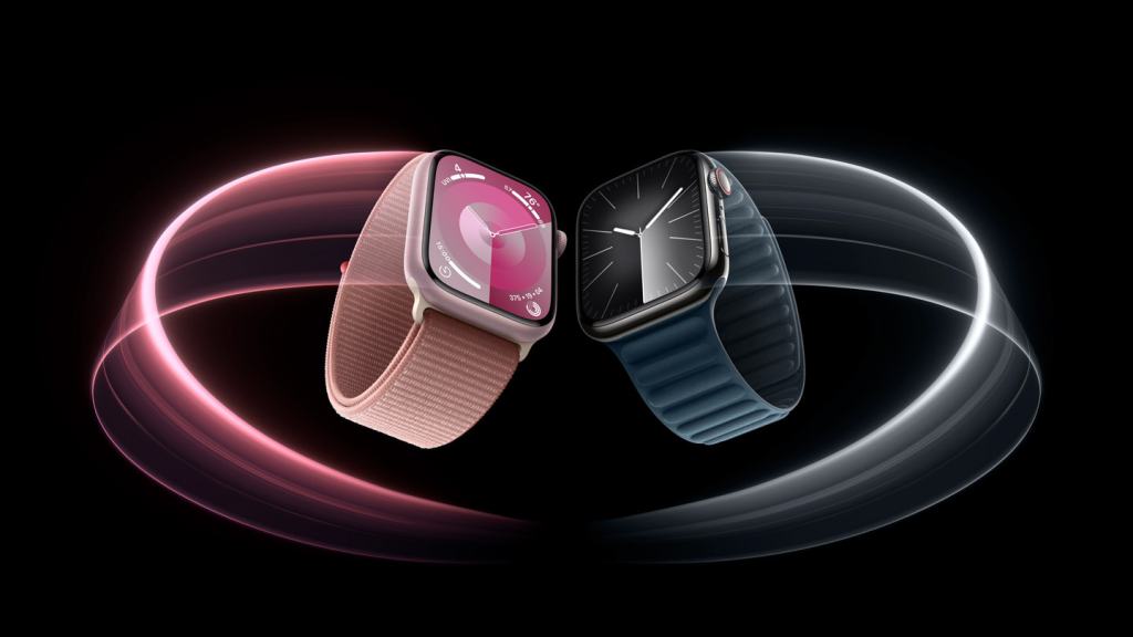
    So I’ve been wearing my Series 9 for a little over 3 months now and many of my thoughts on the Watch have changed from initial review in September. At the time, I titled my review as “Coming Later This Year”, due to so many flagship features of the Series 9 not being available at launch. Since then, Apple has made good on those promised software updates and the Series 9 is now doing everything it was advertised as being able to do in September. 

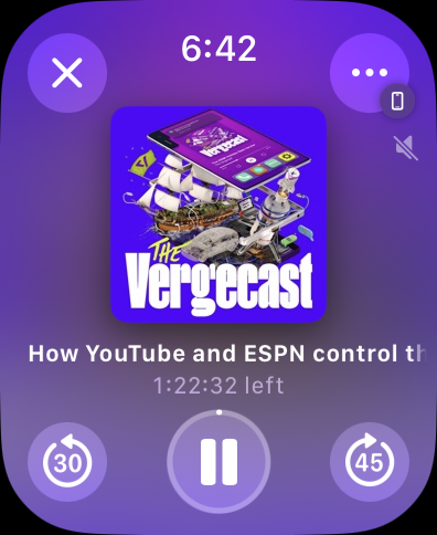
    So let’s start with the big one; Double Tap. This came in October with watchOS 10.1. Apple advertises this as a “magical way to interact with Apple Watch” and I think that oversells the feature a bit. For some specific functions, I do find it genuinely useful. If a song starts playing that I don’t like, rather than raising my wrist and using my other hand to tap the skip button, I can just raise my write, Double Tap, next song plays. It’s much nicer. Similar for ads in podcasts. Ad starts, I just Double Tap until the ad is over. Sitting at my desk at work and I want to quickly check the news or see if I have any missed message? Quick little Double Tap to bring up and scroll the Smart Stack. This one isn’t quite as “magical” as the other examples as if I want to open Messages or News, I then have to use my other hand to tap the screen. 

    Overall I fond Double Tap to be a handy if not always helpful feature. It doesn’t work everywhere, and third party apps currently have no way to use the Double Tap feature, but I do think Double Tap has a future if Apple continues to support it and update over time. My other hope is that Apple makes the feature more customizable. From the Watch face, the only thing Double Tap does is bring up the Smart Stack. I would personally find it much more helpful if Double Tap brought up Notification Center. It’d also be nice if I could set Double Tap to dismiss notifications, rather than do whatever the first action prompted on the notification is. The best way to tell if a feature is good or not, is to take it away and see if you miss you. When in Low Power Mode, Double Tap is turned off. And when I did have my in Low Power Mode, I did try to use Double Tap and missed it. With time, I could probably adjust to not having it, but I do like it enough that I’d rather Apple keep building on it. 

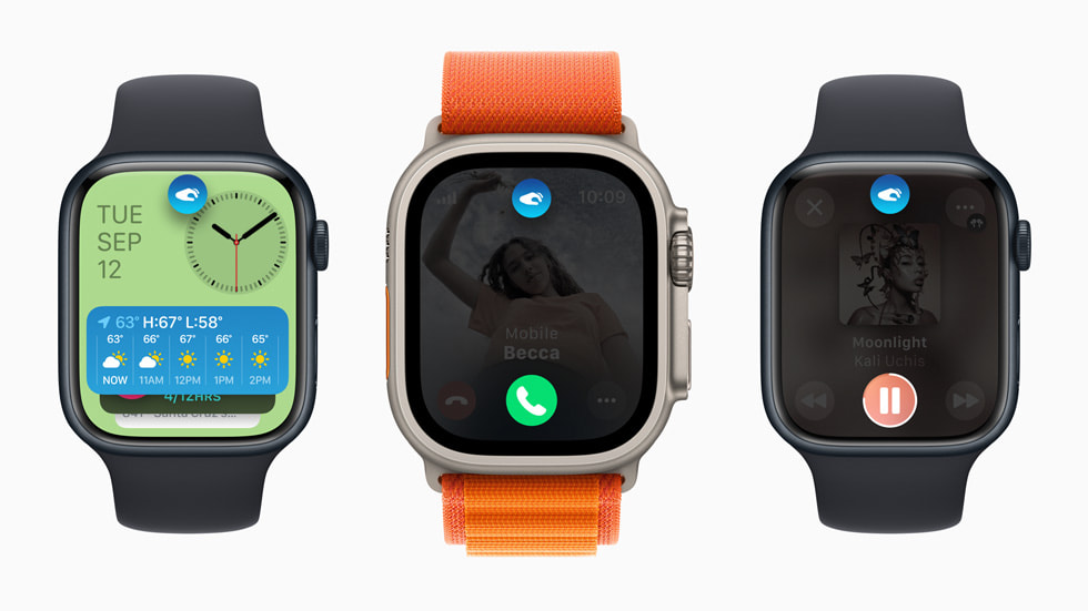
    The other big feature that more recently got added with watchOS 10.2 is Siri integration with the Health app. This allows users to use Siri to request information from the Health app and be delivered to you. It works the other way too, for some health related items, you can use Siri to log that information into the Health app. In a press release, Apple outlined some (maybe all) of these requests. They generally focus on information that could be viewed from the Activity, Workout, Sleep, and Medications app. You can use Siri to log some information that isn’t associated with a specific app though, like your weight, which is nice. 

    I tried to use Siri to log some water intake recently and the request plain didn’t work. I tried “Siri, log 33.8 fluid ounces of water” and Siri thought I was trying to take a medication. I also tried “Siri, I drank 33 fluid ounces of water today” and Siri basically told me that she couldn’t log water to the Health app on Apple Watch and to try doing it on my iPhone instead. Why can I use Siri to log my weight on Watch and not my water intake? I have no idea. Adding insult to injury, there’s not even a Siri Suggestion that pops up on my iPhone to ask if I want to do this action. So if Apple took this feature away, I’d honestly be none the wiser to it. It’s a good idea, but needs to work consistently across all Health categories to be actually useful. 

    I do find it amusing how in the press release for this feature Apple hilighted asking Siri for information the Watch would have no knowledge of without an additional accessory or piece of hardware being used. Like asking for your blood glucose level or blood pressure. I hope this is Apple laying the foundation for these kinds of health sensors to be added to Apple Watch in the coming years. 

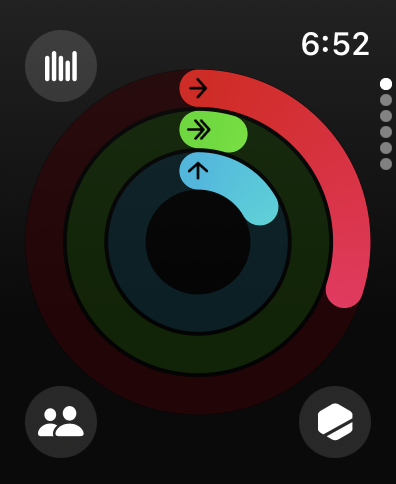
    A few other pieces to go over. The improved brightness of the display. I haven’t actively noticed it at any point in the last few months. Screen brightness on Apple Watch is still controlled automatically via software. The display is also able to get dimmer than before and, unsurprisingly, I haven’t actively seen this difference either. 

    My thoughts on the S9 system in package (SiP) has been largely unchanged since September. The S9 is a pretty notable improvement over previous generations of SiPs Apple has used. Apps are still speedy to load and watchOS has never dropped a frame or slowed down once. Some machine learning (ML) tasks like handwashing detection that use the improved Neural Engine in S9 are better than they were previously. I think the S9 lays a great technical foundation for Apple to build on in future version of watchOS. 

    One of the new components of the S9 is the 2nd generation ultrawideband chip (U2). My thoughts on this have also not changed much since September. This chip enables precision finding of your iPhone 15 or 15 Pro. It also lets it show the Now Playing widget in the Smart Stack when you are near a HomePod mini or 2nd generation HomePod. This feature was added in watchOS 10.2, but I can’t tell if the feature is working correctly or not. I’ve never seen the exact widget Apple shows in the marketing material, but when my Apple TV (which is connected to a 2nd generation HomePod) is playing, it does show up in the Smart Stack. I just don’t know if this is using the U2 chip or if some other Home/AirPlay magic is at work. 

    I will continue to criticize Apple for limiting things like precision finding to models with U2 and not bringing this feature to the Apple Watches with U1 where it would absolutely work. I know this because iPhones and AirTags only have the U1 chip and it works great. 

    But that really is the Apple Watch Series 9. Some good, if not fully baked improvements. It’s the best Apple Watch you can (hopefully) buy. If you have an Apple Watch Series 6 or older, I think you’ll appreciate the upgrades. And for those with a Series 4 or SE who may be considering an upgrade, you definitely won’t be disappointed. 

    I do stand by my greater criticisms of the Apple Watch as a platform however. This is probably worth a full post to explore more in depth, but the first era of Apple Watch (Series 0-3) was defined by Apple adding core technologies to Watch. The second era (Series 4-6) was defined by Apple adding health sensors and quality of life improvements. We are now in the third era (Series 7-9) and it’s so far been defined by Apple making the Watch slightly better every year in some way, but without moving toward an end goal. Is it making Apple Watch an independent wearable computer? No. Is it making Apple Watch a health device? No. It’s hard to tell what Apple really wants the Apple Watch to be at the moment. 

    But for whatever the Apple Watch currently is, the Series 9 is the best yet.

  • Apple Watch Series 9 Review- “Coming Later This Year”

    Apple Watch Series 9 Review- “Coming Later This Year”

    Remember for a couple years when Dieter was still at The Verge and he reviewed Apple’s entry level iPad? He summed it up in the first two sentences for several years by saying, “Yep. It’s an iPad.” I feel the same vibe and energy from the Apple Watch. 

    Yep. It’s an Apple Watch. 

    That’s not a bad thing. Apple Watch Series 9 offers the ECG sensor that was introduced with the Series 4. It has the Always On Display that was introduced with the Series 5. It has the Blood Oxygen sensor that was introduced with the Series 6. It has the large and beautiful edge-to-edge display and overall design that was introduced with the Series 7. And it of course includes the Temperature sensor from the Series 8 last year. It culminates in a device that can track a TON of information about you and provide you with a lot of information about yourself that likely didn’t know about. It’s advanced to say the least. My problem is that that it’s advanced for the sake of being advanced. There is no software feature that takes all this information and presents users with anything of value. 

    The original Apple Watch though the Series 3 added core technological improvements that had a clear purpose for users. GPS to make running workouts more accurate. Improved water resistance to let people wear it while swimming. Cellular so you don’t need an iPhone while you run to make your workouts more enjoyable. Or make a call in an emergency. The Series 4 though 8 added all kind of new health features, but they haven’t culminated in anything. It’s a little disappointing. 

    Focusing on what the Series 9 on its own does have, the S9 system in package (SiP) is Apple’s 6th generation silicon for the Watch. It replaces the 5th generation silicon that they’ve been using since the Series 6 was introduced in 2020. And I do think it is notably better. Apps load almost instantly and everything on the Watch runs without slowdown. Booting up the Apple Watch is also notably faster for the rare occasions that is necessary. Siri responses are also able to be done on device with the S9’s new Neural Engine making Siri responses much snappier.

    The Series 9 display is also slightly improved. It can get up to 2,000 nits, 1,000 more than previous models, and as low as 1 nit. The new brightness will be appreciated while outdoors on a bright day, but I’m not sure where the new low end of that spectrum will be useful. There’s not many situations in which I think to myself, “If only my Watch was dimmer”. Apple mentioned in the keynote this could be useful in a movie theater, but you should use Theater Mode to completely turn the display off. 

    The Series 9 also has the second generation ultra wideband chip built in. The predecessor was dubbed the U1 chip, so I will dub this the U2 chip. It enables Precision Finding for other U2 enabled devices like other Apple Watch Series 9 or Apple Watch Ultra 2 models, or iPhone 15 and 15 Pro models. It should be a great feature, but it’s limited by the fact it’s limited to U2 only devices. My complaint here is not that Apple is improving their ultra wideband technology, but it is odd to me that Apple needed a U2 chip to do a feature that has been available in various U1 enabled iPhones and accessories for a few years now.

    At this time, that’s all there is to the Series 9. It’s another evolution of the Apple Watch lineup. Which again, is not a bad thing. But what is a bad thing is the number of features Apple is advertising that are missing. For most of these, Apple says they are “coming later this year”. Including Siri integration with the Health app. There are new interactions that will be possible between the Apple Watch and a HomePod for media controls or suggestions, but that is also coming later this year. This oddly is an example of Apple enabling a feature between U1 enabled HomePod devices but will only work on Apple Watch models with the U2 chip. I do not understand why. 

    And the biggest omission is the new gesture Apple is touting the S9 chip enables called Double Tap. It’s coming soon- in October- but for the marque feature of this years Apple Watch to be missing on day one is astounding and very un-Apple like. Since it’s not available right now, I can’t test it to tell you how it works. 

    And that’s it. It’s an Apple Watch. The most advanced and technologically improved Apple Watch Apple has ever made. If you have an Apple Watch Series 5 or earlier, this is a great Watch for you to upgrade to. If you have an Apple Watch Series 6 or later, you likely don’t need to upgrade. Keep your current Apple Watch, upgrade to watchOS 10, and enjoy it. If you have an Apple Watch SE (first or second generation), this is also a great Apple Watch to upgrade to if you want the features it offers.

  • watchOS 10 Preview

    watchOS 10 Preview

    watchOS 10 is being billed by Apple as “the biggest update since the introduction of Apple Watch” and I don’t think that statement is too far off the mark. There are changes to virtually every element of Apple Watch. Over the past month or so I keep glancing at my Apple Watch and smiling, gaining a sense of pleasure having it on my wrist. Rather going though everything new in watchOS 10, I want to do something a little different. I want to point out some specific features that have made me feel so happy to be wearing this device on my wrist.    

    First, the watch faces. This is the first thing you see every time you glance at your wrist. Even for people who don’t wear an Apple Watch, the face is the most visible element of your watch. WatchOS 10 has (so far) added two new faces. The less impressive of the set is Palette. It’s similar to other faces Apple has introduced like Gradient or Color- it features a dial that changes color as the hands move around the dial. The four corners of the display feature the rich complications that users have come to expect from most other Apple Watch faces. Though for this face in particular, I’m not sure you need to use them. It looks better without complications. In past versions of watchOS, using a face like Palette would mean you are prioritizing an esthetic over information density, but watchOS 10 has a solution for this. More on that in a moment. 

    The other new face is Snoopy. It features Snoopy and Woodstock from the Peanuts cartoon doing something a little different ever time you raise your wrist. When lowered, it shows the two sleeping on top of Snoopy’s doghouse. But when raised, you are treated to any number of unique animations. From Snoopy blowing a gum bubble and it exploding on his face and getting stuck on the hour hand, Snoopy doing his classic dance across the display, or Snoopy sliding down the hands like a fireman pole. It brings a smile to my face every time. And there are multiple color backgrounds you can select from as well. There’s the less interesting newspaper (giving you a background that looks like it was printed on a newspaper), Lucy Blue, Blanket Blue, Peppermint Patty, Woodstock Yellow, Great Pumpkin, and Doghouse Red. It’s a great callback to characters and props from the cartoon. 

    Since watchOS 7 in 2020, Apple has started holding back the introduction of new watch faces until that years Apple Watch models are revealed, so I do expect more new faces to become available once watchOS 10 officially launches to the public. 

    Circling back to that point I was making earlier about prioritizing esthetic over information density, watchOS 10 has a new feature that frees you up to use whatever watch face you like without having to sacrifice the information you can get at a glance. If you like the super information dense faces like Infograph or Modular, you can keep using them! But if you want to use Snoopy or Contour which feature few to no complications, you can and use the new Widget Stack to get that glanceable information you still want. The Widget Stack is all new to Apple Watch, but is very similar to it’s counterpart on iOS. In fact, many widgets already on iOS look very similar if not identical to their watchOS widget counterparts. And these widgets are on every face now. Simply swipe up or use the Digital Crown to reveal the widget stack and browse your widgets. 

    Currently only Apple apps are available to use, but once watchOS 10 is available to the public, developers will likely begin updating their apps to offer up a widget. I love having the ability to quickly turn the Digital Crown and have my widgets popup and offer up rich information in ways that most complications on most Apple Watch faces simply can’t match.  And when I’m done looking at the information I need, I turn the Digital Crown again and it simply tucks away again with subtle but greatly appreciated Taptic feedback.    

    I do want to draw attention to one of these widgets in particular. It doesn’t have a specific name in watchOS, but its main purpose is to hold three regular sized complications, so I will refer to it as the Complication Tray. The Complication Tray can hold three complications to offer up information to you, like the status of your Activity rings, or quick access to an app like Home. Any widget can be pinned to the top of your stack, so I have this one pinned so I can always quickly no matter where I am on my Watch, access the Workout app, see my Messages, or control my home. 

    The Widget Stack is dynamic as well. Throughout the day based on the time or what you are currently doing, it will update with widgets that are timely. For example, when listening to music or a podcast, the Now Playing Widget will appear on top- before even your pinned widgets. Or if a Workout is in progress, you can quickly pause or resume it right from the Widget Stack. 

    One the subject of Now Playing, this is a much nicer experience than past versions of watchOS. Previously, you just had a big Play/Pause button in the middle of your screen with some AirPlay controls and one of those infamously non-detailed … buttons. The title of your audio would scroll by on the top and it just looks basic. In watchOS 10, Apple has made this a much more pleasant experience while retaining functionality. Your controls are all in the corners of the display, allowing you to quickly rewind or fast forward, play/pause, close the Now Playing window or change your AirPlay settings with a detailed … button. The album art also fills the middle of your screen and can even be tapped to take it full screen just like on iOS. It’s fun to discover even if its not super practical.    

    These bigger buttons and controls in the corners of the display are actually a very common element in watchOS 10 as virtually every single app has been redesigned to look beautiful, offer increased functionality, and communicate more information. Activity for example puts access to your Weekly Summary, Competitions, and Trophy Case right in the corners, removing the need to swipe across the display multiple times to get to what you wanted. Turning the Digital Crown no longer puts you into a long list of information, it instead hilights each of the three rings and offers up deeper information on that specific ring. 

    Weather has full screen weather effects just like the Weather app on every other Apple platform and it looks great. Great enough to be its own face in watchOS 11 I’m sure… It defaults to a current weather overview but using the Digital Crown can show the forecast for the next few hours or even the next 10 days. Tapping the button in the upper right corner lets you quickly select what specific weather information you want- precipitation, humidity, wind, etc… 

    And Noise no longer has a bar that indicates how loud it is and then makes you scroll down a long list to find how safe your current level is. The full screen is utilized to indicate your current noise level with color communicating that information. More detailed information is hidden behind the “I” button but many people won’t need that level of detail anyway. So moving it out of the way is perfectly fine.    

    This new design philosophy should actually start cropping up in many more watchOS apps once developers can update their apps to support watchOS 10 specifically. Apple has found that many apps fit into one of three styles- Dial, Infographic, and List. 

    The implementation of these styles is left to the developer of each app to select and build their app around- users can’t pick and choose a style on a per app basis. But it is nice to see Apple finally finding their footing on how to best design an app for Apple Watch and take advantage of the bigger displays the Series 4 and Series 7 displays offer. This feels like the first version of watchOS to not be constrained in any way by the original Apple Watch display or design limitations. 

    The other thing I want to mention as neither a positive or negative, but something that is different that I do notice is Control Center. Invoking Control Center is no longer done by swiping up on the Watches display. Instead, you press the Side Button. This brings up Control Center from anywhere, rather than the Dock. While I did make expensive use of the Dock in previous versions of watchOS, I don’t actually find myself missing it. The Widget Stack and refreshed Home Screen make accessing the apps I want simple. And tying Control Center to the same button you use to power the Watch On and Off does make a certain amount of philosophical sense. But it is different and something that will take users a little bit to adjust to. 

    There are more changes like this in watchOS 10 actually. The Side Button brings up Control Center. Swiping up brings up the Widget Stack. You can no longer swipe across the face to quickly change faces- you have to press and hold the screen to do so. The Digital Crown no longer has a direct effect on faces it previously had an effect on. And double pressing the Digital Crown no longer quickly swaps you between two apps. Many of these changes are detailed for users once they update their Apple Watch to watchOS 10. And the Tips app offers up lots of good information for users, but I can’t help but feel like many users may spend the first few weeks with watchOS 10 feeling a sense of frustration. 

    But overall, I am very, very positive on watchOS 10. It is by far the biggest update the Watch has received in years and feels like a platform that Apple could actually now build more advanced features and apps off of than what they had previously. I think while many will feel frustrated at first with it, given time, they’ll come around tot he same joy I feel when wearing and interacting with my Apple Watch. 

  • Apple Watch 8 Years Later

    Apple Watch 8 Years Later

    By the time you are reading this, the Apple Watch will be 2923 days old- or 8 years and a day old. I figured I’d take this opportunity to look back at the launch of the Apple Watch and think about what it represented for Apple and the direction the company was moving at the time and think about how its so different today.

    If you haven’t already, I highly recommend using the Wayback Machine to view the Apple Watch page on April 24, 2015 and watch the below YouTube video of the Apple Watch reveal from September 2014. I’ll insert images and video where possible.

    For starters, the September 2014 Apple Watch reveal video.

    Apple Watch (2014, Apple)

    I love this video for showcasing two great features of the Apple Watch. First, the pure design of the Watch. It came in two sizes, came in multiple finishes, and had an insane attention to detail and design. Everything was carefully considered and the craftsmanship is on full display. So much so, that Apple made it a selling point.

    The sizes appealed to different people, the colors and metals appealed to different people and incomes, and the bands did too. And the consideration that went into ensuring the app icons match the shape of the Digital Crown which exposed your apps.

    Second is the customizability of the Apple Watch. In many ways, this was- and still is- the most customizable product Apple has ever made. The Watch with its different sizes and colors and metals could be mixed and matched with any band and any face at any time in super simple ways. Early Apple Watch ads captured that feeling perfectly.

    The way Apple wanted users to feel when using, or more accurately wearing, the Apple Watch was on full display too. Look at the cover photo Apple used on their website when marketing the Apple Watch.

    Something that feels beautiful and non-intrusive. Something that you feel comfortable and confident having on your wrist. Something that empowers you. Something that makes you disconnect from the virtual world and focus on the present. It’s been a while since Apple focused on some of these ideas in general, let along with this kind of consideration and diligence.

    The final thing I want to touch on with regards to the Apple Watch launch is the feeling of excitement that in injected into the company. There was a real feeling in Apple and around the tech industry that wearable technology was the next frontier to be conquered. Wearables, maybe even multiple wearables working together, could and would replace your iPhone and Mac and that seamless use of lightweight devices (lightweight in usability not actual weight) would allow you enjoy all the things you do today, but also let you reconnect with the real world at large. This feeling doesn’t exist anymore. It is 8 years later, but starting in 2019 with the introduction of the Apple Watch Series 5, the exciting new hardware and software Apple was able to ship and push into the Watch began to dramatically slow down.

    I love the Apple Watch. If I could fully replace my iPhone with an Apple Watch and pair of AirPods, I’d do it in a heartbeat. And for a time, that seemed to be what Apple wanted to do. But as time went on, Apple focused less on design and focused more on affordability. They focused more on features and technology rather than introducing features and technology to help users feel something about their device. That’s the Apple I know and love.