Author: Connor Duffus

  • iPadOS 17- Worlds Collide

    iPadOS 17- Worlds Collide

    If you haven’t already, please read my iOS 17 wishlist here. It will provide some important background on how these wishlists were made. 

    iPadOS is a weird operating system for Apple. It’s perfectly fitting as the iPad is weirdest product Apple produces. The iPad started life as basically a big iPhone- they shared the same design and OS. As the years went on, especially after the death of Steve Jobs, they did begin to give the iPad some exclusive features that iPhone didn’t get despite running the same OS. Once 2019 rolled around, Apple decided to take the iPad into an all new direction by giving the iPad it’s own OS- iPadOS. iPadOS 13 was built on top of the foundations of iOS 13, but added many features that made sense on an iPad that couldn’t be as easily utilized on the smaller screen of the iPhone, like multiple windows, Slide Over, gestures for copy/paste/cut/undo/redo,  Picture in Picture, an emphasis on dragging and dropping everything, and a redesigned exclusive Home Screen. It was a fantastic release. But as early as iPadOS 14, Apple started going back on a lot of the improvements they made to the iPad and began bringing a lot of iPadOS features to the iPhone. Eliminating the point of giving the iPad its own OS in the first place. Since iPadOS 14, Apple has gone back on gestures, dragging and dropping, Picture in Picture and the tighter Home Screen grid. In exchange for these features going away  or being paired down, users generally got nothing in return. This year, I want to see Apple return to the direction and design principles of iPadOS 13 and make the iPad a great in-between product of the iPhone and Mac. I want to be clear at the outset. I am not in favor of Apple allowing dual-booting of macOS on iPad, nor Apple simply porting over their Mac apps to iPad and requiring users to have the Magic Keyboard accessory to make it all work. Apple should treat the iPad as a touch first product that has a lot in common with their two other products and carefully design features that appeal and appease users of both products. 

    1. Multiuser Support- This is something that macOS has had forever and is something that the iPad desperately needs. Data shows that iPads rarely leave the home and are frequently used by multiple people in that household. It’d be great to have something akin to the macOS profiles that so that apps and an Apple ID can be tied to just one user. On devices with Touch ID, a simple touch on the Home Button can fast user swap. Or on devices with Face ID, you can authenticate when unlocking for the first time from the Lock Screen or anytime by using Control Center. Similar to tvOS, a little dropdown can come from the top right corner indicating who has been signed in. Each user can have their own Lock Screen, Home Screen, Focus Modes, and app and account access. 

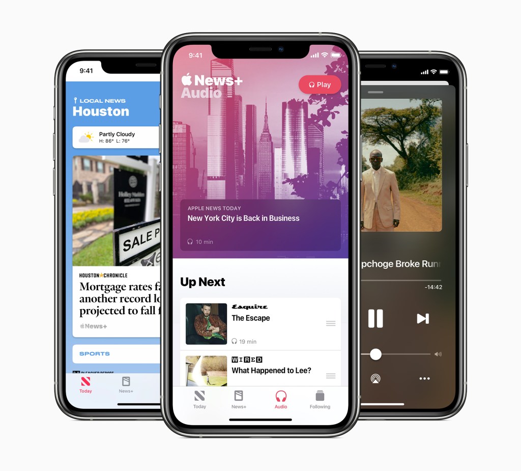
    2. Support for Apple News+ Audio Stories- If you’re a reader of this blog, you’ll know one of the first posts I made was about how Apple News is a frustrating feature to use. In iPadOS 17, Apple should finally allow users to listen to Audio Stories on iPad. On iPad, Apple could even go a step further by using the same ML technology from Apple Music Sing, users can easily follow along with the text of an article being narrated. 

    3. Rename “News+” tab in News to “Magazines”- This is another minor thing concerning the News app, but I think Apple should rename the News+ tab to Magazines in order to eliminate confusion on what the News+ category gives you access to. Tapping it while not subscribed can show you the benefits of subscribing, but once subscribed, it’d be nice if it just let you see all the magazines you’ve followed. 

    4. Optimize Battery Charging- Every other Apple product has the optimize battery charging feature. iPhone, Mac, Watch, even AirPods. Apple should add this to iPad as well to help users preserve their battery integrity and give users information on when they will need to replace the battery. 

    5. All new Home Screen- This is an exciting feature. I hope that Apple returns to the widget and app icon sizing. And Athen instead of having pages like on iPhone, give the iPad a rectangle that is the height of the iPad, so when it’s tuned horizontal, you can see a wider view of your Home Screen. This eliminates the problem of the iPad having a tiny app grid and gives the iPad additional flexibility over devices like the Mac by giving it a larger canvas to work with to freely place apps and widgets and folders on this continue scrolling ribbon that would look the same no matter what orientation the iPad is held.

    6. Updated Status Bar- Taking inspiration from macOS and the Dynamic Island on iPhone 14 Pro, I think Apple should make the Status Bar slightly taller to allow more detailed icons like Now Playing or Timers to be displayed without having to go to Notification or Control Center.

    7. Notifications drop in from top left of screen- I’ve commented before how great notifications are on iOS by dropping down from the top of the screen, then to see them again, you just pull down from the top of the screen and there they live. This is the same behavior on iPad, but an iPad has more screen than iPhone and none of the ears or extra Status Bar space iPhones have, so to make it more clear where you need pull down from in order to see your notifications, I think it’d be great if Notifications dropped in from the top left of the screen. The previously mentioned taller Status Bar and suite of icons it displays would more clearly show to pull down from to access Control Center.

    8. Notifications can be dragged into windows- This is a feature that was previously in iPadOS but somewhere along the line got removed for some odd reason. It used to be super convenient to get an iMessage notification and just drag in out into a Slide Over window and have the full conversation right there. Now you can only tap it to open the app or pull down to reply and have a short glance at the last few messages sent. I have no idea why Apple ever removed this feature, but it made using the iPad harder.

  • iOS 17- A Focus on Refinement

    iOS 17- A Focus on Refinement

    Starting a couple years ago, I began maintaining a detailed note throughout the year keeping track of what changes I’d like to see made to Apple’s operating systems and apps in the hope that come WWDC, I’d be right about some of the changes they’d make. These were bullied lists; some read something like, “Updated Status Bar and Dynamic Island activities”. This obviously makes sense to me, but almost certainly does not to you. So in converting my iOS wishlist to a blog post, I’ll provide a brief justification for the change or try to explain the root of the complaint. Because, I am only human, and humans do love to complain about things they haven’t yet developed a solution for, but in offering the complaint, can spark an idea or discussion with another. I also want to generally speak the state of each platform; how mature is it and how much use do I give that platform each day. These kinds of things effect my views of each platform. Providing context for each is also important. Finally, I’ve tried to group these in somewhat of an order. Generally these lists will being with some higher level system changes and then drill into individual apps So without further ado, let’s begin. 

    iOS is by far Apple’s biggest platform. It’ll also be going on it’s 17th iteration this year. This will also be the 5th year of iOS’s third major design era- the Customization Era. Beginning with iOS 13, Apple introduced Dark Mode system wide, iOS 14 Brough new Widgets and the App Library, iOS 15 brought Focuses and the Notification Summary, and iOS 16 brought major changes to the Lock Screen. These releases have focused on adding complexity to the system and I doubt Apple will go back on that. Complexity is fine, especially on a mature platform like iOS, but there is an ever growing lack of clarity on how all these features work on their own and together. Being able to tie a custom lock screen with custom lock screen widgets and specific Home Screen layouts to certain Focus modes based on times of day or location is very powerful, but it’s also very difficult to do. My biggest hope for iOS 17, is that Apple works to bring all these features together and focus on ensuring features work the way users expect them to. My second biggest wish is that Apple focuses on design again. Making beautiful products. Products aren’t just hardware for Apple- they also sell you an operating system and services. All of them have to work great and look great, especially together.

    1. Refreshed Design Inspired By macOS Big Sur. I want to be clear. I am not advocating for changing all the iOS app icons to match those of the Mac. As Alan Dye mentioned while revealing macOS Big Sur, the icons of Big Sur were inspired by the previous generation macOS icons. This history doesn’t exist on iOS. Also, while macOS and iOS icons look similar, the flatter design of iOS makes it more clearly recognizable what app is for what platform. Especially when you consider on a Mac you can run apps from three different platforms- Mac, iPhone, and iPad. Having a clear indicator of what app belongs on what platform is a consumer benefit that Apple would be foolish to change. What I am advocating for is adding some of the design elements of macOS Big Sur and bringing rime other the iPhone where it makes sense. For example, the macOS Control Center features tons of color and horizontal sliders and switches. Simple to access drop down menus reveal additional options. On iOS, it’d be great to have horizontal sliders for screen brightness and volume control. It’d also be nice to have to long press on each Control Center tile to bring up additional control. Surfacing these controls in separate tiles or in a pop up menu would be great. This can extend to Settings too. Nothing is more simple to understand than a simple on/off toggle switch. The macOS Settings app also has really nice iconography for basically every option you can click on. This is something I’d love to see in the iOS app as well. It would definitely help users navigate around the app and make that navigation more enjoyable. 
    1. Customize Quick Actions on Lock Screen- Currently on every iPhone that is Face ID equipped, the Lock Screen of your device has to two Quick Actions in the lower left and right corners of the screen- the Flashlight and Camera.  These options cannot be changed nor can they removed. This is especially weird considering in last years iOS 16 update, every other element of the Lock Screen was updated to become customizable. The font and color of the clock, the widgets, and the overall style and theme of the Lock Screen itself. But not the Quick Action options. This is the easiest thing for Apple to change. At the most basic level, let any Control Center tile be added to the Lock Screen. In addition, allow users to completely remove the Quick Action option if they so choose. Taking this a step further, Apple should update the default set of Quick Actions. If you’ve used earlier version of iOS, you may remember you could easily swipe and get to your Phone. That’d be a great option to re-introduce. In earlier versions of iOS, you could also have an app that was open on another device appear right not he Lock Screen for easy access. (For example, if I were working on Pages on my Mac an picked up my iPhone, Pages would the lower right Quick Action).
    1. Expanded Lock Screen Gallery Options-In iOS 16, as part of its redesign of the Lock Screen, Apple introduced the Lock Screen Gallery to view all the different Look Screen themes and options available to users. It currently is very good about making it look like there are a lot of options to pick from than there really is. There is the Emoji Lock Screen that lets you pick a handful of emoji and they can be mixed and laid out in a few different ways. There are an immeasurable number of ways to edit and customize a photo that appears on your Lock Screen. This actually makes up the majority of marketing material Apple puts forth about the new Lock Screen. And there are some curated options like the Astronomy, Weather, or Unity options. But that’s about it. I think it’d be great if Apple reintroduced all the images they’ve used from iPhoneOS 1 though iOS 15 and remastered them to look amazing on modern iPhone displays and took advantage of depth whenever possible. I’d also love to see more fun Lock Screens like Weather. For example, if you track your water intake via Apple Health, the Lock Screen can gradually fill up with water throughout the day. As you tilt your iPhone around, it could even slosh around a bit. That’s the kind of fun interactions I’m lookin for. 
    1. Live Photo Support for Lock Screen- This is a simple followup to the above point, but in iOS 16, Apple removed Live Photo support from the Lock Screen. Only static images can be used. Since then, many have complained and rightly so. There is no reason to not have Live Photo support. The Apple Watch Photos face supports Live Photos and the whole Lock Screen redesign was inspired by the Watch. Just make it so whenever a user raises or taps their Lock Screen the photo animates. Same applies to iPhone 6s and later Live Wallpapers; bring those back too. 
    1. Get rid of all traces of 3D Touch and Haptic Touch- I am a vocal proponent of 3D Touch and not a day goes by that I wish Apple didn’t kill it. But they did. That is the reality of the world we live in. Since Apple couldn’t stand to not replace 3D Touch with something else, they invited the solution of Haptic Touch. Haptic Touch is code for a long press. Long presses are some of the worst UI design in app development history and especially in the way Apple has implemented it. In Files or Music for example, a long press brings up a full pages worth of options for users to select. It’s way too much. Apple needs to look at all the places a long press beings up a list of options and consider if those can options can or should be viewed from a separate menu after initially tapping on the item. Files is an easy one. Tapping a file can open it or bring up the preview window and from there, users could select an option to bring up all actionable options for that file specifically. When Apple killed 3D Touch, they replaced its functionality with long presses. This was a miscalculation. The fix is to introduce visible menu options to bring up the options that 3D Touch or long presses did.
    1. Default App support for more app categories- In iOS 14, Apple allowed a small number of app categories to become defaults for the system, including email apps and internet browsers. At the time, I think Apple considered this an experiment to see if it could work and I would generally say it has. The time has now come to expand those app categories to include default app support for things like calendars, maps, reminders, notes, photos, music, and podcasts. If a user wants to set Google Maps as a default, they should be free to do so. Apple’s apps will still be the default and come pre-installed on all Apple devices, but if a user dose’t want to use them, they won’t be forced too. This will force Apple to complete with other developers to consistently create the best apps in its category. 

    7. App Store rules updated to allow browsers to use their own rendering engine, separate of WebKit- In a related thought to the above point, allowing different browsers to use their own render engines will increase competition on iPhone. Allows greater competition among browsers in the App Store

    8. App Store rules updated to require developers to give users more control over notifications- This is another thing that Apple should have done when they introduced a priority level system in iOS 15. Many apps like Uber or BestBuy will send users notifications that are ads for products or services, but also send notifications for important things like alerting you to the fact an order is ready for pickup or has shipped. Developers are the ones who determine if an apps notifications are non-important (and could be blocked in certain Focus modes) or important (and would be marked as Time Sensitive, allowing them to bypass certain Focus modes). The problem is not hard to see. If you are a smart developer who wants people to be in your app at all times and ever present on a users Lock Screen, you send regular notifications and mark them all as Time Sensitive. And that is exactly what these apps do. Apple needs to implement an App Store rule that requires developers to give users control over they types of notifications they receive and if those notifications are Time Sensitive or not. I don’t think it’s up to Apple to require this be controlled in apps or in the Settings app, but it needs to be somewhere. This way, people will have greater control over how much time they spend in an app and filter out distractions from their life. Developers will obviously need time to update their apps, so giving them a year I don’t think is unreasonable. And if at that point an app ins’t in compliance, they will not be able to send users any notifications at all. 

    9. App Store rules updated to allow game streaming apps- Currently the App Store does not allow services like Xbox GamePass to be on the App Store. Some have viewed this as a way to protect Apple Arcade, but I don’t think that’s it. Apple Arcade can always have it’s own dedicated tab in the App Store and unlike GamePass, Arcade doesn’t require an internet connection to play. That’s a competitive feature right there. But the fact users can’t decide what game service to utilize is crazy to me. It’s no different than Netflix streaming movies to your device.

    10. Dedicated Apple Arcade app- In a related note to the above point, Apple Arcade absolutely can be one of the main tabs in the App Store. Apple owns the App Store, and the games they pay to be developed or licensed to their platform can be given top tier placement in their store to ensure revenue. But a dedicated Apple Arcade app that allows you to view and download games, promote new releases and updates, and offer up promotions would be important as well. Not just for existing subscribers but for potential subscribers as well. The Apple TV has its own Arcade app and Macs in Apple Stores have special dedicated Arcade folders. Why not extend this to iOS and take it to the next level?

    11. Dedicated Game Center app- I’m not sure how many people are really aware of what Game Center is or how it works. Part of that is due to the fact that in iOS 10 it was removed as an app where you could go and see what it offered and was instead replaced with being built into the backend of all Game Center games where it’s features were now palced. It’s very odd and kinda annoying when you want to play a game on iOS and these Game Center popups keep getting in the way of your game. Reintroducing Game Center as an app would raise awareness of what the service is and what it offers with users and help cleanup all the games that support  it by returning those Game Center features to its own app. Game Center would be the best place to see all your achievements for all of your games, setup controller settings, send and receive game invites, and manage friends. 

    12. Updated Status Bar and Dynamic Island activities- This is a hard one to explain and it currently only effects iPhone 14 Pro users, but if the rumors are true that all iPhone 15 models will adopt the Dynamic Island, it is certainly something Apple will want to cleanup. Sometimes there are duplication and inconsistencies in how apps using your location utilize Status Bar and Dynamic Island. One example is when I open Pikmin Bloom, the Status Bar updates with a location arrow in a blue circle, then when I start to plant flowers, the Dynamic Island will expand out to show the app is using my location. Which it always was in the first place. It’s bizarre and this is the kind of thing that I hope Apple reviews and cleans up the Status Bar and adjusts some of the things that appear in the Dynamic Island. 

    13. Camera Roll and App Albums in Photos app- This is a simple one. I hope Apple changes the Library tab in Photos to just show photos taken with your iPhone camera or those shared in iMessages. Then all the screenshots you take or photos you save from an app like Twitter or Reddit can be saved to their own App Album. This way it’ll be easier to separate out the pictures that you have taken with your iPhone camera and those saved or taken in other apps

    14. Multiple timer support in Clock app- Finally, this is the big one, please Apple, allow users to set multiple timers in the Clock app on iPhone. This can be done already on Apple Watch and HomePod, but nowhere else. It’s time. 

  • An Apple Journal App Sounds Amazing

    An Apple Journal App Sounds Amazing

    I generally try to avoid rumors on this blog, but there is one new rumor that is going around that has caught my attention. The rumor is that Apple supposedly plans to introduce a new journaling app alongside iOS 17 that will likely be announced at their upcoming Worldwide Developers Conference (WWDC). The app is similar to other journal based apps in the App Store like, perhaps most notably, Day One.

    Based on the reporting from The Verge, “Apple’s ideas for the app include having it pull usage data from the user’s iPhone to make suggestions about what they might like to journal about. It might spot when someone’s daily activity has changed and suggest writing about specific events like a workout. There’s even mention of an “All Day People Discovery” feature that could recognize friends and colleagues that users regularly spend time with.”.

    Upon first hearing this rumor, I didn’t think a journal made a ton of sense for Apple to do. However thinking more about it, it actually does. An Apple Journal app could become the ultimate repository for all your Apple device usage history. Imagine for a moment the Journal app taping into the Health app to see your Sleep Schedule, so I t can prompt you to start a journal upon waking up. Any Apple Fitness+ workouts you complete can be viewed in the Journal, allowing you to track how often you workout in general or do a certain workout type. If there’s a new song you hear, you can directly add that song to the Journal. Apple News integration could be a thing here too, Apple could push a popular article from the News app for a given day or allow you to share an article directly to the Journal to reflect on later. Even Wallet integration could occur here. Imagine being able to pin a movie ticket from your Wallet directly to the Journal app so you can keep it, virtually, forever. The same could apply to Photos. Imagine pinning a photo you took that day to reflect on later.

    A journal app could become the ultimate repository to see how everyone uses their Apple device. Combined with some of the rumored features like the “All Day People Discovery” thing, it could even allow you to share full journals or maybe just entries with friends by using the Find My app or integrating into iMessage.

    This all sounds like an excellent way for Apple users to track what they do on their Apple device and an equally good way for Apple to market their services and other apps to users. This type of app would work great on Apples core devices- iPhone, iPad, and Mac- getting it onto other devices like HomePod, Apple TV, and Apple Watch could be a lot more difficult. Of those platforms, Apple Watch is probably the platform that Apple would actively work to bring this app to. It may let users quickly track their mood or provide a journal reminder.

    I went from uncertain about an Apple Journal app to pretty positive. If this app turns out to be real, we’ll just be weeks away from seeing exactly how far Apple takes it and what the overall goal or mission of this new service is. I do hope that this is a free app and not subscription based. That is one of the major complaints I have with Day One and many of its competitors. I’d even take a one-time purchase, however those types of apps are becoming a rarity and are not generally something Apple does.

  • Apple Watch 8 Years Later

    Apple Watch 8 Years Later

    By the time you are reading this, the Apple Watch will be 2923 days old- or 8 years and a day old. I figured I’d take this opportunity to look back at the launch of the Apple Watch and think about what it represented for Apple and the direction the company was moving at the time and think about how its so different today.

    If you haven’t already, I highly recommend using the Wayback Machine to view the Apple Watch page on April 24, 2015 and watch the below YouTube video of the Apple Watch reveal from September 2014. I’ll insert images and video where possible.

    For starters, the September 2014 Apple Watch reveal video.

    Apple Watch (2014, Apple)

    I love this video for showcasing two great features of the Apple Watch. First, the pure design of the Watch. It came in two sizes, came in multiple finishes, and had an insane attention to detail and design. Everything was carefully considered and the craftsmanship is on full display. So much so, that Apple made it a selling point.

    The sizes appealed to different people, the colors and metals appealed to different people and incomes, and the bands did too. And the consideration that went into ensuring the app icons match the shape of the Digital Crown which exposed your apps.

    Second is the customizability of the Apple Watch. In many ways, this was- and still is- the most customizable product Apple has ever made. The Watch with its different sizes and colors and metals could be mixed and matched with any band and any face at any time in super simple ways. Early Apple Watch ads captured that feeling perfectly.

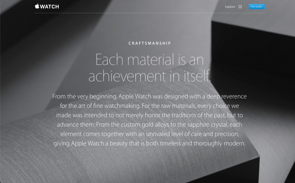
    The way Apple wanted users to feel when using, or more accurately wearing, the Apple Watch was on full display too. Look at the cover photo Apple used on their website when marketing the Apple Watch.

    Something that feels beautiful and non-intrusive. Something that you feel comfortable and confident having on your wrist. Something that empowers you. Something that makes you disconnect from the virtual world and focus on the present. It’s been a while since Apple focused on some of these ideas in general, let along with this kind of consideration and diligence.

    The final thing I want to touch on with regards to the Apple Watch launch is the feeling of excitement that in injected into the company. There was a real feeling in Apple and around the tech industry that wearable technology was the next frontier to be conquered. Wearables, maybe even multiple wearables working together, could and would replace your iPhone and Mac and that seamless use of lightweight devices (lightweight in usability not actual weight) would allow you enjoy all the things you do today, but also let you reconnect with the real world at large. This feeling doesn’t exist anymore. It is 8 years later, but starting in 2019 with the introduction of the Apple Watch Series 5, the exciting new hardware and software Apple was able to ship and push into the Watch began to dramatically slow down.

    I love the Apple Watch. If I could fully replace my iPhone with an Apple Watch and pair of AirPods, I’d do it in a heartbeat. And for a time, that seemed to be what Apple wanted to do. But as time went on, Apple focused less on design and focused more on affordability. They focused more on features and technology rather than introducing features and technology to help users feel something about their device. That’s the Apple I know and love.

  • No Apple Car, No Problem

    No Apple Car, No Problem

    Over the past few years, I’ve noticed Apple introducing several new technologies that are targeted toward the car. Some of these technologies are for people who have very modern cars and others are more stopgap technologies for people with older cars. But all of these technologies have me thinking about Project Titan, Apple’s long-rumored car project. Will we ever see Project Titan materialize into a product or has Apple given up on the project and decided to rework Project Titan into new features that can be built into their existing product line?

    Based on the past few years, I think Apple is clearly moving toward the latter. Repurposing technologies and features that were being designed for their own designed car and packaging them into their existing products- mainly iPhone and Apple Watch.

    Let us start with a simple one. This past year with the release of the iPhone 14/14 Pro and Apple Watch Series 8/SE (2nd generation)/Ultra, Apple introduced a new feature called Crash Detection. Crash Detection is a safety feature that is designed to detect when a driver has crashed into another car. It does this by collecting a wide variety of data. For example, it uses data from the microphone to detect sound consistent with breaking glass, accelerometer data to determine if you suddenly stop moving, GPS data to determine if you are moving along a roadway, and many more pieces of data. This is all data that could be collected by a car and would be an excellent safety feature, and by extension selling point. But instead, Apple has chosen to build this technology into all their current Apple Watch models and most recent iPhone lineup.

    Another is Emergency SOS via Satellite. This is currently an iPhone 14/14 Pro-only feature but is something that could be built into a car as the feature only requires a battery and a satellite connection. When Apple demoed the feature last September, the one thing that caught my eye was the questionnaire that Apple designed to speed up the process of getting users’ assistance by identifying what kind of help is needed. On that questionnaire, one of the options is vehicle issue. This would also be an excellent safety feature for a car and also by extension, a selling feature.

    Third, the introduction of Car Keys to Apple Wallet. This feature works with the U1 and NFC chip inside an iPhone and Apple Watch to lock and unlock and remote start a vehicle. The feature was introduced at WWDC 2021 and is supported in a very limited number of vehicles. Very few are added per year. But this is the kind of feature that Apple would love to have built for their own car as it’s a perfect integration of hardware and software and would be very difficult if not impossible for other car manufacturers to replicate in the same seamless way. However, a delay or cancellation of Apple’s own car very easily could force the company to reconsider making that technology available to all car manufacturers.

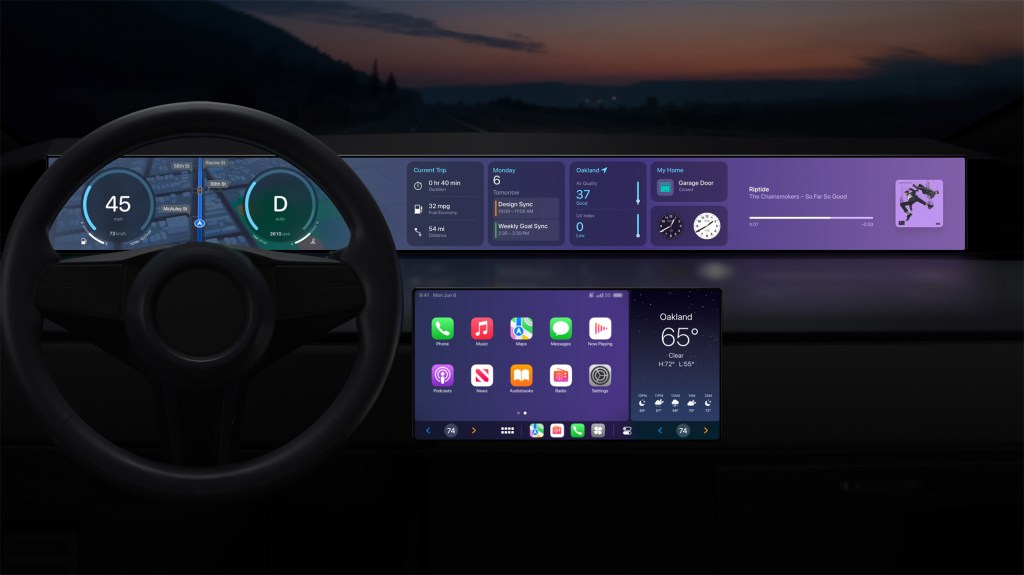
    Finally, I want to touch on the elephant in the room; CarPlay. Originally introduced as part of iOS 7, it eventually launched alongside iOS 8 and handled the bare minimum of what people wanted out of an “iOS in the car” experience. It handled iTunes Radio music streaming, Maps navigation, and phone calls and messages. That was about it. Over the past several years Apple has been working to improve it by adding more features and apps and even support for third-party apps for ordering food and paying for parking. At last year’s WWDC conference, Apple previewed what they called “the next generation of CarPlay”. This upgraded version of CarPlay was designed to work with a wide variety of car screens, multiple of them if a car happened to have them, and display multiple different controls for not just your phone but for your car as well. When the feature was announced last year, I was confident Apple was working to release its own car. However, a year later, it seems to not be what Apple is going for. And no car manufacturer has announced or committed to supporting this next generation of CarPlay.

    Apple and their car project is a nearly decade-old broken relationship. It would greatly seem Apple wants to release its own car but simply cannot justify doing so, but for some reason can justify releasing it to the industry at large which, in turn, rejects the advances. Forcing Apple to reconsider its car project but the cycle keeps going on. I do genuinely hope that Apple decides to someday launch its own car. Every feature that Apple introduces that relates to the car is from a consumer perspective, very intriguing. But they are held back by not being able to control the hardware and software. These are the kinds of problems that Apple has historically excelled at solving. Identifying where a unique integration of hardware, software, and/or services can provide a compelling user experience.

  • Why Notifications Shouldn’t Be Placed in Dynamic Island

    Why Notifications Shouldn’t Be Placed in Dynamic Island

    In 2022, at its annual September Event, Apple revealed the iPhone 14 Pro- sporting a new design that has become commonplace for its flagship “Pro” devices. The change this year focused on the screen and the introduction of the Dynamic Island. A space that was, as Apple put it, “..integrated throughout iOS — and works with lots of different apps — to seamlessly surface what you need, right when you need it.” At launch, it didn’t do much of anything besides surface system-level status changes like confirming if the Ring/Silent switch was in the Ring or Silent position, showing when Focus modes were changing, or expanding out to surface an incoming phone call. 

    With the introduction of iOS 16.1 the following month, Apple brought support for the Live Activities API which could show the real-time status of a particular event right on your Lock Screen or, if you had the iPhone 14 Pro, right in the Dynamic Island. Here we are 6 months later and many power users on various Apple forums and tabloid websites have claimed that Apple should move all app notifications to Dynamic Island. Today, I want to discuss why I think that would be a bad idea. 

    The Dynamic Island has 4 design views that developers need to account for. 

    1. Default View- the default shape and size of Dynamic Island that encapsulates the TrueDepth Camera system. Tapping or long pressing results in no action. 
    2. Compact View- when a single Live Activity is running, information can be presented on both the left (leading side) and right sides (trailing side) of the TrueDepth Camera system. Tapping Dynamic Island will open the app and long pressing the app will open up the…
    3. Expanded View- this view presents a higher level of detail and takes up most of the width of the screen and up to approximately one-sixth of the vertical screen real estate. 
    4. Minimal View- if two or more Live Activities are running, information will be presented on the left side (leading side) or right side (trailing side). Tapping on one or the other will open that respective app and long pressing will open the Expanded View. 

    In addition to the above four views, users can swipe across Dynamic Island to minimize or expand the information. 

    Looking at notifications, that system currently works by a notification banner dropping down from the top of the screen, usually sitting for a few seconds right below Dynamic Island, and then it disappears by returning to the top of the display to be accessed later by navigating to Notification by pulling down from almost anywhere at the top of the screen. The notification can be accessed by going to where it disappeared to. Notifications can be expanded when long-pressed, but this functionality has been reduced in recent versions of iOS. 

    Having detailed all that, I think the problem with integrating notifications into Dynamic Island is revealing itself. There is no available space or gesture available to reveal or display notifications by interacting with Dynamic Island. And there is an almost perfectly clear system in place for accessing Notification Center as is. 

    It is possible Apple could rework Notification Center to become a Live Activity, so when a notification surfaces on a users device the Dynamic Island expands out to the Compact View or Minimal View to show how many notifications are in Notification Center and then tapping and holding on the Dynamic Island expands it out to black the entire screen and lists all a user’s notifications. This would be visually worse than what we have currently and require Apple to dramatically rework the Live Activity and Notifications APIs. 

    Considering the above facts, I don’t believe there is any need for Apple to change the current Notifications setup or change the way Dynamic Island works. I would rather Apple focus its efforts on cleaning up some of the visual errors that can occur with the Dynamic Island or clean up or even work to improve the Status Bar which shares its space with Dynamic Island.

  • AirPods Pro Review- Pleasant to Use

    AirPods Pro Review- Pleasant to Use

    I think the best way to review the second generation AirPods Pro is by looking at the three key elements that make any pair of AirPods, well, AirPods. The pods themselves, the case they are stored in, and the overall experience using the pods and case together with other devices.

    Starting with the pods themselves, Apple put in a new chip to handle all the new audio features they built for the Pros. The AirPods lineup has had quite a chip journey- starting with the W1 in 2016 before that chipset moved over to the Apple Watch and then the creation of the H1 for all AirPods starting in 2018 to the present day. At this point in time, the H2 chip is only inside the second-generation AirPods Pro. This chip allows Apple to deliver several new audio features like improved noise cancellation and a new Adaptive Transparency mode, but these things aren’t noticeable to me and are not what I’ve come to love about the H2 chip. What I love about the H2 chips is the fact that it allows a constant Bluetooth connection to your iPhone to see the pods battery status no matter where you are in iOS- Lock Screen or Home Screen. It also allows the pods themselves to connect more quickly to my iPhone to resume a podcast or playlist. It’s noticeably improved over previous models of AirPods.

    The pods also have an improved touch sensor on the side. Previous generations of AirPods and AirPods Pro have featured a Force Touch surface that can switch between noise cancelation and transparency modes or skip between songs and even summon Siri. But on these new AirPods Pro, the surface is capable of detecting the direction in which you slide your finger across it, up or down, so you can adjust the volume on the fly. This previously would have required you to wear an Apple Watch, pull out your iPhone, or summon Siri and ask her to adjust the volume. But now you can do it directly on the AirPods themselves and it is wonderful.

    The final improvement to the pods I want to discuss is the silicon ear tips. The previous AirPods Pro had a small, medium, and large tip option. None of those sizes ever felt right in my ear and they would always pop out making them impossible to wear for a long period of time or while moving my body. The new extra small tip option does fit my ear and has not yet once popped out. It feels wonderful to wear these AirPods Pro for hours at a time.

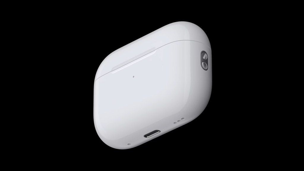
    The pods themselves are a solid improvement from the previous AirPods Pro and even the second and third-generation AirPod models, but the case is I think where Apple went the extra mile in making technological and usage improvements. It can be charged by almost any charging method you can imagine. Plugging in a Lightning cable, standard Qi charging, MagSafe puck, and now even the Apple Watch charger can be used. It’s great to have this many options to charge your AirPods!

    The case now also features a small speaker to play various tones depending on what you’re doing with the pods. Pairing them for the first time plays a fun pairing tone and placing them on a charger makes Apple’s universally recognized charging sound. When the battery gets low, it also plays a sound for that too. It’s fun. But the bigger deal with the speaker is that it works with the Find My app to basically use your AirPods Pro case as an AirTag.

    Opening the Find My app on your iPhone and navigating to your devices and selecting your AirPods Pro case will let you play a sound on them so you can find the case by audio cue. Or, since the case now has the U1 chip inside, the same as an AirTag, it can be precisely located by proximity and your iPhone can guide you directly to it. This suite of features ensures that you cannot lose your expensive new AirPods Pro and acts as a confidence booster to people considering AirPods for the first time as one of the biggest worries people have is centered around losing them.

    The only other change they made to the case was the addition of a lanyard loop so you can easily attach your AirPods Pro case to a backpack or your wrist or something. I don’t care about that, but I’m sure others will. The improvements to the case are so good in fact that I think Apple should work to bring all the features of this case to the other AirPods products they make now. Even if it is an extra paid upgrade, I think people would spring for it.

    The final component of AirPods Pro is the overall experience of using them. As I have detailed so far in the review, the experience is much improved over previous models. The pairing and setup is as simple as it has ever been but is enhanced by the case’s speaker. The new audio features in the pods themselves I don’t really use or appreciate them, but others I’m sure will or do. And the case adds a huge layer of pleasantness to the overall usability and enjoyment factors of the product. Who knew that a speaker and a single chip could be so transformative?

    My only gripes with the AirPods Pro are the fact that it still has a Lightning port on the case rather than the far more ubiquitous USB-C port and the fact that the AirPods Pro doesn’t play well with non-Apple devices and the Mac. Six years in and the Mac still doesn’t have the same seamless setup experience as iPhone does and many features of the AirPods Pro just won’t work if you have an Android device.

    The AirPods Pro are expensive at $250, costing the same price as an Apple Watch SE. But if you want the best AirPods money can buy with the most features possible, these are for you. You will absolutely love what they have to offer. If, however, you can’t spend that much on a pair of AirPods and just need some simple-to-use and setup headphones, I’d happily recommend the 3rd generation AirPods. They’re almost as good but at a lower, $180 price and are probably a better fit overall for most people.

  • Apple News+ Audio Stories- A Frustrating Feature to Use

    Apple News+ Audio Stories- A Frustrating Feature to Use

    In March 2019, Apple announced a new service was coming to Apple News across all platforms- Mac, iPad, and iPhone. This service, Apple News+, provided subscribers access to a host of magazines and articles in premium newspapers. In an effort to expand the value of the service, in July 2020, the company launched Audio Stories. Audio Stories were narrated articles of select Apple News+ content that could be enjoyed on its own or listened to while also reading the article in the News app. This new feature had one big caveat though.

    Audio Stories could only be enjoyed on iPhone. This was, and still is, a baffling design choice as in the lead up to Apple News+ being launched Apple ensured that the News app was available on the Mac and utilized the Project Catalyst technology that allowed them to easily port their iPad version of the app to the Mac to ensure feature parity. So there is truly no technological reason why Apple can’t bring Audio Stories to iPad or Mac. Adding to this confusion is that for quick reads of an article, I would be willing to bet many users read on their iPhone. But for longer form content like magazine articles, I’m sure many users prefer to use their Mac or iPad. The iPad especially makes a great demo device for reading and enjoying magazines and articles.

    The expansion of Apple News to an audio format also should have prompted Apple to bring support for Audio Stories to more devices like Apple Watch and HomePod. Apple has focused a lot of Apple Watch marketing on its connection to audio by heavily promoting the combination of Apple Watch with Apple Music and AirPods. Apple News could have been the next pillar in that combination. Siri could also have also integrated with Apple News to allow users to ask Siri to play a story in their queue and seamlessly work with HomePod.

    By having only some features of your subscription to Apple News+ available on some devices, some subscribers get less value for the same $10 per month price than others depending on what device they prefer to use. That’s just bad business and not fair to all paying subscribers. Imagine if you were subscribed to a video streaming service and only certain movies could be streamed on certain devices. In addition to making no sense, that kind of action would prompt cancellations and deter non subscribers from ever subscribing in the first place.

    In 2018 and 2019, Apple seemed to be moving in a direction of unifying their products to all run the same apps so anyone on any device could subscribe to an apps service and Apple would then in turn be able to collect their 15-30% cut of that subscription revenue. But in the years since, Apple seems to have lost that direction and instead begun to hyper focus on making sure iPhone users get priority treatment in any service they introduce.

    Apple Music is probably the most successful service Apple has introduced (it may be right behind iCloud+) but even Apple Music’s recently released Classical companion app is only available on iPhone. It is not on CarPlay, iPad, Mac, Apple Watch, or even Android. The impact on HomePod has been yet to be determined.

    Apple needs to return to the direction they were headed in in 2018 and 2019 and ensure that subscribers to their service can enjoy all the features they pay for, no matter what device they prefer to use. This will increase the demand of their services, protect the value of those services, and increase sales of other product lines.

  • Apple Wallet Order Tracking Is A Disaster

    Apple Wallet Order Tracking Is A Disaster

    With the introduction of iOS 16.4, Apple added a new widget for the Apple Wallet app- Order Tracking. This widget is supposed to allow users to see an orders status directly from the Home Screen without needing to open the Wallet app. On its own merits, this is an excellent addition to the growing collection of widgets from the Apple Wallet app. The problem will become obvious when the widget never updates.

    I have been using iOS 16 as a public beta for 9 months. 6 months have passed since iOS 16 publicly released in September 2022 and despite almost exclusively using Apple Pay as my method of payment and shopping at retailers that support Apple Pay on their website, not once have I seen an order added the order tracking feature of the Wallet app. Including, most embarrassingly, orders placed directly from the Apple Store.

    In November 2022, I placed an order for the Eve Indoor Camera from the Apple Store and had it set to be shipped directly to my home where it was to arrive within a few days. This purchase was not able to be tracked via the Wallet app, I instead had to rely upon the Apple Store app to send me notifications on the status of my order.

    In 2015 when Apple introduced Apple Pay, one of the first merchants to support the new tap-to-pay technology was Apple itself. Why hasn’t it done so with its newest Wallet feature?

  • Apple Arcade- A Fall From Grace

    Apple Arcade- A Fall From Grace

    In March 2019, Apple announced a new service coming to the App Store. The service’s mission was to deliver new, exclusive, original games directly to Apple users for a single monthly price, no matter what device you owned- Apple TV, iPhone, iPad, or Mac- and those games would be ad-free, micro-transaction free, and ad tracking free.


    That service was Apple Arcade.


    It launched later that year alongside the public launch of iOS 13, iPadOS 13, and tvOS 13 with a large handful of games for subscribers to download and play at their leisure. It was refreshing to play a game on your iPhone that didn’t require a new account to be set up or a social media account to be linked or an annoying ad popping up every few minutes followed by another ad trying to get you to spend a couple of dollars on some in-game currency. You just downloaded the game and played it. It was a console-level experience on whatever Apple device you owned. The least seamless part of the whole service was some games that required a controller to play on Apple TV, but even with that hassle, I think many subscribers were willing to tolerate it as the alternative was playing with the original first-generation Siri Remote.


    All of this for $5 per month made Apple Arcade an attractive service for mobile gamers and families with children.


    Apple Arcade’s fall from grace occurred on April 2, 2021, when Apple published a Newsroom release titled “Apple Arcade launches its biggest expansion yet, growing its award-winning catalog to more than 180 games”.


    The Newsroom release detailed a massive (and rapid) expansion of titles to the Apple Arcade library. It did so by establishing three categories of games under the Apple Arcade branding.
    First was Arcade Originals- these titles included all previously release Apple Arcade titles that were playable on all Apple devices and were usually original titles that couldn’t be found elsewhere. The other two categories were Timeless Classics and App Store Greats. Both of these categories were iPhone or iPad only and were simple re-releases of existing games you could already find in the App Store. The Timeless Classics label was applied to games that had their origins in a classic card, dice, or board games. Chess for example. The App Store Greats label was applied to games that had their origins as being originally released on the App Store. Fruit Ninja is probably the most recognizable example.


    Suddenly, the Apple Arcade brand shifted from ad-free, micro-transaction-free, original titles playable on any Apple device, to a mix of games that were all ad and micro-transaction free, but some could only be played on certain devices and free or superior versions could be readily found in the same place you were already looking at Apple Arcade titles.
    From April 2021 to the present day, the vast majority of new releases on Apple Arcade are under the Timeless Classics or App Store Greats label. This has led to a massive increase in iPhone and iPad only titles being added to the service that are of lower quality than the Arcade Originals that got people to sign up in the first place. What used to be considered a steal at $5 per month, now feels worthless at the same price because the average quality has so significantly declined.


    What made me realize this was one of the latest releases- Clue. This digital release of the classic board game is an App Store Great- it has a free version already on the App Store- and it has many issues being played on both my iPad Pro and iPhone 14 Pro. On my iPad Pro, the game can only be played in portrait mode. On my iPhone 14 Pro, many of the issues are related to the game’s lack of optimization for dealing with Dynamic Island. The game overrides any Live Activity from appearing in Dynamic Island (which I honestly was not aware was possible by any app) and many UI elements overlap with it as well. As a free app on the App Store, these issues are somewhat annoying, but not dealbreakers. But as part of the Apple Arcade game lineup, with Apple’s backing, it becomes a lot more disappointing and more of a deal breaker.


    And this isn’t a one-off thing either. Neko Atsume: Kitty Collector on Apple Arcade removes the Apple Watch integration that existed in the original free version of the App. The game also hasn’t been updated to remove the large black bars at the top and bottom of the app because it was released with the screen design of the iPhone 8 and earlier in mind. Hearts also has an outdated menu design and doesn’t take advantage of GameCenter at all for online play.


    These releases are, put simply, lazy. And I’m not necessarily blaming the developers of these games for these issues. They absolutely should update their apps to at least display correctly on all devices, whether they are part of Apple Arcade or not. But the majority of the blame is on Apple for not enforcing any kinds of standards for the titles they purchase the rights to for their service.


    Until these issues are addressed, Apple Arcade will continue to be that one Apple service that for a period of time was high quality and certainly worthwhile, but in a bid to rapidly increase the bottom line and pull in a few more subscribers, rapidly did the opposite and went downhill.